2.0.6 • Published 8 years ago
ngx-slider-moby v2.0.6
Ngx Slider Moby.
Reactive slider/scope slider component for angular.
Live demo: https://pavelpleshko-slider-moby.now.sh
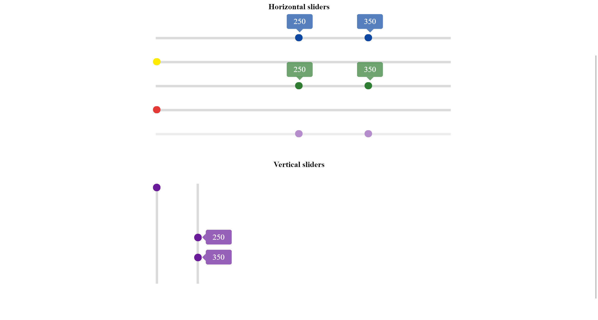
Screenshot

Get started
Slider supports touch events for mobile devices.
Install package itself
npm install ngx-slider-moby --save
How to use
Include NgxSliderMobyModule into your module like so:
import { NgxSliderMobyModule } from 'ngx-slider-moby';
...
@NgModule({
  imports: [
    NgxSliderMobyModule
  ],
})
export class YourModule { }
Inclusion of module will give you access to the slider component which you can include in your components. Example:
<ngx-slider-moby [max_value]="300" [min_value]="0" [range]="true"></ngx-slider-moby>Can be used as form control(implements ControlValueAccessor interface) like so:
<div [formGroup]="myForm">
<ngx-slider-moby [max_value]="300" [min_value]="0" [range]="true" formControlName="priceRange"></ngx-slider-moby>
<ngx-slider-moby [max_value]="10" [min_value]="0" [range]="false" formControlName="kilogramms"></ngx-slider-moby>
</div>
NOTE: In case when you are using [range]="true" form control value will be as follows:
{from:20,to:55}
NOTE: If you want to use vertical slider specifying [vertical]="true" parent's height should be also specified otherwise component will behave unexpectedly.
Inputs
| Prop | Type | Default | Description |
|---|---|---|---|
min_value | number | 0 | minimal value for given slider |
max_value | number | 500 | maximal value for given slider |
value_from | number | 0 | If specified will assign provided value to the component value1 variable |
value_to | number | 0 | Similar with above but for value2 variable |
showThumbLabels | boolean | true | whether or not to show labels on default slider(not range) |
vertical | boolean | true | If false then the slider will appear horizontally |
step | number | 1 | Allows to specify the number of units that one step has |
range | boolean | false | If speified true then the slider will be a scope slider and have corresponding value and appearance(ex.: from 30 to 50). Thumblabels are visible by default in this type of slider |
disabled | boolean | false | If true then puts slider in a disabled state and doesn't handle any events on the element |
direction | 'ltr' or 'rtl' | ltr | Left to right or right to left(not implemeneted yet) |
color | string | purple | Slider will assume the corresponding color palette. Options: red,green,blue,purple,yellow |
Events
valueChange - emits the object which looks like this in case of default slider {sliderId:string,value:number,percent:number},in case of range slider as follows:
{sliderId:string,
	value:
	{from:number,to:number},
	percent:
	{from:number,to:number}
}
blurred - blur event emits boolean true or false;
focused - focus event emits boolean true or false;
Update 2.0.0 info.
- Major bug fixes.
- Animation runs smoother.
Update 1.1.0 info.
- Added colors 'black','grey'.
- Added support of floating
step. - Fixed some bugs.