overwatch-settings-stepper


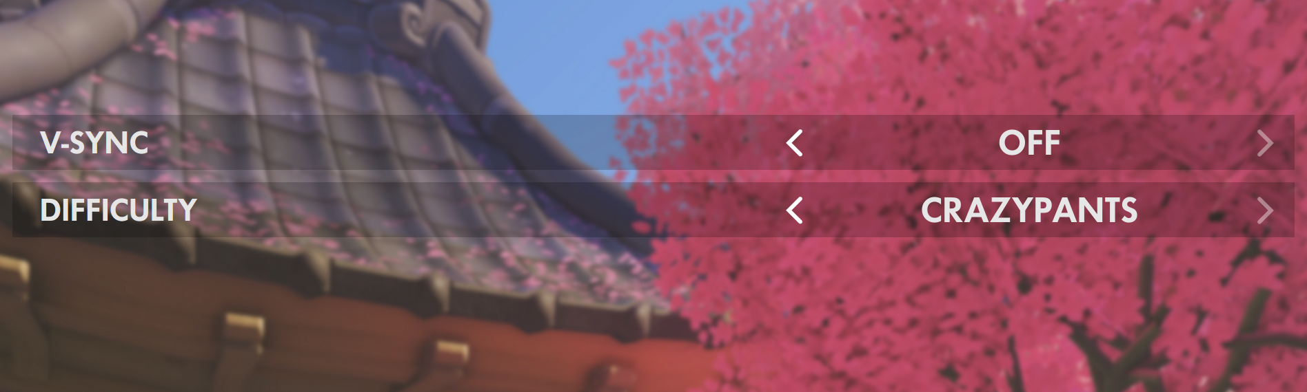
A React component modeling the Overwatch Settings the stepper and toggle UI elements.
Install
npm install --save overwatch-settings-stepperFonts
Futura No 2 D DemiBold
This font is used by Activision Blizzard for much of Overwatch's design. For this component to match the Overwatch design, including the font is required. It can be licensed from MyFonts.
When using CSS font-face, the font-family should match whats below:
font-family: 'Futura No 2 D DemiBold';Usage
Check out example/index.js for working example or below for exact usage.
import { SettingsStepper, Toggle } from 'overwatch-settings-stepper'

class Example extends React.Component {
    state = {
        activeIndex: 1,
    }

    onStep = (activeIndex) => {

        //... do some logic

        this.setState({
            activeIndex
        })

    }

    render() {

        const { activeIndex } = this.state

        return <SettingsStepper
            {...{
                activeIndex,
                onStep: this.onStep,
                label: 'difficulty',
                options: [
                    'Easy',
                    'Medium',
                    'Hard',
                    'Nightmare',
                    'Insane',
                    'Crazypants'
                ],
            }}
        />
    }
}
Components
SettingsStepper
The SettingsStepper is the component with the core functionality. It expects options, onStep, and activeIndex.
It is a controlled component, meaning when onStep is called, a new activeIndex is fed to the parent to determine the active visible option of the options.
Toggle
The Toggle is an implementation of SettingsStepper, and a convenience component for those that dont want to implement a simple checkbox/toggle. It expects toggled and onToggle.
It is a controlled component, meaning when onToggle is called, a new toggled is fed to the parent to determine the Toggle's On or Off state.
Props
SettingsStepper
| name | required | type | default | desc |
|---|---|---|---|---|
| activeIndex | X |
integer | 0 | Index of the active visible option, should be stored in parent state and changed from onStep |
| onStep | X |
function | null | Callback method called when stepper is progressed (clicked) forward or backward; Parameter is the new activeIndex to be set in state in the parent component. |
| options | X |
array | [ 'On', 'Off' ] | array of strings options to step through |
| label | string | Label for the component, positioned to the left of the stepper options |
Toggle
| name | required | type | default | desc |
|---|---|---|---|---|
| onToggle | X |
function | null | Callback method called when toggle is toggled (clicked); Parameter is the new toggled boolean, to be set in state in the parent component. |
| toggled | X |
boolean | false | Boolean that reflects whether the toggle is On or Off; Should be stored in parent component state, and changed from onToggle |
| label | string | Label for the component, positioned to the left of the toggle options |
Development
npm run devRunning the example
Install it:
cd example/; npm installRunning the example
Run it while developing (in another terminal window):
cd example/; npm run devOpen http://localhost:8080/ to see the running example
Tests
npm testLicense
Made with by Chris Dolphin

Fonts
The font Futura No 2 D DemiBold should be licensed through MyFonts.com
Related
- awesome-overwatch - A curated list of official Overwatch links and community github repos, codepen demos, and chrome extensions.
- overwatch-settings-select - A React component modeling the Overwatch Settings select element.
- overwatch-side-nav - A React component modeling the Official Overwatch website side-navigation.
- overwatch-table - A React component modeling the Overwatch custom game table element.
- dva-heart-emote - A WebGL remake of the heart container animation from D.Va's emote.