0.1.7 • Published 3 years ago
p14-modal-component-library v0.1.7
Modal component
A simple and reusable Modal component for React.
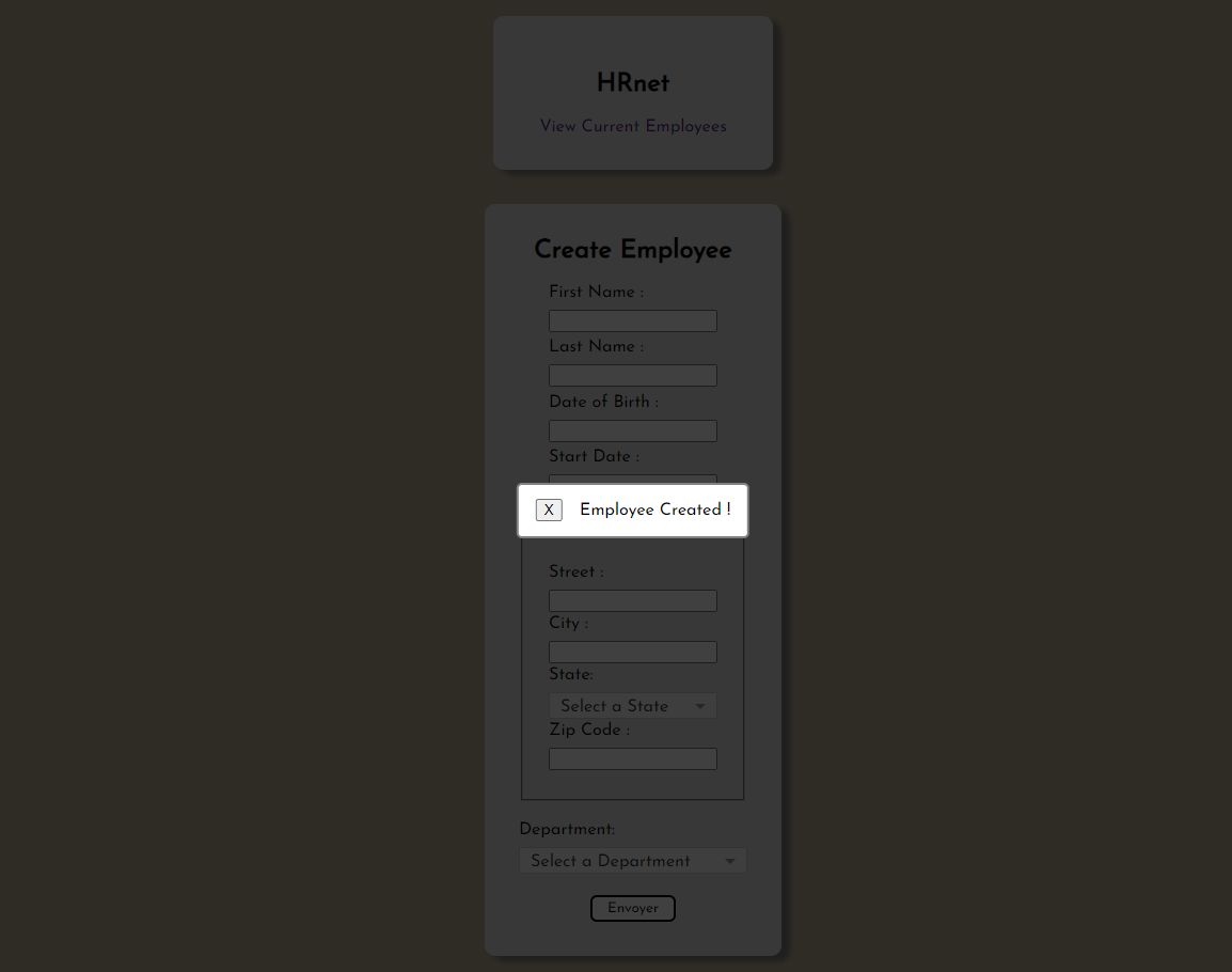
This component allow you to render a modal with a message in the center of your screen.

Installation
The package can be installed via npm :
npm i p14-modal-component-libraryConfiguration
The component needs two props :
- {message} : write here the message you want to display in the modal.
{onClose} : handler to close the modal. You will have to add a handle closing function in your file.
Example :
- JS
const [isModalVisible, setIsModalVisible] = useState(false);

const handleSave = (e) => {
	e.preventDefault();
	setIsModalVisible(true);
};

const handleClosing = (e) => {
	setIsModalVisible(false);
};
- JSX
{
	isModalVisible && (
		<Modal message={"Employee Created !"} onClose={handleClosing} />
	);
}
Compatibility
This component has been developped with the current latest version of React (v18.2.0).