persian-date-picker-svelte v0.1.0
Persian Date Picker Svelte
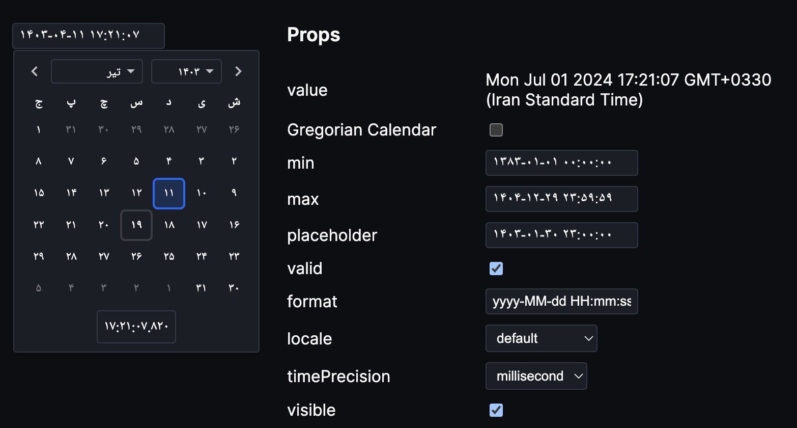
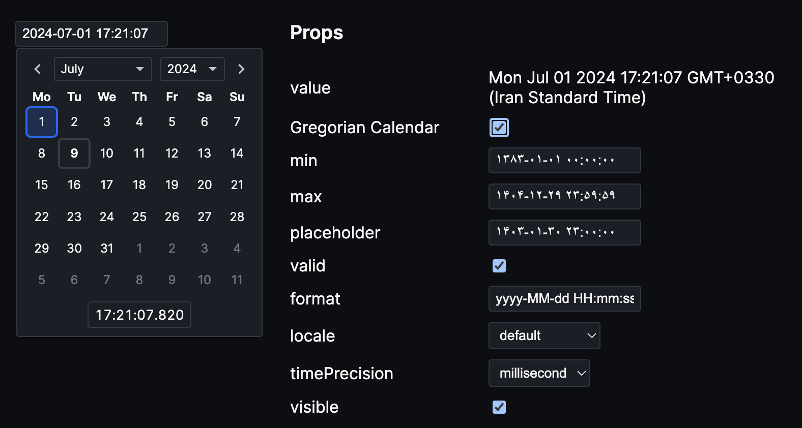
Persian Date Picker Svelte is a package which supports both Jalali and Gregorian calendars, inspired by Date Picker Svelte
Features:
- Theming
- Custom formats
- Internationalization for the Gregorian Calendar (i18n)
- Auto-punctuation (e.g typing "20201111111111" gives you "2020-11-11 11:11:11" with the default format)
- Keyboard shortcuts
Documentation
Install
npm install -D persian-date-picker-svelteUsage
<script>
  import { DateInput } from 'persian-date-picker-svelte'
  let date = new Date()
  const calendarType = 'Jalali'
</script>

<DateInput bind:value={date} bind:calendarType/>
You can toggle between Jalali and Gregorian calendars by setting the calendarType prop to one of the "Jalali" | "Gregorian" values.
<script>
  import { DateInput } from 'persian-date-picker-svelte'
  let date = new Date()
  const calendarType = 'Gregorian'
</script>

<DateInput bind:value={date} bind:calendarType/>
Component with an input field that shows the DatePicker component on focus. The component will not assign a date value until a specific date is selected in the picker or entered into the field.
| Prop | Type | Description |
|---|---|---|
calendarType | "Jalali" | "Gregorian" | type of the calendar, default is Jalali |
value | Date | null | Date value |
min | Date | The earliest value the user can select |
max | Date | The latest value the user can select |
placeholder | string | Placeholder used when date value is null |
timePrecision | "minute" | "second" | "millisecond" | null | Show a time picker with the specified precision |
id | string | null | Set the input element's ID attribute |
valid | bool | Whether the text is valid |
format | string | Format string |
visible | bool | Whether the date popup is visible |
disabled | bool | Disable the input |
required | bool | Require a value to submit form |
closeOnSelection | bool | Close the date popup when a date is selected |
browseWithoutSelecting | bool | Wait with updating the date until a value is selected |
dynamicPositioning | bool | Dynamically postions the date popup to best fit on the screen |
locale | Locale | Locale object for internationalization |
Example format string: yyyy-MM-dd HH:mm:ss
| Pattern | Result example |
|---|---|
yyyy | 2021 |
yy | 21 |
MM | 12 |
dd | 31 |
HH | 23 |
mm | 59 |
ss | 59 |
Component with a calendar for choosing a date. The component will not assign a date value until a specific date is selected in the picker.
| Prop | Type | Description |
|---|---|---|
calendarType | "Jalali" | "Gregorian" | type of the calendar, default is Jalali |
value | Date | null | Date value |
min | Date | The earliest year the user can select |
max | Date | The latest year the user can select |
timePrecision | "minute" | "second" | "millisecond" | null | Show a time picker with the specified precision |
locale | Locale | Locale object for internationalization |
browseWithoutSelecting | bool | Wait with updating the date until a date is selected |
Object to support internationalization. Properties (all are optional):
weekdays: Array of weekdays in short form, Sunday to Monday. - Default for Jalali calendar is:['ی', 'د', 'س', 'چ', 'پ', 'ج', 'ش']- Default for Gregorian calendar is:['Su', 'Mo', 'Tu', 'We', 'Th', 'Fr', 'Sa']months: Array of month names, January to December. - Default for Jalali calendar is:['فروردین','اردیبهشت','خرداد','تیر','مرداد','شهریور','مهر','آبان','آذر','دی','بهمن','اسفند']- Default for Gregorian calendar is:['January', 'February', 'March', 'April', 'May', 'June', 'July', 'August', 'September', 'October', 'November', 'December']weekStartsOn: The day the week starts on, 0 = Sunday. - Default for Jalali calendar is:6- Default for Gregorian calendar is:1
If you use date-fns, you can create a Locale object (only for Gregorian calendar) by passing a date-fns locale to this function:
<script>
  import { DatePicker, localeFromDateFnsLocale } from 'persian-date-picker-svelte'
  import { hy } from 'date-fns/locale'
  let date = new Date()
  let locale = localeFromDateFnsLocale(hy, 'Gregorian')
</script>

<DatePicker bind:value={date} {locale} />
Colors:
--date-picker-foreground--date-picker-background--date-picker-highlight-border--date-picker-highlight-shadow--date-picker-selected-color--date-picker-selected-background
Lengths:
--date-input-width
Dark theme example:
:root {
	--date-picker-background: #1b1e27;
	--date-picker-foreground: #f7f7f7;
}
Inspirations
persian-date-picker-svelte is inspired by the great work of the developers of the following packages:
Date Picker Svelte :
Which provides the foundation for the date picker functionality in persian-date-picker-svelte.date-fns-jalali :
This library enables Jalali calendar support within persian-date-picker-svelte.