popup-lite v1.3.1
Welcome to Popup Lite!
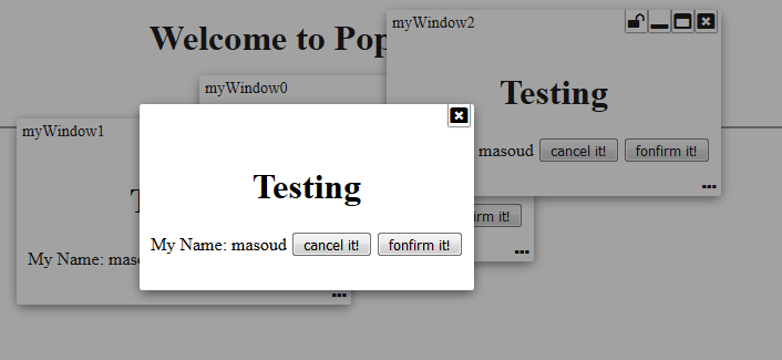
Have you ever wanted to have a lite weight modal popup, dialogue box, or free moving window? Well... I needed one. And here it is... a lite weight pop-up fully configurable with modal, dialog, and free workspace like window... all in one package!
This library provides Angular 4 components that enables you to have such things without relying on heavy "@angular/material" and just by adding PopupLiteModule into your AppModule.
NOTE: If your project still is angular 2, 4, or 5; please luck-down your version reference to flexible table to 1.2.1 version by removing ^ from the version dependency in your package json. Otherwise for Angular 6+, please use 1.2.2 version or higher.
NOTE: Starting with version 1.3.1 you need to import this library through @sedeh/popup-lite.
Live Demo | Source code | Comments/Requests
Dependencies
MODULE:
	PopupLiteModule

EXPORTS:
  PopupLiteModule,
  PopupLiteOptions,
  PopupLiteContentComponent,
  WindowLiteService,
  PopupLiteComponent,
  PopupLiteService

DEPENDENCIES:
    "drag-enabled": "^0.2.4",
    "font-awesome": "^4.7.0",
Interfaces
The following are available functionalities presented in this version:
Interfaces to use
export interface PopupLiteOptions {
	id?:string,
	overlay?: boolean,
	close?: boolean,
	closeOnOverlay?:boolean,
	minimize?: boolean,
	maximize?: boolean,
	resizable?: boolean,
	dragable?:boolean,
	centered?:boolean,
	fixed?:boolean,
	pinable?:boolean,
	header?: boolean,
  footer?: boolean,
  headerIcon?: string,
	idOnHeader?:boolean,

	maxHeight?:string,
	minWidth?:string,
	maxWidth?:string,
}
export interface PopupLiteContentComponent {
	data: any;
	id: string;
}

export interface WindowLiteService {
	openWindow(component: any, id: string, data?: any, options?: PopupLiteOptions): Observable<any>;
	openModal(component: any, id: string, data?: any, options?: PopupLiteOptions): Observable<any>;
	openDialog(component: any, id: string, data?: any, options?: PopupLiteOptions): Observable<any>;
}
Sample code
modalBox() {
    this.popService.openModal(TestModalComponent, "myModal"+this.counter++, {name: "masoud", status:"login"}, {iconHeader: 'fa fa-lock', idOnHeader: true}).subscribe(
      (success)=>{
        this.events.push(success);
      },
      (fail) => {
        this.events.push(fail);
      });
}

freeBox() {
    this.popService.openWindow(TestModalComponent, "myWindow"+this.counter++, {name: "masoud", status:"free"}).subscribe(
      (success)=>{
        this.events.push(success);
      },
      (fail) => {
        this.events.push(fail);
      });
}

dialogBox() {
    this.popService.openDialog(TestModalComponent, "myID"+this.counter++, {name: "masoud", status:"dialog"}).subscribe(
        (success)=>{
          this.events.push(success);
        },
        (fail) => {
          this.events.push(fail);
        });
    }
}
.............

import { Component } from '@angular/core';

import { PopupLiteService } from './popup-lite/injectables/popup-lite.service';
import { PopupLiteContentComponent } from './popup-lite/interfaces/popup-lite.interface';

@Component({
  selector: 'test',
  templateUrl: './test.component.html',
  styleUrls: ['./test.component.scss']
})
export class TestModalComponent implements PopupLiteContentComponent {

  data: any;
  id: string;
  pageTitle = "Component";

  constructor(private popService: PopupLiteService) {
  }

  popupTitle(id) {
    return this.data === 'login' ? 'Login ' : (this.data === 'free ' ? 'Free Goodies ' : 'Dialogue ') + id;
  }
  cancel() {
    this.popService.cancel(this.id, {action: "cancel", data: this.data});
  }
  confirm() {
    this.popService.confirm(this.id, {action: "confirm", data: this.data});
  }
}
.............
<div style="text-align:center">
  <h1>Testing</h1>

  My Name:
  <span [innerHTML]="data.name"></span>
  <button (click)="cancel()">cancel it!</button>
  <button (click)="confirm()">confirm it!</button>
</div>
Releases
| Version | Description |
|---|---|
| 1.3.1 | updated dependencies. |
| 1.3.0 | It was brought to my attention that some users have trouble using my components in their angular 6 environment. Since I had only updated few dependencies when moved to Angular 6, I am thinking dependencies are causing issues. So, for this release, I am updating all dependencies to what Angular 6 applications are expecting to have. Please let me know if this is fixing or not fixing any issues you are facing. |
| 1.2.2 | rolling to angular 6+ after fixing the dependency issue. |
| 1.2.1 | Temporary roll-back to angular 5. I forgot to luck-down the dependencies for angular 5 before upgrading to angular 6. this will cause problem if you are still using angular 5. |
| 1.2.0 | Updated libraries to become compatible with Angular 6+. |
| 1.1.2 | Added option to add icon on left side of title if you plan to see an icon on the pop window. |
| 1.1.1 | Added ability for the embedded component to reset the pop-up title. If your component implements popupTitle() method, you will have opportunity to reset the title based on a particular state. Let's say, you have a login panel and want to flow through forgot password and registration fields. Then, it will make sense to change panel title when you are in a different flow. |
| 1.0.1 | removed css attribute which was adding page height to the browser view port. |
| 1.0.0 | Compiled with AOT option and resolved issues. |
| 0.0.1 | Initial release. |
