
postcss-px-conversion
A PostCSS plugin that converts px to vw, vh, vmin, vmax, rem and rpx.
English · 简体中文 · Changelog · Feedback


Features
px to viewport units
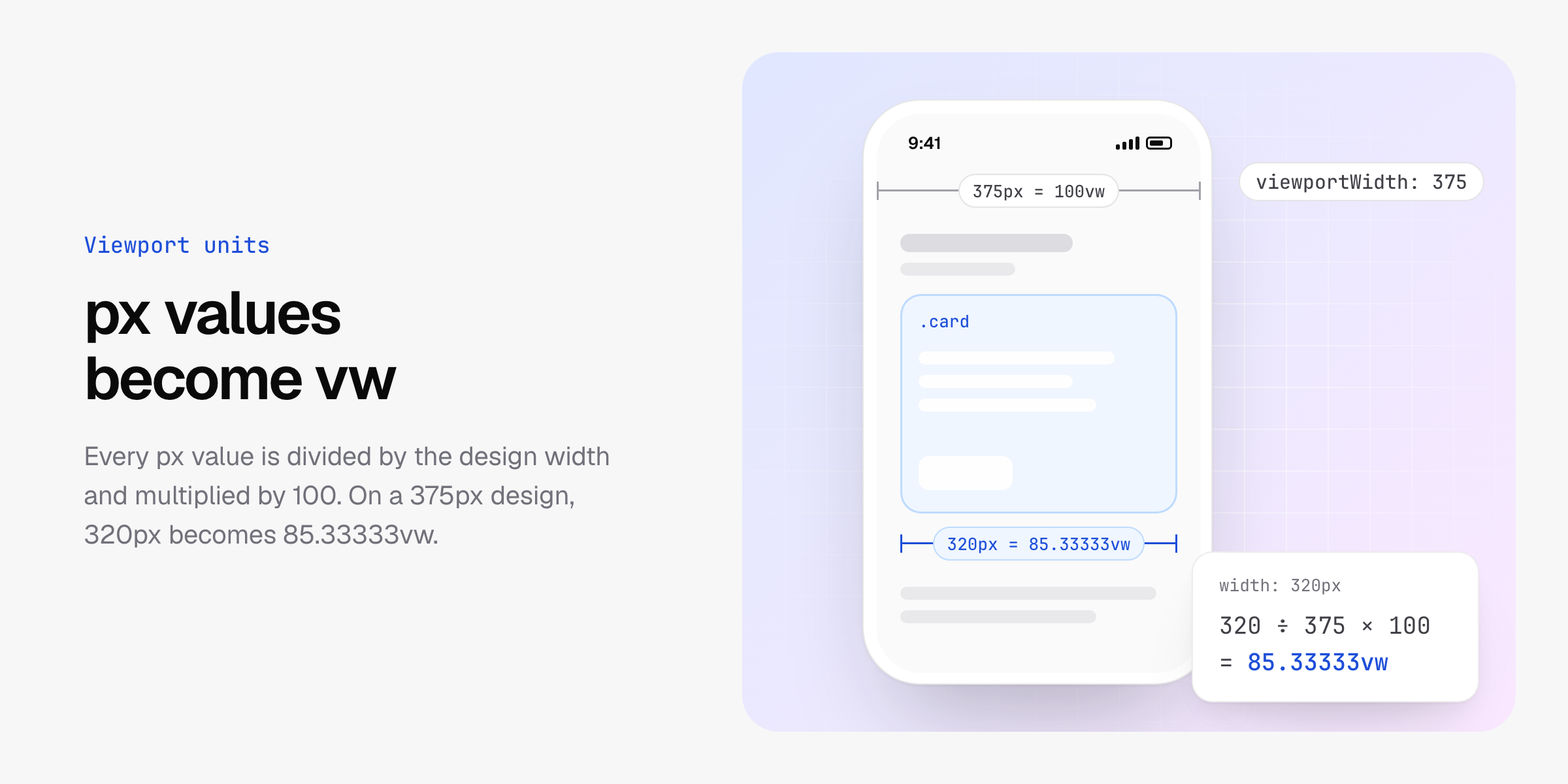
Write the sizes from the design in px. Each value is divided by viewportWidth and multiplied by 100, so on a 375px design width: 320px becomes width: 85.33333vw.
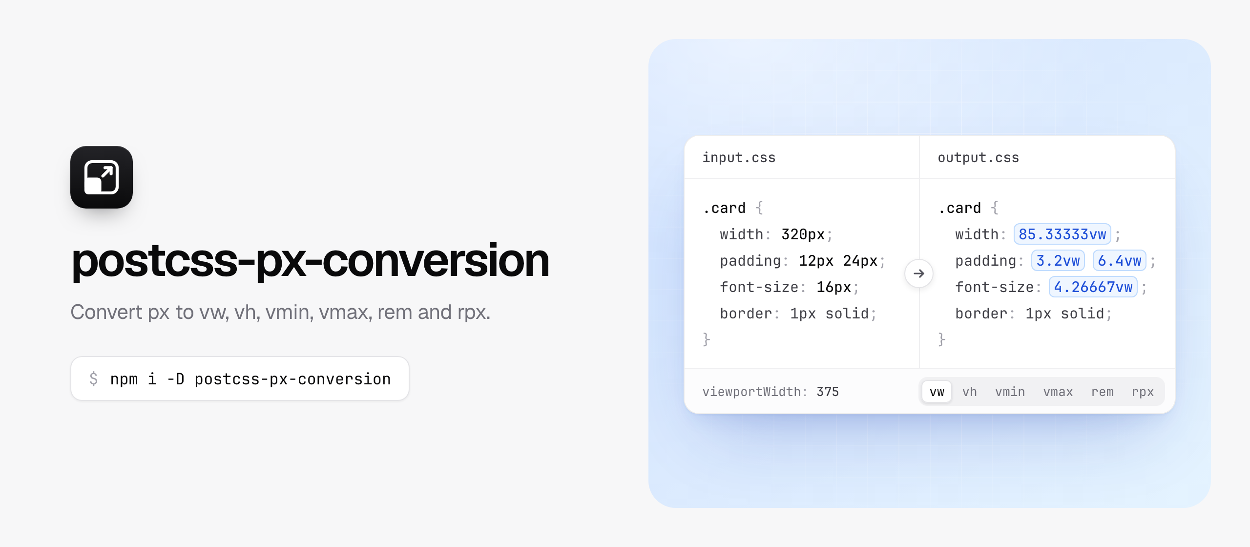
/* Input */
.card {
  width: 320px;
  padding: 12px 24px;
  font-size: 16px;
  border: 1px solid;
}

/* Output */
.card {
  width: 85.33333vw;
  padding: 3.2vw 6.4vw;
  font-size: 4.26667vw;
  border: 1px solid;
}
Values up to minPixelValue, which is 1 by default, keep their px, so hairline borders stay one pixel wide.

vw, vh, vmin, vmax, rem or rpx
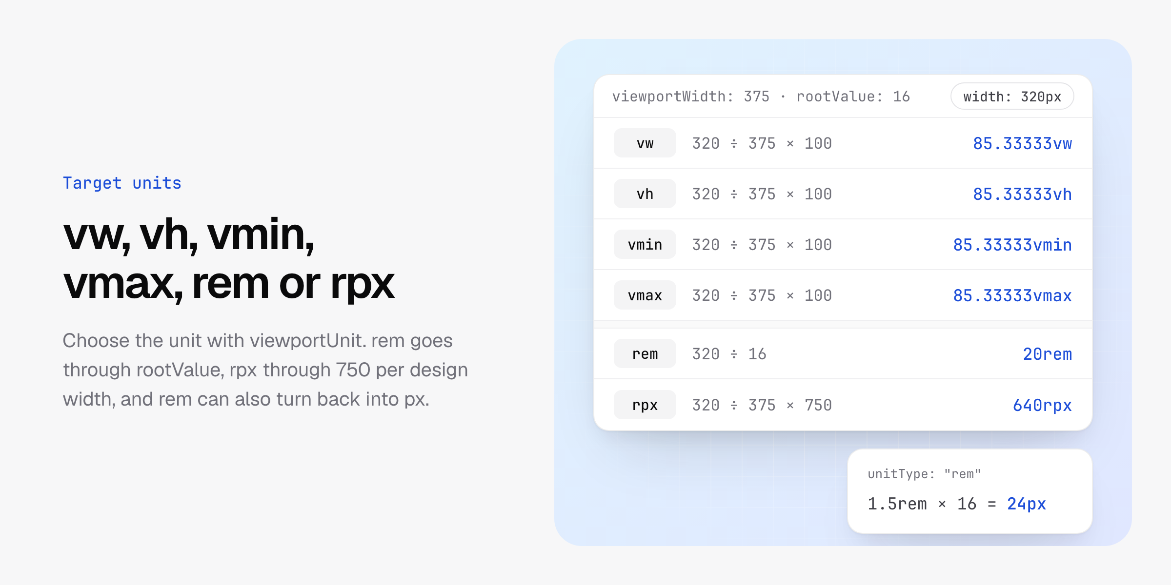
viewportUnit sets the unit to convert to, and fontViewportUnit sets it for properties whose name contains font. Viewport units scale with the design width, and so does rpx, which divides the screen into 750 parts. rem and px convert into each other through rootValue, which is 16 by default.
// 320px -> 20rem
postcssPxConversion({ viewportUnit: "rem" });
// 320px -> 640rpx
postcssPxConversion({ viewportUnit: "rpx" });
// 1.5rem -> 24px
postcssPxConversion({ unitType: "rem", viewportUnit: "px", fontViewportUnit: "px" });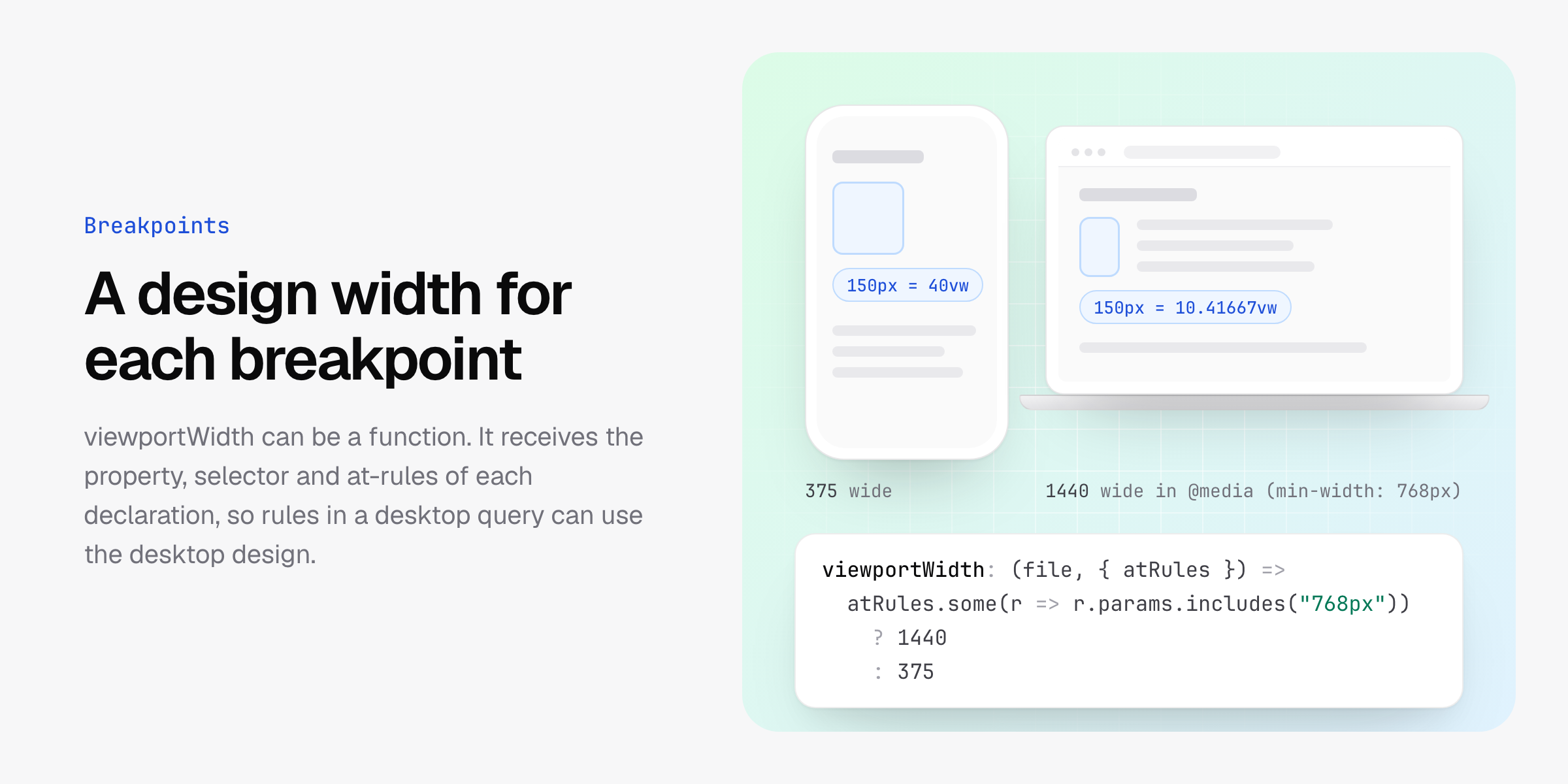
A design width for each breakpoint
viewportWidth can be a function. It receives the file path and the position of the declaration: its property, the selector of its rule and the at-rules around it, outermost first. Returning undefined leaves the declaration as it is.
postcssPxConversion({
  allowMediaQuery: true,
  viewportWidth: (file, { atRules }) => {
    const desktop = atRules.some(atRule => atRule.params.includes("min-width: 768px"));
    return desktop ? 1440 : 375;
  },
});
With this setting, width: 150px becomes 40vw on its own and 10.41667vw inside @media (min-width: 768px).
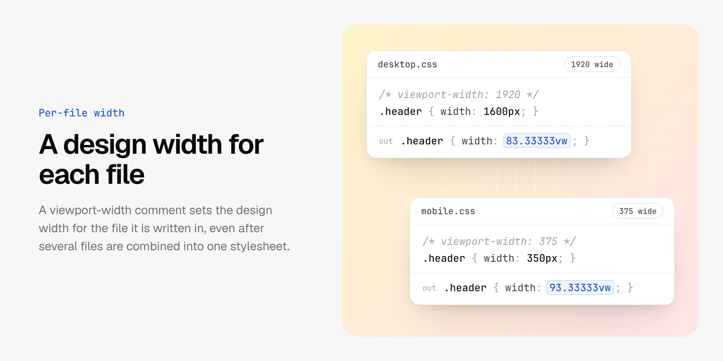
A design width for each file
A comment that starts with viewport-width sets the width for the declarations from the file it is written in, even after several files have been combined into one stylesheet. The width is the first number after the comment text and has to be greater than 0.
/* viewport-width: 1920 */
.header {
  width: 1600px; /* converted to 83.33333vw */
}
/* viewport-width: 375 */
.header {
width: 350px; /* converted to 93.33333vw */
}One build can then produce stylesheets for desktop and mobile, loaded with media queries:
<link rel="stylesheet" href="desktop.css" media="(min-width: 1280px)" />
<link rel="stylesheet" href="mobile.css" media="(max-width: 1279px)" />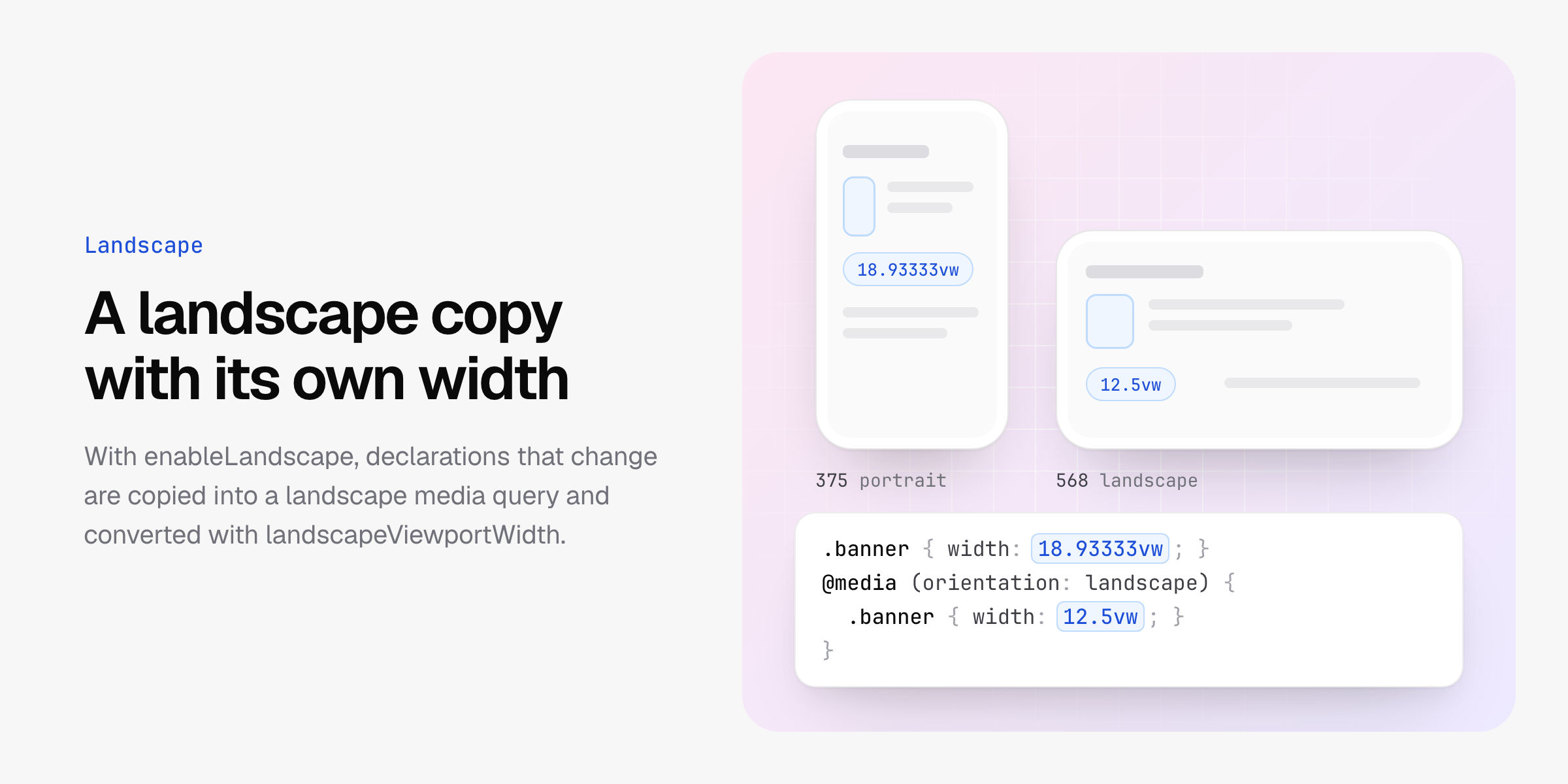
Landscape
With enableLandscape, the declarations that change are copied into a @media (orientation: landscape) block and converted with landscapeUnit and landscapeViewportWidth, which is 568 by default.
/* Input */
.banner {
  width: 71px;
}

/* Output */
.banner {
  width: 18.93333vw;
}
@media (orientation: landscape) {
  .banner {
    width: 12.5vw;
  }
}
Rules written directly in the stylesheet or in @layer blocks are copied, with the rules nested in them kept in place. The block goes at the end of the stylesheet, or at the end of the @layer the rules came from. Rules you write in a landscape media query yourself are converted with the landscape settings when allowMediaQuery is on.
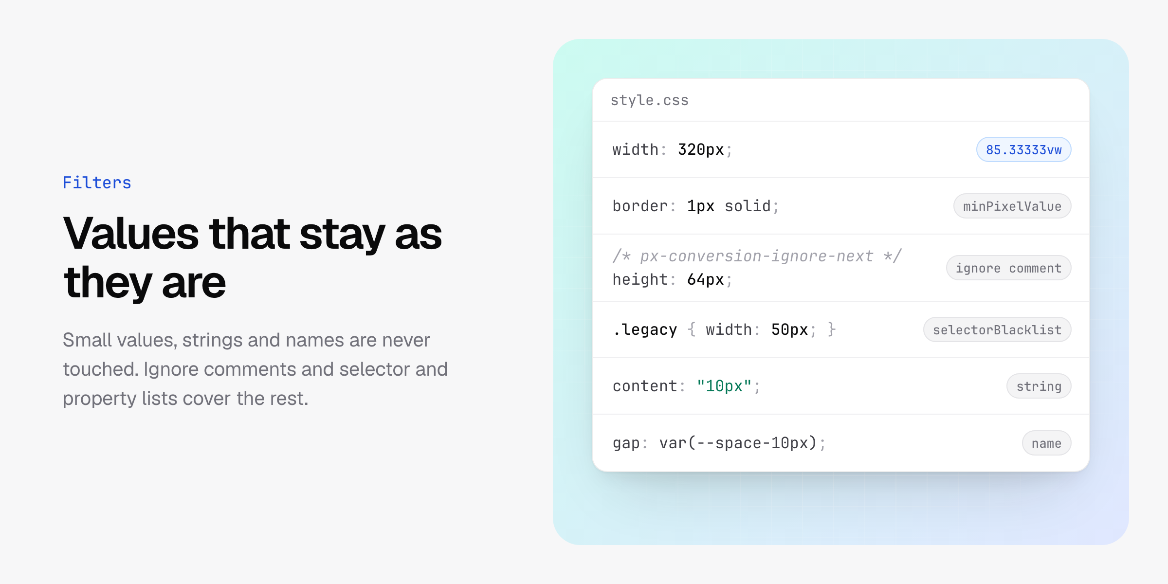
Values that stay as they are
Strings, url() and names that contain a number, such as var(--space-10px), are never converted. Neither are at-rule params such as @media (min-width: 768px), or the descriptors of @page, @property and @font-face.
A px-conversion-ignore-next comment before a declaration, or a px-conversion-ignore-prev comment after it on the same line, keeps that declaration as it is. The comment is removed from the output.
.box {
  /* px-conversion-ignore-next */
  width: 10px;
  height: 10px; /* px-conversion-ignore-prev */
}selectorBlacklist, selectorWhitelist, allowedProperties, excludedProperties, excludeFiles and includeFiles choose which rules, properties and files are converted. Rules inside @media and @container are converted only when allowMediaQuery is on.
Installation
npm install postcss postcss-px-conversion --save-devUsage
Add the plugin to your PostCSS configuration:
// postcss.config.mjs
export default {
  plugins: {
    "postcss-px-conversion": {
      viewportWidth: 375,
    },
  },
};
The plugin can also be imported and called, or passed to PostCSS as it is:
// postcss.config.mjs
import postcssPxConversion from "postcss-px-conversion";

export default {
  plugins: [postcssPxConversion({ viewportWidth: 375 })],
};
Tailwind CSS 4 puts its rules in
@layer, and the plugin converts rules there. Its breakpoints are media queries, so they are converted whenallowMediaQueryis on.
Nuxt
nuxt.config.ts
export default defineNuxtConfig({
  postcss: {
    plugins: {
      "postcss-px-conversion": {
        viewportWidth: 375,
        unitPrecision: 10,
        viewportUnit: "vw",
        minPixelValue: 1,
        includeFiles: [/\/pages\//],
        excludeFiles: [/node_modules/, /pages\/active\/index\.vue/],
      },
    },
  },
});
With this directory structure, the index page is converted and the active page is not:
- package.json
- pages
  - index
    - index.vue
  - active
    - index.vue
rem to px
Sizes in rem follow the font size of the page's <html> element. A UI that renders inside pages you do not control, such as a browser extension's content script UI in a shadow root, can convert rem to px to keep the same size everywhere:
// postcss.config.mjs
import postcssPxConversion from "postcss-px-conversion";

export default {
  plugins: [
    postcssPxConversion({
      unitType: "rem",
      viewportUnit: "px",
      fontViewportUnit: "px",
      minPixelValue: 0,
      allowMediaQuery: true,
    }),
  ],
};
minPixelValue: 0 converts small values such as 0.25rem, and allowMediaQuery: true converts rules inside media queries too, such as Tailwind CSS breakpoints.
Options
| Option | Default | Description |
|---|---|---|
unitType |
"px" |
The unit to convert from. viewportWidth and landscapeViewportWidth are measured in it. |
viewportWidth |
375 |
The width of the design, or a function that returns it for a file and position. Viewport units and rpx use it. |
rootValue |
16 |
How many px one rem is, used to convert rem to px and px to rem. |
unitPrecision |
5 |
The number of decimal places in converted values. |
allowedProperties |
["*"] |
Properties to convert. * matches all, *name*, name* and *name match parts of a property, and a leading ! excludes it. |
excludedProperties |
[] |
Properties never to convert, written like allowedProperties without !. |
viewportUnit |
"vw" |
The unit to convert to. |
fontViewportUnit |
"vw" |
The unit to convert properties whose name contains font to. |
selectorBlacklist |
[] |
Rules whose selector contains one of these strings or matches one of these regular expressions are left alone, together with the rules nested in them. |
selectorWhitelist |
[] |
When not empty, only rules whose own selector, or the selector of a rule around them, matches an entry are converted. |
minPixelValue |
1 |
Values up to this number, in unitType, are not converted. |
allowMediaQuery |
false |
Convert rules inside @media and @container. |
replaceRules |
true |
Replace values in place. When false, the converted declaration is added after the original one. |
excludeFiles |
[] |
Files to leave alone, matched by path with strings or regular expressions. |
includeFiles |
[] |
When not empty, only files whose path matches are converted. |
enableLandscape |
false |
Add a @media (orientation: landscape) block with the values converted by landscapeViewportWidth. |
landscapeUnit |
"vw" |
The unit to convert to in landscape. |
landscapeViewportWidth |
568 |
The width of the design in landscape, or a function like viewportWidth. |
enablePerFileConfig |
true |
Read a width for each file from a comment. |
viewportWidthComment |
"viewport-width" |
The text a per-file width comment starts with. |
An option set to undefined keeps its default. Invalid options throw an error when the plugin is created, and so does a width function that returns 0 or less.
Types are available on the default export, for example postcssPxConversion.Options and postcssPxConversion.ConversionContext.
How values are converted
| Target | Formula | Example, on a 375px design |
|---|---|---|
vw, vh, vmin, vmax and other units |
value / viewportWidth * 100 |
320px becomes 85.33333vw |
rpx |
value / viewportWidth * 750 |
320px becomes 640rpx |
rem, from unitType px |
value / rootValue |
320px becomes 20rem |
px, from unitType rem |
value * rootValue |
1.5rem becomes 24px |
Other conversions to px or rem are not supported, because their size in px is unknown. An unsupported pair, or the same unit on both sides, throws an error when the plugin is created. Results round half up to unitPrecision decimal places, and a result of 0 is written as 0.
The plugin converts numbers in declaration values of style rules, keyframes and @position-try.
Feedback
If you have any questions or issues, please report them on GitHub Issues.