preact-forms-helper v0.7.5
Preact forms helper :first_quarter_moon_with_face: :first_quarter_moon_with_face:
Create and control your forms in your Preact application more easily !
- No dependencies :sparkles:
- Less than 2Ko (when gzipped) :notes:
/!\ DISCLAIMER : Unofficial library - Not linked to the preact team. It's a personal project /!\Preact ? :raising_hand:
Preact is a 'Fast 3kB alternative to React with the same modern API.' : https://preactjs.com/
Note : This project has been tested only in Preact, but it should work in React too.
Methods and validators available :cyclone:
Methods of the form class:
| Method | Description |
|---|---|
| hasErrors('fieldName') | Return true if the given field has at least one error |
| updateValidators(newFormValidatorsJSON) | Update existing validators - form will be re-validate automatically |
| getErrors('fieldName') | Return all the errors associated to the given field |
| isTouched('fieldName') | Return if a field has been modified by an user |
| hasError('fieldName','errorName') | Return true if the given field has the given error |
| getValues() | Return the form values |
| getValue('fieldName') | Return the saved value |
| setValue('fieldName','value', component?) | Update a form value programatically - form will be re-validate automatically |
| isValid() | Return if the form is currently valid |
| isSelected('fieldName','value') | Return true if the current value of the given field is equals the entry value (Useful when dealing with checkboxes and radio buttons) |
Validators
For all input, select and textarea
| Validator | Description |
|---|---|
| Validators.required() | Field is required |
For inputtype=number or inputtype=range
| Validator | Description |
|---|---|
| Validators.minInteger() | Minimal value (border included) |
| Validators.maxInteger() | Maximal value (border included) |
| Validators.between() | Interval (borders included) |
For inputtype=text|url|email, select and textarea
| Validator | Description |
|---|---|
| Validators.minLength() | Minimal length of the text |
| Validators.maxLength() | Maximal length of the text |
| Validators.email() | Check if the input is an email address |
| Validators.url() | Check if the input is a website URL |
| Validators.alpha() | Check if the input contains only letter |
| Validators.alphaDash() | Check if the input contains only letter or underscore |
| Validators.numeric() | Check if the input contains only number |
| Validators.pattern() | Check if the input matches the given regular expression |
Note : for checkboxes or select with multiple, minLength and maxLength use the number of elements selected.
For inputtype=date
| Validator | Description |
|---|---|
| Validators.dateBeforeToday() | The given must be before the today's date (today is not included) => for inputtype=date |
| Validators.dateAfterToday() | The given must be after the today's date (today is not included) => for inputtype=date |
| Validators.dateBefore() | The given must be before the given date (the given date is not included) => for inputtype=date |
| Validators.dateAfter() | The given must be after the given date (the given date is not included) => for inputtype=date |
Quick tutorial :mortar_board:
First, you need to create a new Form class and set it in your component state.
import { Form } from 'preact-forms-helpers';

...
  this.state = {
    form: new Form({
      // Nothing... for now :-)
    }
  }
...
Then we will add a 'firstname' input which we will be required and its size must at least 2 characters. His first value will be 'Alexandre' (left empty for no value)
import { Form, Validators, validateField } from 'preact-forms-helpers';

...
  this.state = {
    form: new Form({
      firstname: { value: 'Alexandre', validators: [Validators.required(), Validators.minLength(2)] }
    }
  }
...
To finish, we create the input field and call the validateField function (with component and form as argument)
import { Form, Validators, validateField } from 'preact-forms-helpers';

...
<input type="text" name="firstname" onInput={validateField(this, form)} />
...
What will happen ? On every input from user, the form will be updated, giving you if :
- The given field has errors :
this.state.form.hasErrors('firstname') - The errors (if any) :
this.state.form.getErrors('firstname') If the field has been modifed :
this.state.form.isTouched('firstname')Then the component will be forceUpdate()Important : The library make the connection between between the form class property and the input by using the input name attribute. As you can see, we got
firstname: { validators: [...] }and<input type="text" name="firstname" />.
If you want to use different name between the property and the input, validateField accepts a third argument :onInput={validateField(this, form, 'myCustomPropertyName')}
To finish, you can check global state of the form by using this.state.form.isValid()
<input disabled={!form.isValid()} type="submit" value="Submit form" />And then get the form values with this.state.form.getValues()
<form onSubmit={e => { e.preventDefault(); console.log(this.state.form.getValues(); }>Specials cases : type="checkbox" and \<select multiple> :eyes:
In this case, an array will be saved. To handle it, you have to add: multiple:true when you instanciate the form class. Exemple:
drink: { validators: [...], multiple: true }
Example application :dolphin:
You can find all use cases above in an example application, available at https://github.com/AlexandreCantin/preact-forms-helper-example
Some screenshots
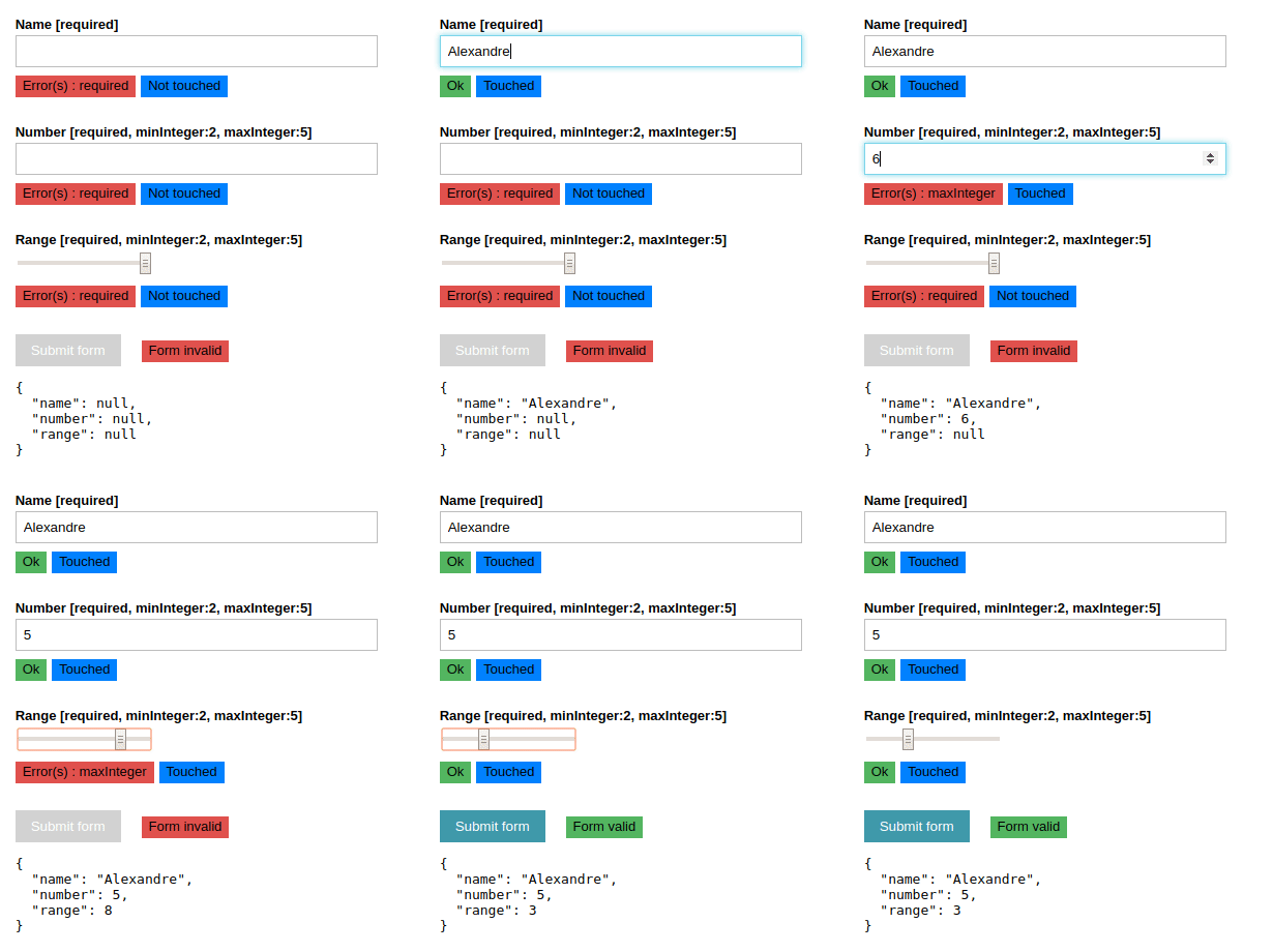
Text and numbers

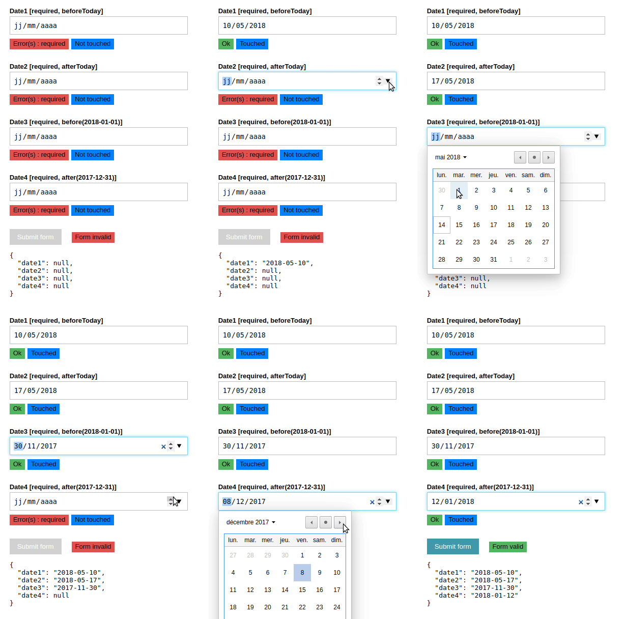
Dates

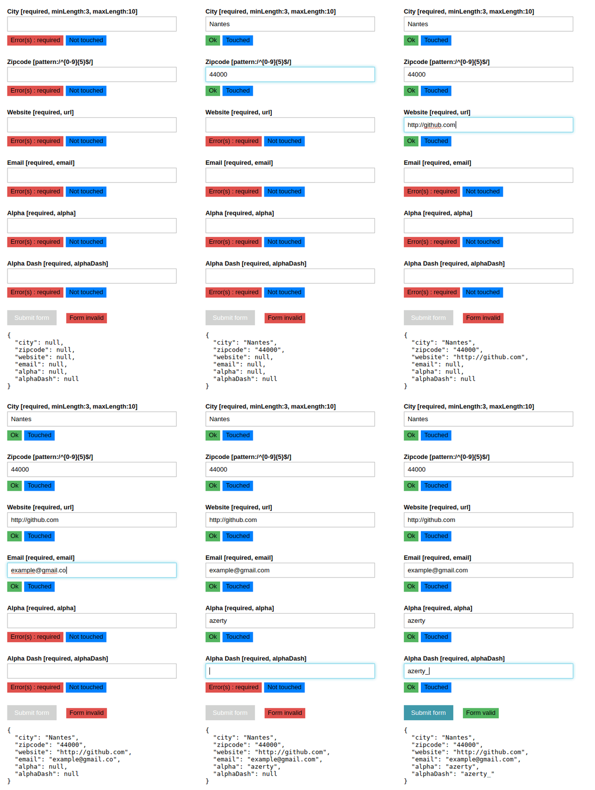
E-mail, zipcode, website and text

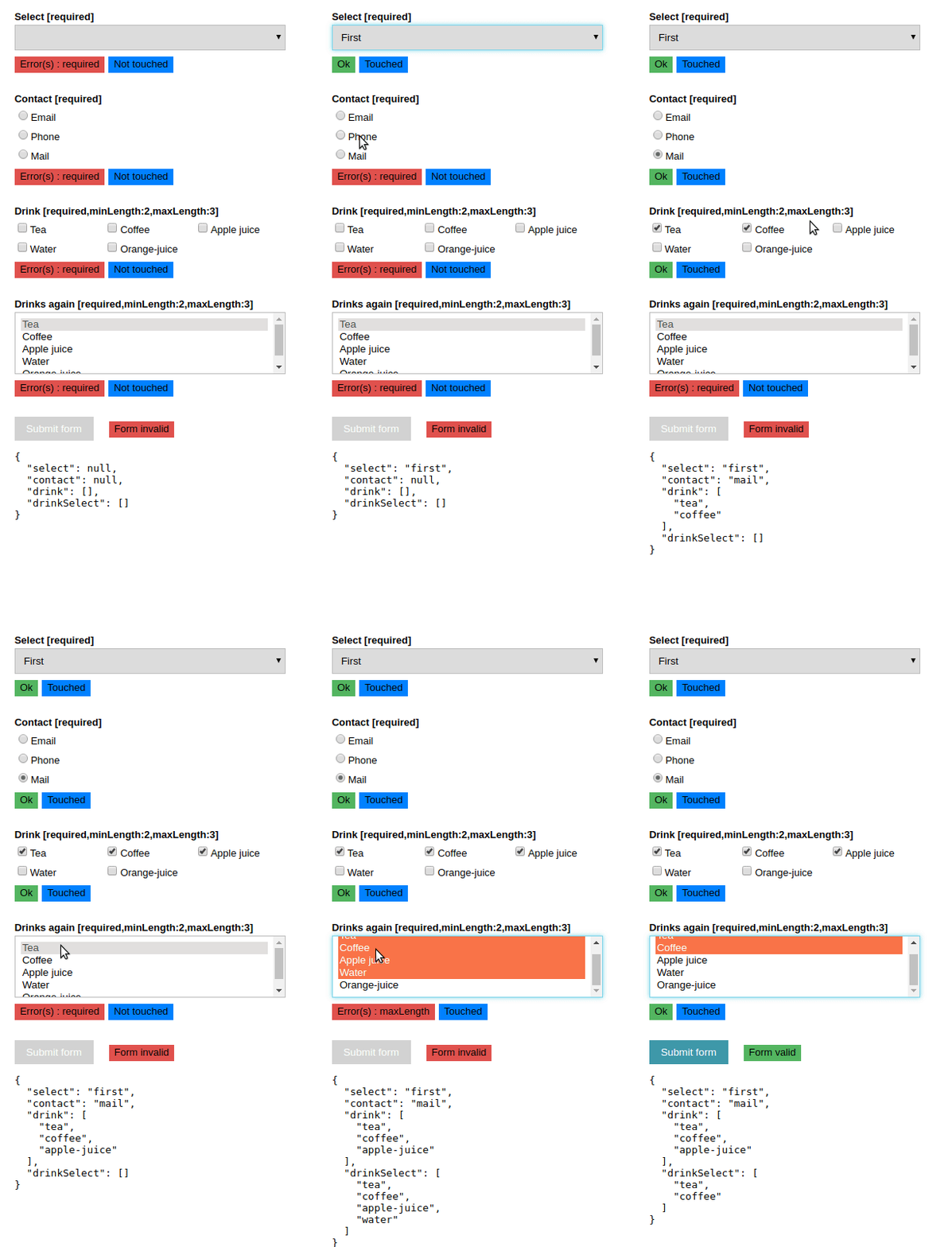
Select, radio, checkbox and select.multiple

Roadmap :zap:
- Reduce bundle size by merging some behavior
- Find a better than forceUpdate() the component
- Export validation in his own Web Worker