progress-ring-component v1.0.36
Progress Ring Component
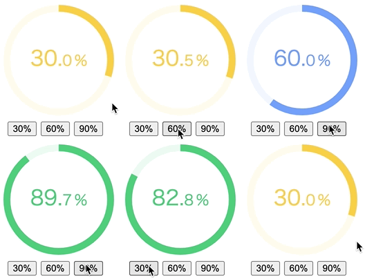
This is an animated web component showing progress in percentage. It internally uses easing-animation-frames library to create CPU-friendly easing animations and compiled with Stencil.
How to use

<progress-ring percentage="30"></progress-ring>
<progress-ring percentage="60" round-linecap="true"></progress-ring>
<progress-ring percentage="90" disable-digits="true">
  <p class="completed-count">9/10<br />Complete</p>
</progress-ring>
There is only one mandatory property, percentage, which declares the ending percentage in animation. You can also use radius prop to change the size of the ring, and storkeWidth to change the thickness of the ring. The full list of properties can be found below.
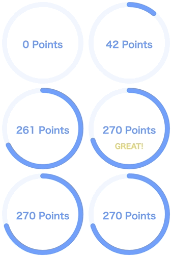
You can also place custom HTML elements within the component's <progress-ring></<progress-ring> tag as HTMLSlotElement, which you have full control on for styling.
This component works reactively in a unidirectional fashion. When the percentage changes, it stops the current animation and resumes it with new percentage. There is pre-defined color scheme (red (< 25%) -> yellow (< 50%) -> blue (< 75%) -> green (>= 75%)).

<progress-ring percentage="10"></progress-ring>

<div class="buttons">
  <button id="buttonOne">30%</button>
  <button id="buttonTwo">60%</button>
  <button id="buttonThree">90%</button>
</div>

<script>
  const ring = document.querySelector("progress-ring");
  const buttonOne = document.querySelector("#buttonOne");
  const buttonTwo = document.querySelector("#buttonTwo");
  const buttonThree = document.querySelector("#buttonThree");

  buttonOne.addEventListener("click", () => {
    ring.setAttribute("percentage", 30);
  });
  buttonTwo.addEventListener("click", () => {
    ring.setAttribute("percentage", 60);
  });
  buttonThree.addEventListener("click", () => {
    ring.setAttribute("percentage", 90);
  });
</script>
Properties
| Property | Type | Default | Description |
|---|---|---|---|
| percentage | number | 0 | Percentage value (mandatory) |
| radius | number | 80 | Radius of the ring |
| stroke-width | number | 10 | Thickness of the ring |
| round-linecap | boolean | false | Addes rounded linecap to the ring |
| duration | number | 4000 | Animation duration in miliseconds |
| easing-type | string | "quartInOut" | Easing animation function name |
| int-size | number | 30 | Font size of integer |
| decimal-size | number | intSize * 0.7 | Font size of decimals |
| disable-digits | boolean | false | Hides digits |
| disable-decimals | boolean | false | Hides decimal places |
| colors | string | '[[0,"#ff4f40"],[25, "#ffcd40"],[50, "#66a0ff"],[75, "#30bf7a"]]' | Color steps with percentage and color code |
| invert-colors | boolean | false | Inverts the color scheme |
| event-id | string | undefined | Event Id to be used for animation callbacks |
Easing Types
Easing Types refer to Robert Penner's Easing Function names: backInOut, backIn, backOut, bounceInOut, bounceIn, bounceOut, circInOut, circIn, circOut, cubicInOut, cubicIn, cubicOut, elasticInOut, elasticIn, elasticOut, expoInOut, expoIn, expoOut, linear, quadInOut, quadIn, quadOut, quartInOut, quartIn, quartOut, quintInOut, quintIn, quintOut, sineInOut, sineIn and sineOut.
Advanced usage with animation events
By passing even-id as a prop, you can listen to events emitted by with the animation, and register callback functions for them. Please see Demo 3.

| Event Name | Payload | Description |
|---|---|---|
| prcProgress | { id: string, progress: number, percentage: number } | Event to be emitted on every progress change (from 0 to 1) |
| prcColor | { id: string, color: string } | Event to be emitted for the color value |
| prcStart | { id: string } | Event to be emitted when the animation starts |
| prcComplete | { id: string } | Event to be emitted when the animation is completed |
| prcStop | { id: string } | Event to be emitted when the animation is stopped |
| prcResume | { id: string } | Event to be emitted when the animation is resumed |
| prcRestart | { id: string } | Event to be emitted when the animation is restarted |
You can either directly import the component in script tag or integrate it into the framework you're using for the project.
How to load in your project
Simply place a script tag <script type="module" src="https://unpkg.com/progress-ring-component/dist/progressring/progressring.esm.js"></script> in the head of your index.html.
<!DOCTYPE html>
<html>
  <head>
    <script
      type="module"
      src="https://unpkg.com/progress-ring-component@1.0.36/dist/progressring/progressring.esm.js"
    ></script>
  </head>
  <body>
    <progress-ring percentage="50"></progress-ring>
  </body>
</html>
If you're using Typescript, you may need additional types. The example below is a React component.
import { JSX as LocalJSX } from "progress-ring-component/loader";
import { HTMLAttributes } from "react";

type StencilToReact<T> = {
  [P in keyof T]?: T[P] &
    Omit<HTMLAttributes<Element>, "className"> & {
      class?: string;
    };
};

declare global {
  export namespace JSX {
    interface IntrinsicElements
      extends StencilToReact<LocalJSX.IntrinsicElements> {}
  }
}

function App() {
  return (
    <div>
      <progress-ring percentage={30}></progress-ring>
    </div>
  );
}

export default App;2 years ago
2 years ago
4 years ago
4 years ago
4 years ago
4 years ago
4 years ago
4 years ago
4 years ago
4 years ago
4 years ago
4 years ago
4 years ago
4 years ago
4 years ago
4 years ago
4 years ago
4 years ago
4 years ago
4 years ago
4 years ago
4 years ago
4 years ago
4 years ago
4 years ago
4 years ago
4 years ago
4 years ago
4 years ago
5 years ago
5 years ago
6 years ago
7 years ago
7 years ago
7 years ago
7 years ago
7 years ago
7 years ago
7 years ago
7 years ago
7 years ago
7 years ago
7 years ago
7 years ago
7 years ago
7 years ago
7 years ago
7 years ago

