progressbar-circle v1.0.1
Progress-Circle:
What is it?
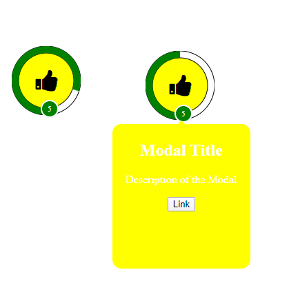
Progress-Circle is a custom web component that wraps a progress bar around an Icon of your choosing. When you click on this HTML element it will display a modal that you can customize. Click on it again and the modal will disppear. There is an image of it below.

How to use it?
It is quite easy to use it on your webpage. Just follow the below steps: 1. Include the icon link in your header. For example if you are using Font Awesome 4 it would be
<link rel="stylesheet" href="https://cdnjs.cloudflare.com/ajax/libs/font-awesome/4.7.0/css/font-awesome.min.css">Include the link to the script file that holds the this custom web component (progress-circle.js) near the bottom of the body section of your webpage. See below
<script src="./progresscircle.js"></script>3) Then use the custom element tags on your webpage.
<progress-circle>Test</progres-circle>That is all you have to do to use this custom element. There is an example HTML page (progress-circle.html) that shows how to use it.
    <!DOCTYPE html>
	<html>
	  <head>
		<!-- You must link in the file that holds the icon type that you are using like I did below -->
		<link rel="stylesheet" href="https://cdnjs.cloudflare.com/ajax/libs/font-awesome/4.7.0/css/font-awesome.min.css">
		<title>Progress Circle</title>
	  </head>
	  <body>

		<h1 style="text-align: center;">This is a test of the progress-circle component</h1>

		<progress-circle total="10" current="5" badgetext="5" bgcolor="yellow" progresscolor="green" icontype="fa fa-thumbs-up" modaltitle="Modal Title" >
			<p>Description of the Modal</p>
			<button type="button">Link</button>
		</progress-circle>

		<!-- You must include the line below as it holds the code of this custom element -->
		<script src="./progresscircle.js"></script>

	  </body>
	</html>
There are 8 properties (7 attributes and the innerHTML) that you can use to customize this element.
- total - Is the total number of section for the progressbar. The max number
- current - Is the current status of the progressbar thus if it's set to 4 and total to 10 then the progress bar would be 40% filled
- badgetext - Is the text that will appear in the badge. The bottom circle.
- bgcolor - Will be the background color of the progress-circle element and the modal that will appear if you click on it
- progresscolor - Will be the color of the progressbar and the badge
- icontype - the class name of the icon you want to appear on this element. Note must link in the icon like I did above
- modaltitle - Will be the title of the modal that will appear if you click on the element. IF you click on the element when the modal is visible it will make it disappear.
- The HTML that is between the this element tag will be the body of the modal.
Note: That each of these attributes have defaults values but you should at less set icontype, total, current, Modal Title, and Modal Body
6 years ago