prompt-view v1.0.0
PromptView
Lightweight dialogue component for prompting user input.

Usage
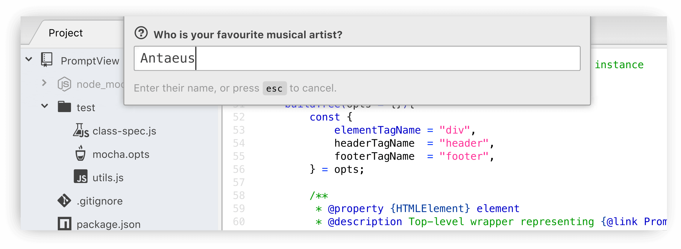
The component was designed to match the look-and-feel of Atom's usual modal dialogues
(such as those used by its go-to-line and fuzzy-finder packages).
const PromptView = require("prompt-view");

let view = new PromptView();
let answer = await view.promptUser({
	headerText: "What's your favourite movie?",
	footerText: "Enter a name or YouTube URL",
});
The same PromptView can be used multiple times, even if messages differ.
Package authors need not create more than one PromptView throughout their
package's lifecycle:
answer = await view.promptUser({
	headerText: "What's your second favourite movie?",
	footerText: `You answered "${answer}" last time.`,
});
Properties may be set during construction, or set at the time the user is prompted for input:
view = new PromptView({headerHTML: "<b>Enter something:</b>"});
view.promptView().then(reply => …);

// Same as:
view = new PromptView();
view.promptView({headerHTML: "<b>Enter something:</b>"});
Browsers
Although this component was written with Atom projects in mind, it works in ordinary browser environments too, with the following caveats:
No styling is applied; authors must provide this in their own stylesheets.
The
hiddenattribute is used to control visibility, unless the container element is a<dialog>element.Newly-created
PromptViewobjects are appended to the page's<body>node. Authors should move this somewhere more suitable if a different location in the DOM is required.
Instance properties
The full list of supported properties are:
| Name | Type | Default | Description |
|---|---|---|---|
| autoFocus | Boolean | true | Set and restore focus when toggling prompt. |
| autoHide | Boolean | true | Hide the prompt upon losing focus. |
| element | HTMLElement | Top-level wrapper representing the PromptView in Atom's workspace. | |
| elementClass | String | "prompt" | Space-separated list of CSS classes assigned to the instance's element. |
| elementTagName | String | "div" | Name of the HTML tag used to create element. This property can only be set during construction, using the original option-hash passed to the constructor function. |
| footerClass | String | "prompt-footer" | Space-separated list of CSS classes assigned to instance's footer. |
| footerElement | HTMLElement | Content block displayed below inputField, empty unless headerText or headerHTML have been set. | |
| footerHTML | String | "" | HTML representation of the footerElement's contents. |
| footerTagName | String | "footer" | Name of the HTML tag used to create footerElement. This property can only be set during construction using the original option-hash passed to the constructor function. |
| footerText | String | "" | A plain-text representation of the footerElement's content. |
| headerClass | String | "prompt-header" | Space-separated list of CSS classes assigned to instance's headerElement. |
| headerElement | HTMLElement | Content block displayed above inputField, empty unless headerText or headerHTML have been set. | |
| headerHTML | String | "" | HTML representation of the headerElement's content. |
| headerTagName | String | "header" | Name of the HTML tag used to create headerElement. This property can only be set during construction, using the original option-hash passed to the constructor function. |
| headerText | String | "" | A plain-text representation of the headerElement's content. |
| input | String | "" | Text currently entered into the instance's inputField. Writing to this property will replace whatever text has been entered in the field. |
| inputField | TextEditor, HTMLFormElement | Miniature editing bar where user types their input. | |
| isPending | Boolean | false | Whether the view is waiting for user to confirm their input. |
| placeholder | String | "" | Placeholder text displayed by inputField when empty. |
8 years ago