properties-panel
Properties-Panel
import React, { useState } from 'react';
import Panel from 'properties-panel/lib/Panel';
import Subsection from 'properties-panel/lib/groupings/Subsection';
import InlineInput from 'properties-panel/lib/inputs/InlineInput';
import ColourPicker from 'properties-panel/lib/inputs/ColourPicker';
import GradientPicker from 'properties-panel/lib/inputs/GradientPicker';
import Group from 'properties-panel/lib/groupings/Group';
import Tabs from 'properties-panel/lib/groupings/Tabs';
import 'properties-panel/lib/styles/sliders.css'
function App() {
const [properties, setProperties] = useState()
return (
<>
<div style={{ position: "absolute", width: "400px", height: "100%" }}>
<Panel SetValue={(props) => { setProperties(props) }} value={properties}>
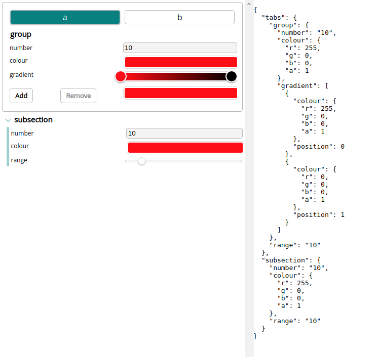
<Tabs name="tabs" tabs={[{ title: "a" }, { title: "b" }]} >
<Group name="group">
<InlineInput name="number" input={{ type: "number" }} default="10" />
<ColourPicker name="colour" default={{ r: 255, g: 0, b: 0, a: 1 }} />
<GradientPicker name="gradient" default={[{ colour: { r: 255, g: 0, b: 0, a: 1 }, position: 0 }, { colour: { r: 0, g: 0, b: 0, a: 1 }, position: 1 }]} />
</Group>
<InlineInput name="range" input={{ type: "range", className: "slider" }} default="10" />
</Tabs>
<Subsection name="subsection">
<InlineInput name="number" input={{ type: "number" }} default="10" />
<ColourPicker name="colour" default={{ r: 255, g: 0, b: 0, a: 1 }} />
<InlineInput name="range" input={{ type: "range", className: "slider" }} default="10" />
</Subsection>
</Panel>
</div>
<pre style={{ position: "absolute", left: "400px", height: "100%" }}>{JSON.stringify(properties, null, 2)}</pre>
</>
);
}
export default App;WARNING - this project is work in progress, and thus subject to changes and not working
Get it https://www.npmjs.com/package/properties-panel
npm i properties-panel
Properties Panel is a simple tool for creating powerful... property panels. The JSX is used to define a JSON object and a user interface that can be used to drive your app.
Inputs
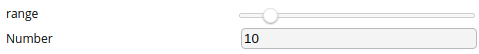
Inline Input
Inline Input is the most basic section. It is a wrapping of <input> for the properties-panel system
nameThe name of the property in the JSON objectdefaultThe default value of the inputinputprops passed on to the<Input>component- Optional
titleThe name that is displayed in the user interface. Defaults to name if not provided
import React, { useState } from 'react';
import Panel from 'properties-panel/lib/Panel';
import InlineInput from 'properties-panel/lib/inputs/InlineInput';
import 'properties-panel/lib/styles/sliders.css'

function App() {
  const [properties, setProperties] = useState()
  return (
    <>
      <div style={{ position: "absolute", width: "400px", height: "100%" }}>
        <Panel SetValue={(props) => { setProperties(props) }} value={properties}>
          <InlineInput name="range" input={{ type: "range", className: "slider" }} default="10" />
          <InlineInput title="Number" name="number" input={{ type: "number" }} default="10" />
        </Panel>
      </div>
      <pre style={{ position: "absolute", left: "400px", height: "100%" }}>{JSON.stringify(properties, null, 2)}</pre>
    </>
  );
}
export default App;
{
"range": "10",
"number": "10"
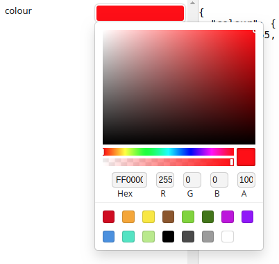
}Colour Picker
The colour picker I used is the sketch one https://casesandberg.github.io/react-color/
Colour picker lets the user select a colour easily
defaultThe default value of the input. Must be a colour.nameThe name of the property in the JSON object- Optional
titleThe name that is displayed in the user interface. Defaults to name if not provided
import React, { useState } from 'react';
import Panel from 'properties-panel/lib/Panel';
import ColourPicker from 'properties-panel/lib/inputs/ColourPicker';
import 'properties-panel/lib/styles/sliders.css'

function App() {
  const [properties, setProperties] = useState()
  return (
    <>
      <div style={{ position: "absolute", width: "400px", height: "100%" }}>
        <Panel SetValue={(props) => { setProperties(props) }} value={properties}>
          <ColourPicker name="colour" default={{ r: 255, g: 0, b: 0, a: 1 }} />
        </Panel>
      </div>
      <pre style={{ position: "absolute", left: "400px", height: "100%" }}>{JSON.stringify(properties, null, 2)}</pre>
    </>
  );
}
export default App;
{
"colour": {
"r": 255,
"g": 0,
"b": 0,
"a": 1
}
}
Gradient Picker
Gradient Picker lets the user create a linear gradient
defaultThe default value of the input. Must be an array of objects containing both colour and position.nameThe name of the property in the JSON object- Optional
titleThe name that is displayed in the user interface. Defaults to name if not provided
import React, { useState } from 'react';
import Panel from 'properties-panel/lib/Panel';
import GradientPicker from 'properties-panel/lib/inputs/GradientPicker';
import 'properties-panel/lib/styles/sliders.css'

function App() {
  const [properties, setProperties] = useState()
  return (
    <>
      <div style={{ position: "absolute", width: "400px", height: "100%" }}>
        <Panel SetValue={(props) => { setProperties(props) }} value={properties}>
          <GradientPicker name="gradient" default={
            [
              { colour: { r: 255, g: 0, b: 0, a: 1 }, position: 0 },
              { colour: { r: 0, g: 0, b: 0, a: 1 }, position: 1 }
            ]} />
        </Panel>
      </div>
      <pre style={{ position: "absolute", left: "400px", height: "100%" }}>{JSON.stringify(properties, null, 2)}</pre>
    </>
  );
}
export default App;

{
   "gradient": [
      {
        "colour": {
          "r": 255,
          "g": 0,
          "b": 0,
          "a": 1
        },
        "position": 0
      },
      {
        "colour": {
          "r": 0,
          "g": 0,
          "b": 0,
          "a": 1
        },
        "position": 1
      }
    ]
}
Groupings
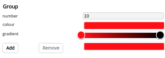
Group
A group is a container for multiple sections. This is use-full for grouping properties of a similar nature together.
nameThe name of the sub-object in the JSON object- Optional
titleThe name that is displayed in the user interface. Defaults to name if not provided - Children Any number of groupings or sections can be contained by a Group
import React, { useState } from 'react';
import Panel from 'properties-panel/lib/Panel';
import InlineInput from 'properties-panel/lib/inputs/InlineInput';
import ColourPicker from 'properties-panel/lib/inputs/ColourPicker';
import GradientPicker from 'properties-panel/lib/inputs/GradientPicker';
import Group from 'properties-panel/lib/groupings/Group';
import 'properties-panel/lib/styles/sliders.css'

function App() {
  const [properties, setProperties] = useState()
  return (
    <>
      <div style={{ position: "absolute", width: "400px", height: "100%" }}>
        <Panel SetValue={(props) => { setProperties(props) }} value={properties}>
          <Group title="Group" name="group">
            <InlineInput name="number" input={{ type: "number" }} default="10" />
            <ColourPicker name="colour" default={{ r: 255, g: 0, b: 0, a: 1 }} />
            <GradientPicker name="gradient" default={[{ colour: { r: 255, g: 0, b: 0, a: 1 }, position: 0 }, { colour: { r: 0, g: 0, b: 0, a: 1 }, position: 1 }]} />
          </Group>
        </Panel>
      </div>
      <pre style={{ position: "absolute", left: "400px", height: "100%" }}>{JSON.stringify(properties, null, 2)}</pre>
    </>
  );
}
export default App;
{
"group": {
"number": "10",
"colour": {
"r": 255,
"g": 0,
"b": 0,
"a": 1
},
"gradient": [
{
"colour": {
"r": 255,
"g": 0,
"b": 0,
"a": 1
},
"position": 0
},
{
"colour": {
"r": 0,
"g": 0,
"b": 0,
"a": 1
},
"position": 1
}
]
}
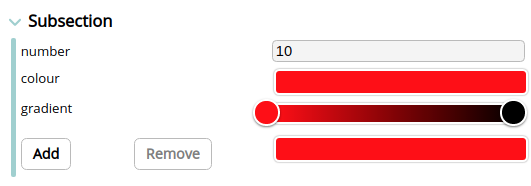
}Subsection
A subsection is similar to a group except it can be expanded and hidden.
nameThe name of the sub-object in the JSON object- Optional
titleThe name that is displayed in the user interface. Defaults to name if not provided - Children Any number of groupings or sections can be contained by a subsection
import React, { useState } from 'react';
import Panel from 'properties-panel/lib/Panel';
import Subsection from 'properties-panel/lib/groupings/Subsection';
import InlineInput from 'properties-panel/lib/inputs/InlineInput';
import ColourPicker from 'properties-panel/lib/inputs/ColourPicker';
import GradientPicker from 'properties-panel/lib/inputs/GradientPicker';
import 'properties-panel/lib/styles/sliders.css'


function App() {
  const [properties, setProperties] = useState()
  return (
    <>
      <div style={{ position: "absolute", width: "400px", height: "100%" }}>
        <Panel SetValue={(props) => { setProperties(props) }} value={properties}>
          <Subsection title="Subsection" name="subsection">
            <InlineInput name="number" input={{ type: "number" }} default="10" />
            <ColourPicker name="colour" default={{ r: 255, g: 0, b: 0, a: 1 }} />
            <GradientPicker name="gradient" default={[{ colour: { r: 255, g: 0, b: 0, a: 1 }, position: 0 }, { colour: { r: 0, g: 0, b: 0, a: 1 }, position: 1 }]} />
          </Subsection>
        </Panel>
      </div>
      <pre style={{ position: "absolute", left: "400px", height: "100%" }}>{JSON.stringify(properties, null, 2)}</pre>
    </>
  );
}
export default App;
{
"subsection": {
"number": "10",
"colour": {
"r": 255,
"g": 0,
"b": 0,
"a": 1
},
"gradient": [
{
"colour": {
"r": 255,
"g": 0,
"b": 0,
"a": 1
},
"position": 0
},
{
"colour": {
"r": 0,
"g": 0,
"b": 0,
"a": 1
},
"position": 1
}
]
}
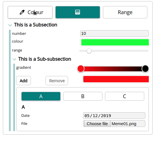
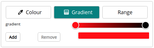
}Tabs
Tabs are another way to group sections together.
nameThe name of the sub-object in the JSON objecttabsAn array of objects that define how each tab looks. Each tab has a title and/or a link to an icon.- Children The same number of tabs of groupings or sections can be contained in a tab. It is common to use a group if the tab needs more than one section.
import React, { useState } from 'react';
import Panel from 'properties-panel/lib/Panel';
import InlineInput from 'properties-panel/lib/inputs/InlineInput';
import ColourPicker from 'properties-panel/lib/inputs/ColourPicker';
import GradientPicker from 'properties-panel/lib/inputs/GradientPicker';
import Tabs from 'properties-panel/lib/groupings/Tabs';
import 'properties-panel/lib/styles/sliders.css'


function App() {
  const [properties, setProperties] = useState()
  return (
    <>
      <div style={{ position: "absolute", width: "400px", height: "100%" }}>
        <Panel SetValue={(props) => { setProperties(props) }} value={properties}>
          <Tabs name="tabs" tabs={[
            { title: "Colour", icon: "https://fonts.gstatic.com/s/i/materialicons/colorize/v1/24px.svg?download=true" },
            { icon: "https://fonts.gstatic.com/s/i/materialicons/gradient/v1/24px.svg?download=true" },
            { title: "Range" }]}>
            <ColourPicker name="colour" default={{ r: 255, g: 0, b: 0, a: 1 }} />
            <GradientPicker name="gradient" default={[
              { colour: { r: 255, g: 0, b: 0, a: 1 }, position: 0 },
              { colour: { r: 0, g: 0, b: 0, a: 1 }, position: 1 }]} />
            <InlineInput name="range" input={{ type: "range", className: "slider" }} default="10" />
          </Tabs>
        </Panel>
      </div>
      <pre style={{ position: "absolute", left: "400px", height: "100%" }}>{JSON.stringify(properties, null, 2)}</pre>
    </>
  );
}
export default App;
{
  "tabs": {
    "colour": {
      "r": 255,
      "g": 0,
      "b": 0,
      "a": 1
    },
    "gradient": [
      {
        "colour": {
          "r": 255,
          "g": 0,
          "b": 0,
          "a": 1
        },
        "position": 0
      },
      {
        "colour": {
          "r": 0,
          "g": 0,
          "b": 0,
          "a": 1
        },
        "position": 1
      }
    ],
    "range": "10"
  }
}