qqjfdjkfdsjkfkdsjfksjpickr v1.2.1
Features
- Themes
- Simple usage
- Zero dependencies
- Multiple color representations
- Color comparison
- Opacity control
- Detail adjustments via. mouse-wheel
- Responsive and auto-positioning
- Supports touch devices
- Swatches for quick-selection
- Shadow-dom support
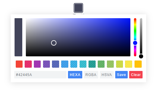
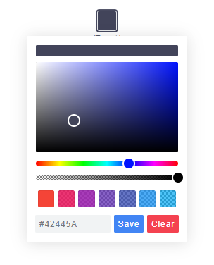
Themes
| Classic | Monolith | Nano |
|---|---|---|
 |  |  |
Nano uses css-grid thus it won't work in older browsers.
Getting Started
Node
Note: The readme is always up-to-date with the latest commit. See Releases for installation instructions regarding to the latest version.
Install via npm:
$ npm install @simonwep/pickrInstall via yarn:
$ yarn add @simonwep/pickrInclude code and style:
// One of the following themes
import '/node_modules/@simonwep/pickr/dist/themes/classic.min.css';   // 'classic' theme
import '/node_modules/@simonwep/pickr/dist/themes/monolith.min.css';  // 'monolith' theme
import '/node_modules/@simonwep/pickr/dist/themes/nano.min.css';      // 'nano' theme

// Modern or es5 bundle
import Pickr from '/node_modules/@simonwep/pickr/dist/pickr.min';
import Pickr from '/node_modules/@simonwep/pickr/dist/pickr.es5.min';
Browser
jsdelivr:
<!-- One of the following themes -->
<link rel="stylesheet" href="https://cdn.jsdelivr.net/npm/@simonwep/pickr/dist/themes/classic.min.css"/> <!-- 'classic' theme -->
<link rel="stylesheet" href="https://cdn.jsdelivr.net/npm/@simonwep/pickr/dist/themes/monolith.min.css"/> <!-- 'monolith' theme -->
<link rel="stylesheet" href="https://cdn.jsdelivr.net/npm/@simonwep/pickr/dist/themes/nano.min.css"/> <!-- 'nano' theme -->

<!-- Modern or es5 bundle -->
<script src="https://cdn.jsdelivr.net/npm/@simonwep/pickr/dist/pickr.min.js"></script>
<script src="https://cdn.jsdelivr.net/npm/@simonwep/pickr/dist/pickr.es5.min.js"></script>
Be sure to load the pickr.min.js (or the es5 version) after pickr.min.css. Moreover the script tag doesn't work with the defer attribute.
Usage
// Simple example, see optional options for more configuration.
const pickr = Pickr.create({
    el: '.color-picker',
    theme: 'classic', // or 'monolith', or 'nano'

    swatches: [
        'rgba(244, 67, 54, 1)',
        'rgba(233, 30, 99, 0.95)',
        'rgba(156, 39, 176, 0.9)',
        'rgba(103, 58, 183, 0.85)',
        'rgba(63, 81, 181, 0.8)',
        'rgba(33, 150, 243, 0.75)',
        'rgba(3, 169, 244, 0.7)',
        'rgba(0, 188, 212, 0.7)',
        'rgba(0, 150, 136, 0.75)',
        'rgba(76, 175, 80, 0.8)',
        'rgba(139, 195, 74, 0.85)',
        'rgba(205, 220, 57, 0.9)',
        'rgba(255, 235, 59, 0.95)',
        'rgba(255, 193, 7, 1)'
    ],

    components: {

        // Main components
        preview: true,
        opacity: true,
        hue: true,

        // Input / output Options
        interaction: {
            hex: true,
            rgba: true,
            hsla: true,
            hsva: true,
            cmyk: true,
            input: true,
            clear: true,
            save: true
        }
    }
});
Events
Since version 0.4.x Pickr is event-driven. Use the on(event, cb) and off(event, cb) functions to bind / unbind eventlistener.
| Event | Description | Arguments |
|---|---|---|
init | Initialization done - pickr can be used | PickrInstance |
save | User clicked the save / clear button | HSVaColorObject \| null, PickrInstance |
change | Color has changed (but not saved). Also fired on swatchselect | HSVaColorObject, PickrInstance |
swatchselect | User clicked one of the swatches | HSVaColorObject, PickrInstance |
Example:
pickr.on('init', instance => {
    console.log('init', instance);
}).on('save', (color, instance) => {
    console.log('save', color, instance);
}).on('change', (color, instance) => {
    console.log('change', color, instance);
}).on('swatchselect', (color, instance) => {
    console.log('swatchselect', color, instance);
});
Options
const pickr = new Pickr({

    // Selector or element which will be replaced with the actual color-picker.
    // Can be a HTMLElement.
    el: '.color-picker',

    // Which theme you want to use. Can be 'classic', 'monolith' or 'nano'
    theme: 'classic',

    // Nested scrolling is currently not supported and as this would be really sophisticated to add this
    // it's easier to set this to true which will hide pickr if the user scrolls the area behind it.
    closeOnScroll: false,

    // Custom class which gets added to the pcr-app. Can be used to apply custom styles.
    appClass: 'custom-class',

    // Don't replace 'el' Element with the pickr-button, instead use 'el' as a button.
    // If true, appendToBody will also be automatically true.
    useAsButton: false,

    // If true pickr won't be floating, and instead will append after the in el resolved element.
    // Setting this to true will also set showAlways to true. It's possible to hide it via .hide() anyway.
    inline: false,

    // If true, pickr will be repositioned automatically on page scroll or window resize.
    // Can be set to false to make custom positioning easier.
    autoReposition: true,

    // Defines the direction in which the knobs of hue and opacity can be moved.
    // 'v' => opacity- and hue-slider can both only moved vertically.
    // 'hv' => opacity-slider can be moved horizontally and hue-slider vertically.
    // Can be used to apply custom layouts
    sliders: 'v',

    // Start state. If true 'disabled' will be added to the button's classlist.
    disabled: false,

    // If true, the user won't be able to adjust any opacity.
    // Opacity will be locked at 1 and the opacity slider will be removed.
    // The HSVaColor object also doesn't contain an alpha, so the toString() methods just
    // print HSV, HSL, RGB, HEX, etc.
    lockOpacity: false,

    // Precision of output string (only effective if components.interaction.input is true)
    outputPrecision: 0,

    // If set to false it would directly apply the selected color on the button and preview.
    comparison: true,

    // Default color
    default: 'fff',

    // Optional color swatches. When null, swatches are disabled.
    // Types are all those which can be produced by pickr e.g. hex(a), hsv(a), hsl(a), rgb(a), cmyk, and also CSS color names like 'magenta'.
    // Example: swatches: ['#F44336', '#E91E63', '#9C27B0', '#673AB7'],
    swatches: null,

    // Default color representation of the input/output textbox.
    // Valid options are `HEX`, `RGBA`, `HSVA`, `HSLA` and `CMYK`.
    defaultRepresentation: 'HEX',

    // Option to keep the color picker always visible.
    // You can still hide / show it via 'pickr.hide()' and 'pickr.show()'.
    // The save button keeps its functionality, so still fires the onSave event when clicked.
    showAlways: false,

    // Close pickr with a keypress.
    // Default is 'Escape'. Can be the event key or code.
    // (see: https://developer.mozilla.org/en-US/docs/Web/API/KeyboardEvent/key)
    closeWithKey: 'Escape',

    // Defines the position of the color-picker.
    // Any combinations of top, left, bottom or right with one of these optional modifiers: start, middle, end
    // Examples: top-start / right-end
    // If clipping occurs, the color picker will automatically choose its position.
    position: 'bottom-middle',

    // Enables the ability to change numbers in an input field with the scroll-wheel.
    // To use it set the cursor on a position where a number is and scroll, use ctrl to make steps of five
    adjustableNumbers: true,

    // Show or hide specific components.
    // By default only the palette (and the save button) is visible.
    components: {

        // Defines if the palette itself should be visible.
        // Will be overwritten with true if preview, opacity or hue are true
        palette: true,

        preview: true, // Display comparison between previous state and new color
        opacity: true, // Display opacity slider
        hue: true,     // Display hue slider

        // show or hide components on the bottom interaction bar.
        interaction: {
            hex: false,  // Display 'input/output format as hex' button  (hexadecimal representation of the rgba value)
            rgba: false, // Display 'input/output format as rgba' button (red green blue and alpha)
            hsla: false, // Display 'input/output format as hsla' button (hue saturation lightness and alpha)
            hsva: false, // Display 'input/output format as hsva' button (hue saturation value and alpha)
            cmyk: false, // Display 'input/output format as cmyk' button (cyan mangenta yellow key )

            input: false, // Display input/output textbox which shows the selected color value.
                         // the format of the input is determined by defaultRepresentation,
                         // and can be changed by the user with the buttons set by hex, rgba, hsla, etc (above).
            cancel: false, // Display Cancel Button, resets the color to the previous state
            clear: false, // Display Clear Button; same as cancel, but keeps the window open
            save: false,  // Display Save Button,
        },
    },

    // Button strings, brings the possibility to use a language other than English.
    strings: {
       save: 'Save',  // Default for save button
       clear: 'Clear', // Default for clear button
       cancel: 'Cancel' // Default for cancel button
    }
});
Selection through a Shadow-DOM
Example setup:
<div class="entry">
  #shadow-root
    <div class="innr">
       <div class="another">
         #shadow-root
           <div class="pickr"></div>
       </div>
    </div>
</div>
To select the .pickr element you can use the custom >> shadow-dom-selector in el:
el: '.entry >> .innr .another >> .pickr'Every ShadowRoot of the query-result behind a >> gets used in the next query selection.
An alternative would be to provide the target-element itself as el.
The HSVaColor object
As default color representation is hsva (hue, saturation, value and alpha) used, but you can also convert it to other formats as listed below.
- hsva.toHSVA() - Converts the object to a hsva array.
- hsva.toHSLA() - Converts the object to a hsla array.
- hsva.toRGBA() - Converts the object to a rgba array.
- hsva.toHEXA() - Converts the object to a hexa-decimal array.
- hsva.toCMYK() - Converts the object to a cymk array.
- hsva.clone() - Clones the color object.
The toString() is overridden so you can get a color representation string.
hsva.toRGBA(); // Returns [r, g, b, a]
hsva.toRGBA().toString(); // Returns rgba(r, g, b, a) with highest precision
hsva.toRGBA().toString(3); // Returns rgba(r, g, b, a), rounded to the third decimal
Methods
- pickr.setHSVA(h
:Number,s:Number,v:Number,a:Float, silent:Boolean) - Set an color, returns true if the color has been accepted. - pickr.setColor(representation
:String, silent:Boolean):Boolean- Parses a string which represents a color (e.g.#fff,rgb(10, 156, 23)) or name e.g. 'magenta', returns true if the color has been accepted.nullwill clear the color.
If silent is true (Default is false), the button won't change the current color.
- pickr.on(event
:String, cb:Function) - Appends an event listener to the given corresponding event-name (see section Events), returns the pickr instance so it can be chained. - pickr.off(event
:String, cb:Function) - Removes an event listener from the given corresponding event-name (see section Events), returns the pickr instance so it can be chained. - pickr.show() - Shows the color-picker, returns instance.
- pickr.hide() - Hides the color-picker, returns instance.
- pickr.disable() - Disables pickr and adds the
disabledclass to the button, returns instance. - pickr.enable() - Enables pickr and removes the
disabledclass from the button, returns instance. - pickr.isOpen() - Returns true if the color picker is currently open.
- pickr.getRoot()
:HTMLElement- Returns the root DOM-Element of the color-picker. - pickr.getColor()
:HSVaColor- Returns the current HSVaColor object. - pickr.destroy()
:HSVaColor- Destroys all functionality. - pickr.destroyAndRemove()
:HSVaColor- Destroys all functionality and removes the pickr element including the button. - pickr.setColorRepresentation(type
:String):Boolean- Change the current color-representation. Valid options areHEX,RGBA,HSVA,HSLAandCMYK, returns false if type was invalid. - pickr.applyColor(silent
:Boolean) - Same as pressing the save button. If silent is true theonSaveevent won't be called. - pickr.addSwatch(color
:String):Boolean- Adds a color to the swatch palette. Returnstrueif the color has been successful added to the palette. - pickr.removeSwatch(index
:Number) - Removes a color from the swatch palette by its index.
Static methods
Pickr
- Pickr.create(options
:Object):Pickr- Creates a new instance.
Pickr.utils
- once(element
:HTMLElement, event:String, fn:Function, options:Object) - Attach an event handle which will be fired only once - on(elements
:HTMLElement(s), events:String(s), fn:Function, options:Object) - Attach an event handler function. - off(elements
:HTMLElement(s), event:String(s), fn:Function, options:Object) - Remove an event handler. - createElementFromString(html
:String):HTMLElement- Creates an new HTML Element out of this string. - eventPath(evt
:Event):[HTMLElement]- A polyfill for the event-path event propery. - removeAttribute(el
:HTMLElement, name:String) - Removes an attribute from a HTMLElement and returns the value. - createFromTemplate(str
:String) - See inline doumentation. - adjustableInputNumbers(el
:InputElement, mapper:Function) - Creates the possibility to change the numbers in an inputfield via mouse scrolling. The mapper function takes three arguments: the matched number, an multiplier and the index of the match.
Use this utils carefully, it's not for sure that they will stay forever!
Contributing
If you want to open a issue, create a Pull Request or simply want to know how you can run it on your local machine, please read the Contributing guide.
7 years ago