2.0.2 • Published 5 years ago
ra-delete-with-custom-confirm-button v2.0.2
ra-delete-with-custom-confirm-button
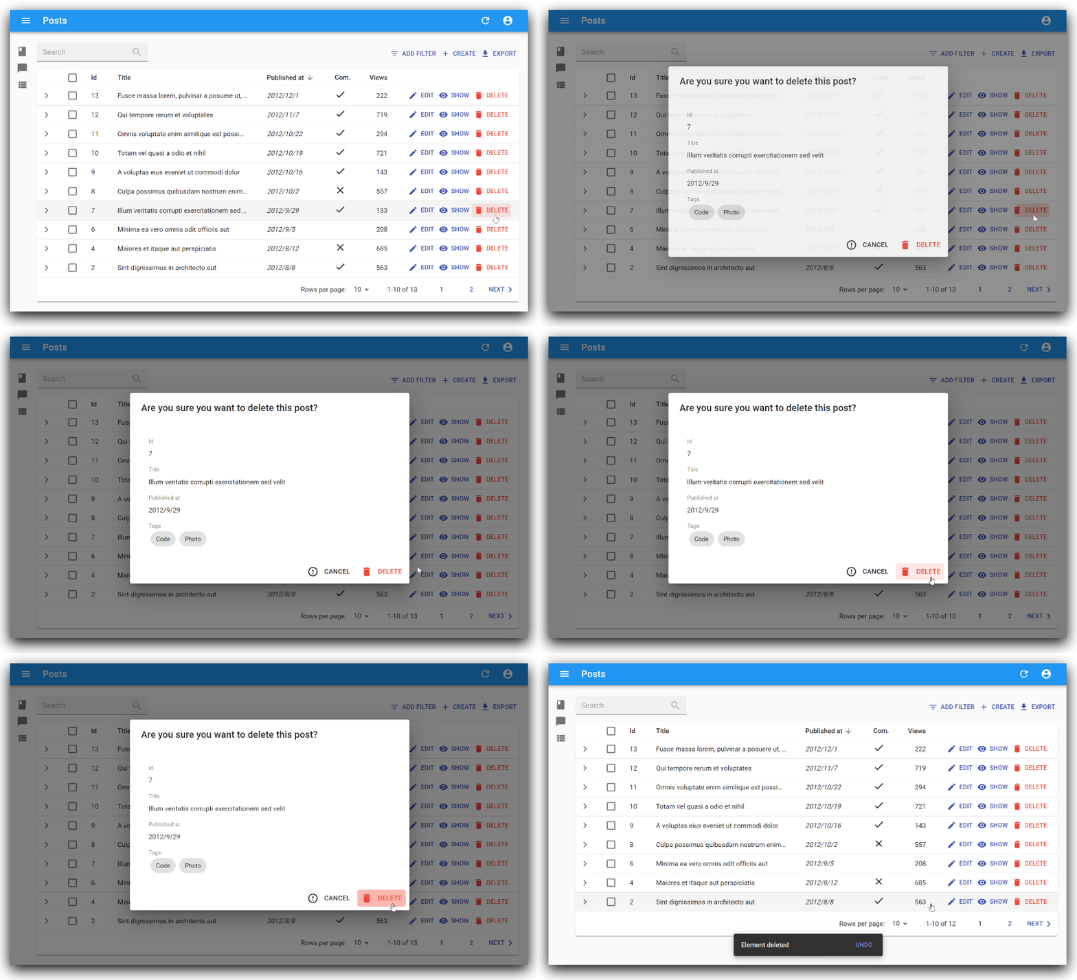
Delete button with your custom confirm dialog for React-admin.

Installation
# via npm
npm install --save ra-delete-with-custom-confirm-button

# via yarn
yarn add ra-delete-with-custom-confirm-button
Demo
After having cloned this repository, run the following commands:
cd example/
yarn install
yarn start
And then browse to http://localhost:8080/.
The credentials are login/password
Usage
import DeleteWithCustomConfirmButton from 'ra-delete-with-custom-confirm-button';
import Delete from '@material-ui/icons/Delete';
import ErrorOutline from '@material-ui/icons/ErrorOutline';

// Define your custom title of confirm dialog
const DeleteConfirmTitle = 'Are you sure you want to delete this post?';

// Define your custom contents of confirm dialog
const DeleteConfirmContent = props => {
  return (
    <SimpleShowLayout {...props} >
      <TextField source='title' label='title' />
      <TextField source='user' label='user' />
      <TextField source='date' label='date' />
      <RichTextField source='description' label='description' />
    </SimpleShowLayout>
  );
};

const InformationList = props => {
  const translate = useTranslate();
  return (
    <List {...props} >
      <Datagrid>
        <TextField source='title' label='title' />
        <TextField source='date' label='date' />
        <TextField source='user' label='user' />
        <DeleteWithCustomConfirmButton
          title={DeleteConfirmTitle}      // your custom title of delete confirm dialog
          content={DeleteConfirmContent}  // your custom contents of delete confirm dialog
          label='Delete'                  // label of delete button (default: 'Delete')
          confirmColor='warning'          // color of delete button ('warning' or 'primary', default: 'warning')
          ConfirmIcon={Delete}            // icon of delete button (default: 'Delete')
          cancel='Cancel'                 // label of cancel button (default: 'Cancel')
          CancelIcon={ErrorOutline}       // icon of cancel button (default: 'ErrorOutline')
          undoable={true}                 // undoable (default: true)
        />
      </Datagrid>
    </List>
  );
};

export default InformationList;
props
| Name | Type | Description | Default |
|---|---|---|---|
| title | string | your custom title of delete confirm dialog | |
| content | element | your custom contents of delete confirm dialog | |
| label | string | label of delete button | 'ra.action.delete' (Delete in English) |
| confirmColor | string | color of delete button ('warning' or 'primary') | 'warning' |
| DeleteIcon | element | icon of delete button from @material-ui/icons | |
| cancel | string | label of cancel button | 'ra.action.cancel' (Cancel in English) |
| CancelIcon | element | icon of cancel button from @material-ui/icons | |
| undoable | bool | undoable or not | true |
| redirect | string | redirect to | 'list' |
License
This library is licensed under the MIT License.

