raven-dialog v0.2.0
Raven Dialog for Angular
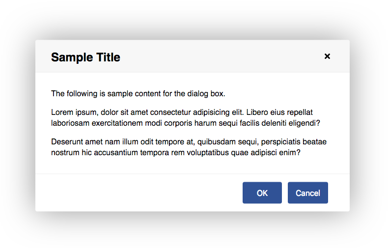
An Angular dialog box component that makes use of the HTML <dialog> element for improved accessibility.

Features
- Keyboard/touch accessible
- Easily styled with CSS variables
- Use CSS transforms to customize open/close transitions
Installation
Install into your Angular project using NPM.
npm install raven-dialog --save
Import the DialogModule into your module.
import { DialogModule } from 'raven-dialog';

@NgModule({
  imports: [
    DialogModule,
    // ...
  ],
  // ...
})
export class AppModule { }
Usage
Add a <raven-dialog> element to your template, and open or close it by binding a variable to the open attribute.
import { Component } from '@angular/core';

@Component({
  selector: 'app-root',
  template: `
    <raven-dialog heading="Sample Title"
      [(open)]="isOpen"
      [modal]="true">
      <p>Dialog box content here.</p>
    </raven-dialog>
  `,
  styles: []
})
export class AppComponent {
  isOpen = false;
}
Options
| Option | Type | Description | Default Value |
|---|---|---|---|
| heading | string | An optional heading to place at the top of the dialog. | "" |
| open | boolean | Whether the dialog is open or not. | false |
| modal | boolean | Whether the dialog should be modal or not. | false |
Styling
CSS variables are used for styling. Example:
raven-dialog {
  --dialog-border: 2px solid #ccc;
  --dialog-border-radius: 5px;
}
Available CSS Variables
| Variable | Description | Default Value | |
|---|---|---|---|
| --dialog-margin | Minimum left/right margin of the dialog box. | 2rem | |
| --dialog-padding | Padding around the dialog box content. | 2rem; | |
| --dialog-min-width | Minimum width of the dialog box. | 20rem | |
| --dialog-max-width | Maximum width of the dialog box. | 40rem | |
| --dialog-border | Border around the dialog box. | 0 | |
| --dialog-border-radius | Border radius of dialog box. | .25rem | |
| --dialog-transition-in | Transition when opening dialog box. | transform .2s ease-out, opacity .1s ease-out, box-shadow .2s | ase-out |
| --dialog-transition-out | Transition when closing dialog box. | transform .2s ease-in, opacity .2s ease-in, box-shadow .2s ease-in | |
| --dialog-transform | Transform property of dialog box. | scale(1) | |
| --dialog-transform-in | Transform property when transitioning in. | scale(.9) | |
| --dialog-transform-out | Transform property when transitioning out. | scale(.9) | |
| --dialog-opacity | Opacity of dialog box. | 1 | |
| --dialog-opacity-in | Dialog opacity when transitioning in. | 0 | |
| --dialog-opacity-out | Dialog opacity when transitioning out. | 0 | |
| --dialog-box-shadow | Box shadow around dialog box. | 0 0 7rem rgba(0, 0, 0, .4) | |
| --dialog-box-shadow-in | Box shadow when transitioning in. | 0 0 0 rgba(0, 0, 0, 0.6) | |
| --dialog-box-shadow-out | Box shadow when transitioning out. | 0 0 0 rgba(0, 0, 0, 0.6) | |
| --dialog-header-padding | Amount of padding in the header. | 1rem 2rem | |
| --dialog-header-color | Text color of the header. | #000 | |
| --dialog-header-background | Background of the header. | #f7f7f7 | |
| --dialog-header-border-bottom | Border under the header. | 1px solid #eee | |
| --dialog-backdrop-background | Background of the modal backdrop. | rgba(0, 0, 0, .2) |
Browser Compatibility
Many browsers do not have native support for the <dialog> element and will require a polyfill. Check the Can I Use database for current compatibility.
The dialog-polyfill polyfill is recommended and is supported by raven-dialog. Follow these steps to install it.
cdto your project's root directory.- Run:
npm install dialog-polyfill --save - Update your angular.json file to include the style sheet and JavaScript file from the polyfill.
"styles": [
  "node_modules/dialog-polyfill/dialog-polyfill.css"
],
"scripts": [
  "node_modules/dialog-polyfill/dialog-polyfill.js"
],
Development
To contribute to the development of this component, clone this repository and run npm install. Then run ng serve -o to start a development server and to open a sample page in your browser.
License
MIT license.