rc-rich-text-editor v1.0.6
Rc Rich Text Editor React Component
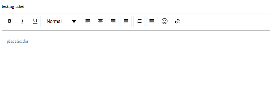
Rc Rich Text Editor is a customizable, rich-text editor component for React applications. It provides a contenteditable div with various text formatting options, placeholder support, and custom styling capabilities.
Features
- Rich-text editing capabilities
- Customizable toolbar with various text formatting options
- Placeholder support
- Custom styling options
- Accessibility support
- Event handling for text changes
- Sanitization of input to prevent XSS attacks
Installation
To use this component in your React project, follow these steps:
yarn add rc-rich-text-editor
or
npm install rc-rich-text-editor
Usage
Here's a basic example of how to use the Rc Rich Text Editor component:
import React from 'react';
import {RichTextEditor} from 'rc-rich-text-editor';

const MyComponent = () => {
  const handleTextChange = (content) => {
    console.log('Content changed:', content);
  };

  return (
    <RichTextEditor
      id="my-editor"
      name="my-editor"
      label="My Editor"
      placeholder="Start typing..."
      onTextChange={handleTextChange}
    />
  );
};

export default MyComponent;
Props
The RichTextEditor component accepts the following props:
id(required): Unique identifier for the editorname(required): Name attribute for the editorlabel: Label for the editorinitialValues: Initial HTML content for the editorplaceholder: Placeholder text when the editor is emptycontrolOptions: Custom options for the toolbar controls (see Toolbar Customization)wrapperClassName: Custom class name for the wrapper diveditorClassName: Custom class name for the editor divtoolbarClassName: Custom class name for the toolbarstylePlatte: Custom styles for various elements of the editoronTextChange: Callback function called when the text content changes
Toolbar Customization
The editor includes a customizable toolbar (EditableTopbar) that allows you to control which formatting options are available. You can customize the toolbar using the controlOptions prop:
const customControlOptions = {
  bold: { show: true, icon: <CustomBoldIcon /> },
  italic: { show: false },
  underLine: { show: true, className: 'custom-underline-btn' },
  // ... other options
};

<RichTextEditor
  // ... other props
  controlOptions={customControlOptions}
/>
Available Control Options
The toolbar supports the following control options:
Basic Formatting:
bolditalicunderLine
Text Alignment:
justifyLeftjustifyCenterjustifyRightjustifyFull
Lists:
orderedListunorderedList
Special Features:
headinglinkemoji
Customization Properties
For most buttons, you can customize:
show: Boolean to control visibility of the buttonicon: Custom React element to replace the default iconclassName: Additional CSS class for styling
Special cases:
- Link: Has additional
linkIconandunlinkIconproperties - Heading: Has an additional
dropdownClassNamefor styling the dropdown
Customization Examples
Hide a button:
const customOptions = {
  italic: { show: false }
};
Custom icon:
const customOptions = {
  bold: { icon: <MyCustomBoldIcon /> }
};
Custom styling:
const customOptions = {
  underLine: { className: 'my-underline-button' }
};
Link button customization:
const customOptions = {
  link: {
    show: true,
    linkIcon: <MyLinkIcon />,
    unlinkIcon: <MyUnlinkIcon />,
    className: 'custom-link-button'
  }
};
Heading button customization:
const customOptions = {
  heading: {
    show: true,
    dropdownIcon: <MyDropdownIcon />,
    className: 'heading-button',
    dropdownClassName: 'heading-dropdown'
  }
};
Available Style Properties
The following properties can be customized using the stylePlatte object:
primaryColor: Main color for interactive elementsprimaryColorDark: Darker shade of the primary colorcolorWhite: Color for light elementscolorBlack: Color for dark elementsplaceholderTextColor: Color for placeholder texttoolbarBorderColor: Border color for the toolbareditorBorderColor: Border color for the editorlinkInputBorderColor: Border color for link input fieldslinkCancelButtonHoverColor: Hover color for link cancel buttonsborderRadius: Border radius for various elementsboxShadowLinkPopupButton: Box shadow for link popup buttonsboxShadowToolbarButton: Box shadow for toolbar buttonsboxShadowPopup: Box shadow for popup elements
Screenshot


Accessibility
The component includes basic accessibility features, such as proper ARIA attributes for the editable div and toolbar buttons.
Contributing
Contributions are welcome! If you find any issues or want to add new features, feel free to open an issue or submit a pull request.