react-admin-color-components v1.0.4
react-admin-color-components
Color utility components for use in react-admin applications
Installation
npm install react-admin-color-components --saveUsage

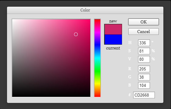
This package provides a ColorInput component based on the react-color pickers libray, as well as a corresponding ColorField and ColorSquare (which is used to display the current color in both aforementioned components) for use in a react-admin application.
The ColorInput's default picker is the PhotoshopPicker, but the prop picker can be used to override the default. Additional props for the picker can be passed as part of pickerOptions. The picker's header can be overriden using the pickerHeader prop.
The ColorInput accepts most react-admin input props, including validate, defaultValue, fullWidth, helperText, sx, etc., and requires a source to be defined in order to work correctly as a form input or filter.
The ColorInput uses a "fragile controlled" input strategy in which the current field value is stored in React state while the picker is open, and the field value is only updated once onChangeComplete is called, which is usually at the point of closing the picker. If the picker is closed without confirming, such as clicking Cancel on the Photoshop picker, the field's value will not be updated.
This package is based on the previous work of alexgschwend and vascofg, who built similar component libraries.
Contributing
I welcome opened issues and pull requests! This package was primarily geared towards my particular needs, but I'd love to see it cover more use-cases and become useful to a wider audience.
License
This library is licensed under the MIT License.