react-agendfy v1.0.8
React Agendfy Calendar Component
React Agendfy is a flexible and customizable calendar component for React applications. It supports various calendar views, drag and drop event management, recurring events, resource filtering, and now with enhanced timezone support and notification functionalities.
Table of Contents
- Features
- Installation
- Usage
- Configuration Options (Config Prop)
- Events Object Structure
- Resources Object Structure
- Email Adapter
- Localization (i18n)
- Calendar Export (ICS Format)
- Plugin Support
- Contributing
- License
Features
- Multiple Calendar Views: Supports month, week, day, and list views.
- Drag & Drop Event Management: Easily move and resize events within the calendar.
- Recurring Events: Handles events that repeat daily, weekly, monthly, etc., using RRule.
- Event Resizing: Adjust event durations directly on the calendar (week and day views).
- Resource Filtering: Filter events by assigned resources.
- Timezone Support: Comprehensive timezone handling using
@date-fns/tz. - Event Notifications (Alerts): Configure alerts to remind users of upcoming events.
- Customizable Configuration: Extensive
configprop to tailor the calendar's appearance and behavior. - Localization: Basic localization for text elements.
- Resource Display: Visually represent event resources.
- Tooltips: Informative tooltips for events.
- Business Hours: Highlight business hours in the calendar view.
- Event Click and Slot Click Handlers: Callbacks for user interactions.
Installation
npm install react-agendfyor
yarn add react-agendfyEnsure you have installed all peer dependencies listed in the peerDependencies section of the package.json.
Usage
Basic Usage
Import the Calendar component and necessary dependencies into your React component:
import React, { useState, useCallback, useMemo, useRef, useEffect } from 'react';
import Calendar from 'react-agendfy';
import { format } from 'date-fns';

const initialEvents = [
    {
        id: "1",
        "title": "Sample Event",
        "start": "2025-07-20T10:00:00.000Z",
        "end": "2025-07-20T12:00:00.000Z",
        "color": "#3490dc",
        "isAllDay": false,
        "isMultiDay": false,
    }
];

function MyCalendarApp() {
    const [events, setEvents] = useState(initialEvents);
    const calendarRef = useRef(null);


    const defaultConfig = {
        timezone: 'UTC', // or 'America/Sao_Paulo', 'Africa/Luanda', etc.
        defaultView: "week",
        slotDuration: 30,
        slotLabelFormat: "HH:mm",
        slotMin: "00:00",
        slotMax: "23:59",
        lang: 'en',
        today: 'Today',
        monthView: 'Month',
        weekView: 'Week',
        dayView: 'Day',
        listView: 'List',
        all_day: 'All Day',
        clear_filter: 'Clear Filters',
        filter_resources: 'Filter Resources',

    };

    const config = useMemo(() => {
        return defaultConfig;
    }, []);


    const handleEventUpdate = useCallback((updatedEvent) => {
        console.log("Updated event:", updatedEvent);
        // Implement your event update logic here, e.g., API calls, state updates
        setEvents(events.map(event => event.id === updatedEvent.id ? updatedEvent : event));
    }, [events, setEvents]);


    const handleEventClick = useCallback((event) => {
        console.log("Clicked event:", event);
        alert(`Clicked event: ${event.title}`);
    }, []);

    const handleDayClick = useCallback((dayDate) => {
        console.log("Clicked day:", dayDate);
        alert(`Clicked day: ${format(dayDate, 'dd/MM/yyyy')}`);
    }, []);

    const handleSlotClick = useCallback((slotTime) => {
        console.log("Clicked slot:", slotTime);
        alert(`Clicked slot: ${format(slotTime, 'HH:mm dd/MM/yyyy')}. You can add a new event here.`);
    }, []);


    return (
        <div style={{ height: '800px', width: '100%' }}>
            <Calendar
                events={events}
                config={config}
                onEventUpdate={handleEventUpdate}
                onEventClick={handleEventClick}
                onDayClick={handleDayClick}
                onSlotClick={handleSlotClick}
            />
        </div>
    );
}

export default MyCalendarApp;
Calendar Views
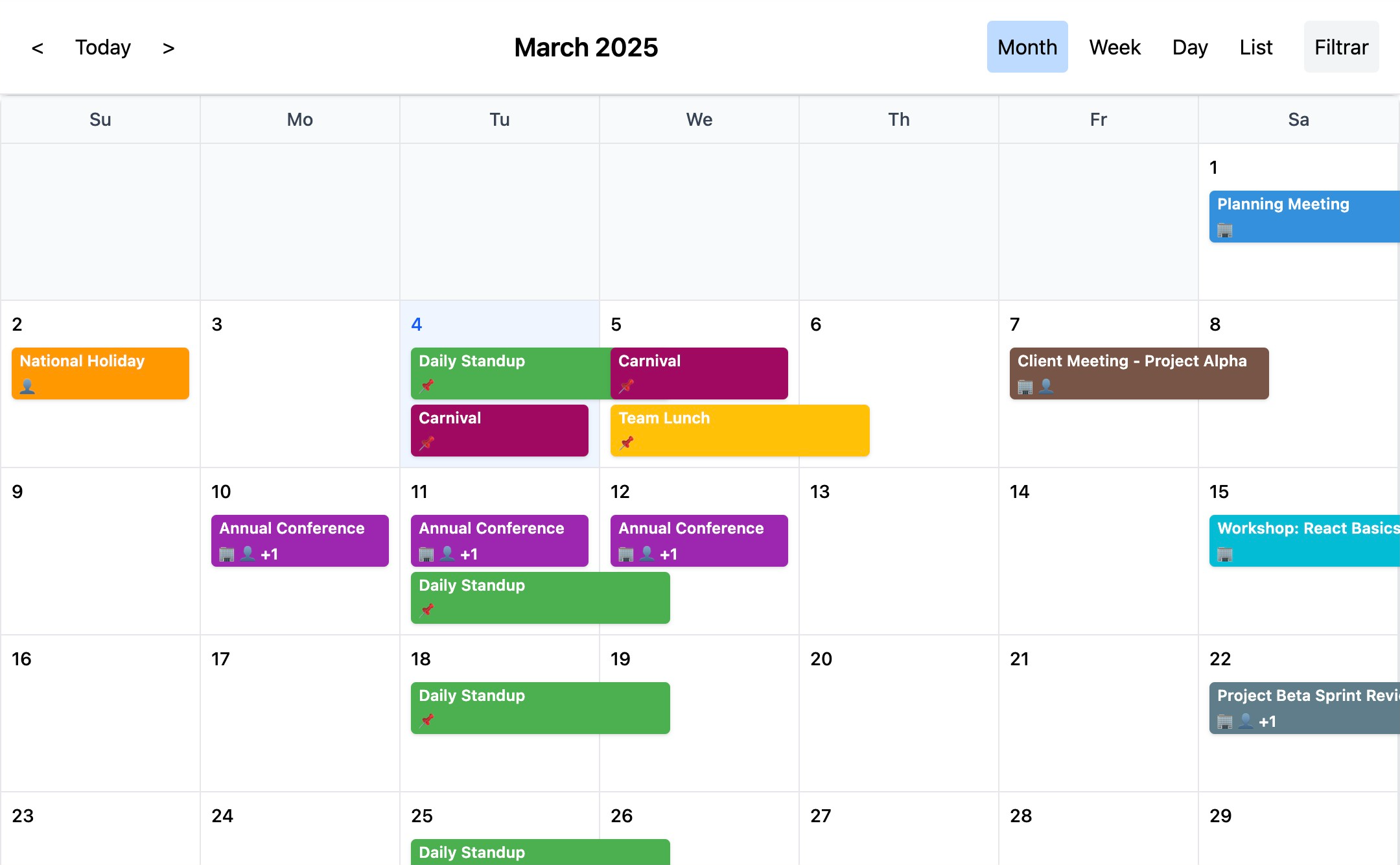
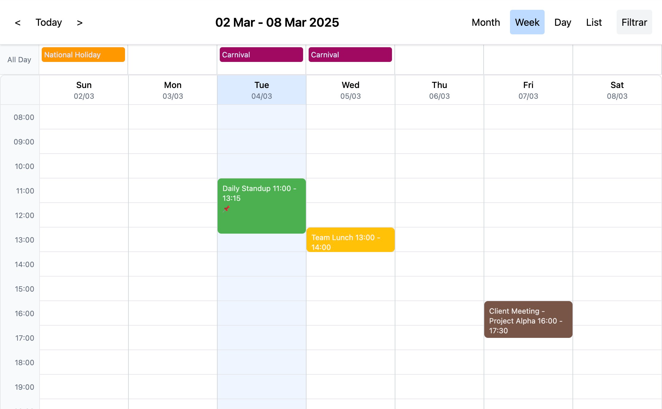
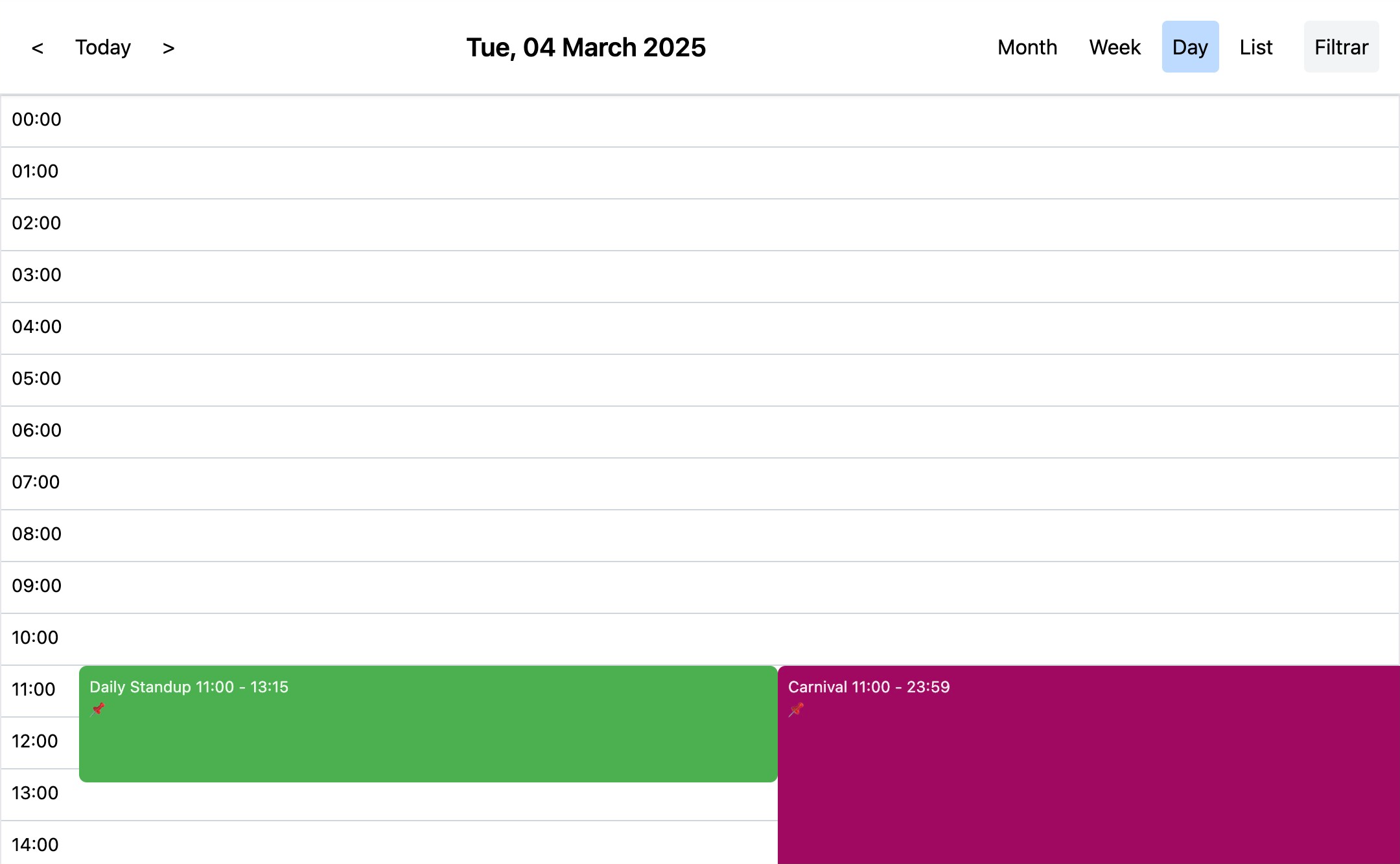
React Agendfy supports four main calendar views, configurable via the defaultView option in the config prop:
- Month View: Displays a traditional month grid. Set
defaultView: "month". - Week View: Shows a weekly agenda with time slots. Set
defaultView: "week". - Day View: Focuses on a single day's schedule with time slots. Set
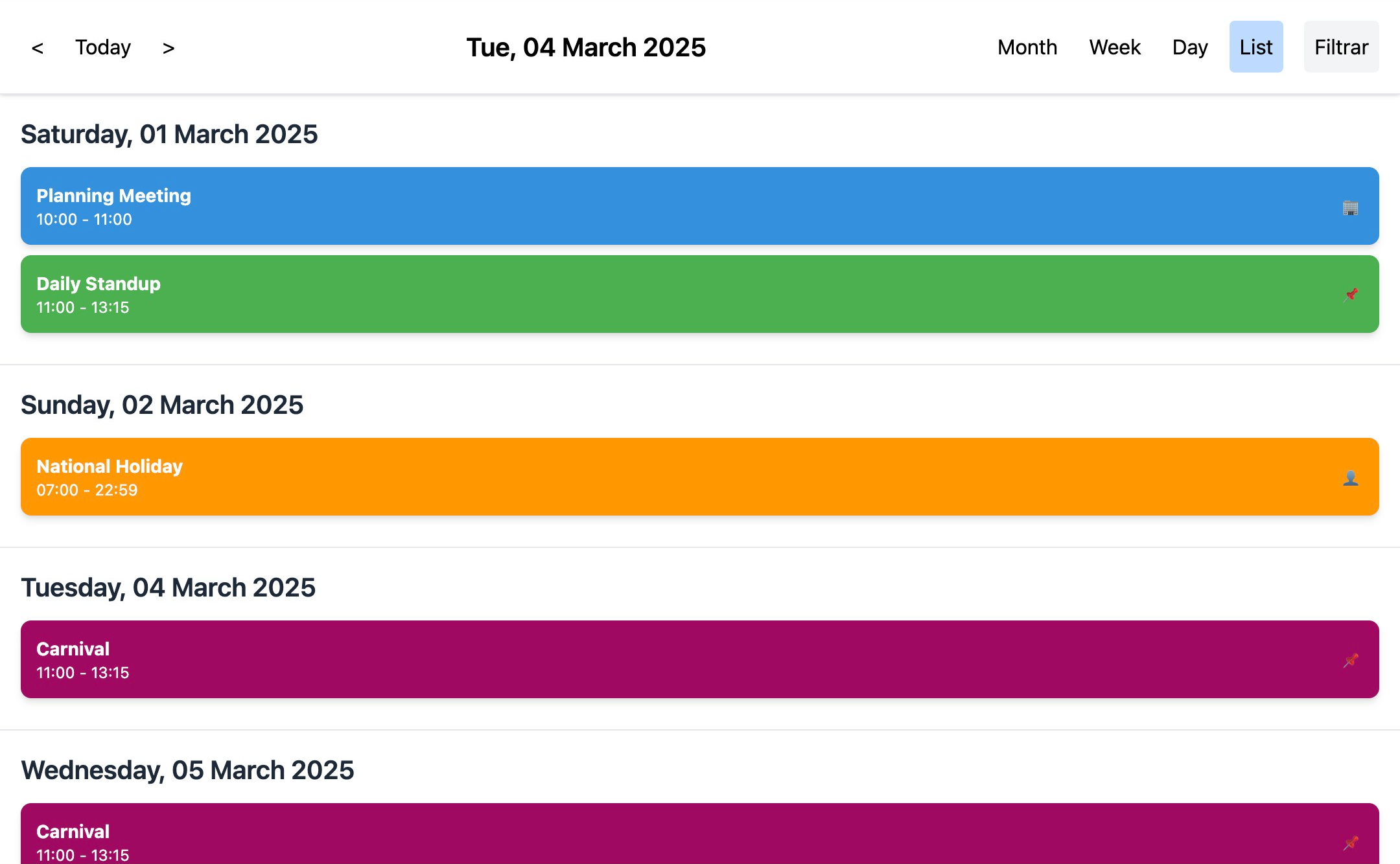
defaultView: "day". - List View: Presents events in a list format, grouped by day for the current month. Set
defaultView: "list".
Users can navigate between views using the view selector in the calendar header.
Event Handling
onEventClick(event: Event): Callback function triggered when an event is clicked. Provides the event object as a parameter.onEventUpdate(updatedEvent: Event): Callback function for when an event is dragged and dropped to a new time slot or resized. It is crucial to update your event state with theupdatedEventprovided.onEventResize(resizedEvent: Event): Callback function when an event is resized (Week and Day views only). Update your event state with theresizedEvent.
Drag and Drop
- Enable Drag and Drop: Drag and drop functionality is enabled by default when you provide the
onEventUpdateandonEventResizecallbacks. - Moving Events: Drag events to different time slots in week and day views to reschedule them. The
onEventUpdatecallback is triggered after a successful drag and drop operation. - Resizing Events: Resize events vertically in week and day views by dragging the bottom border of the event. The
onEventResizecallback is triggered upon resizing completion.
Recurring Events
React Agendfy supports recurring events using the RRule standard. Define recurrence rules in your event objects using the recurrence property.
{
    id: "4",
    title: "Daily Standup",
    start: "2025-03-01T10:00:00.000Z",
    end: "2025-03-01T12:15:00.000Z",
    color: "#4caf50",
    recurrence: "FREQ=WEEKLY;INTERVAL=1;COUNT=10", // Example: Weekly for 10 occurrences
    isAllDay: false,
    isMultiDay: false,
},
The expandRecurringEvents utility function (exported from the library) can be used to expand recurring events into individual event instances for a given date range.
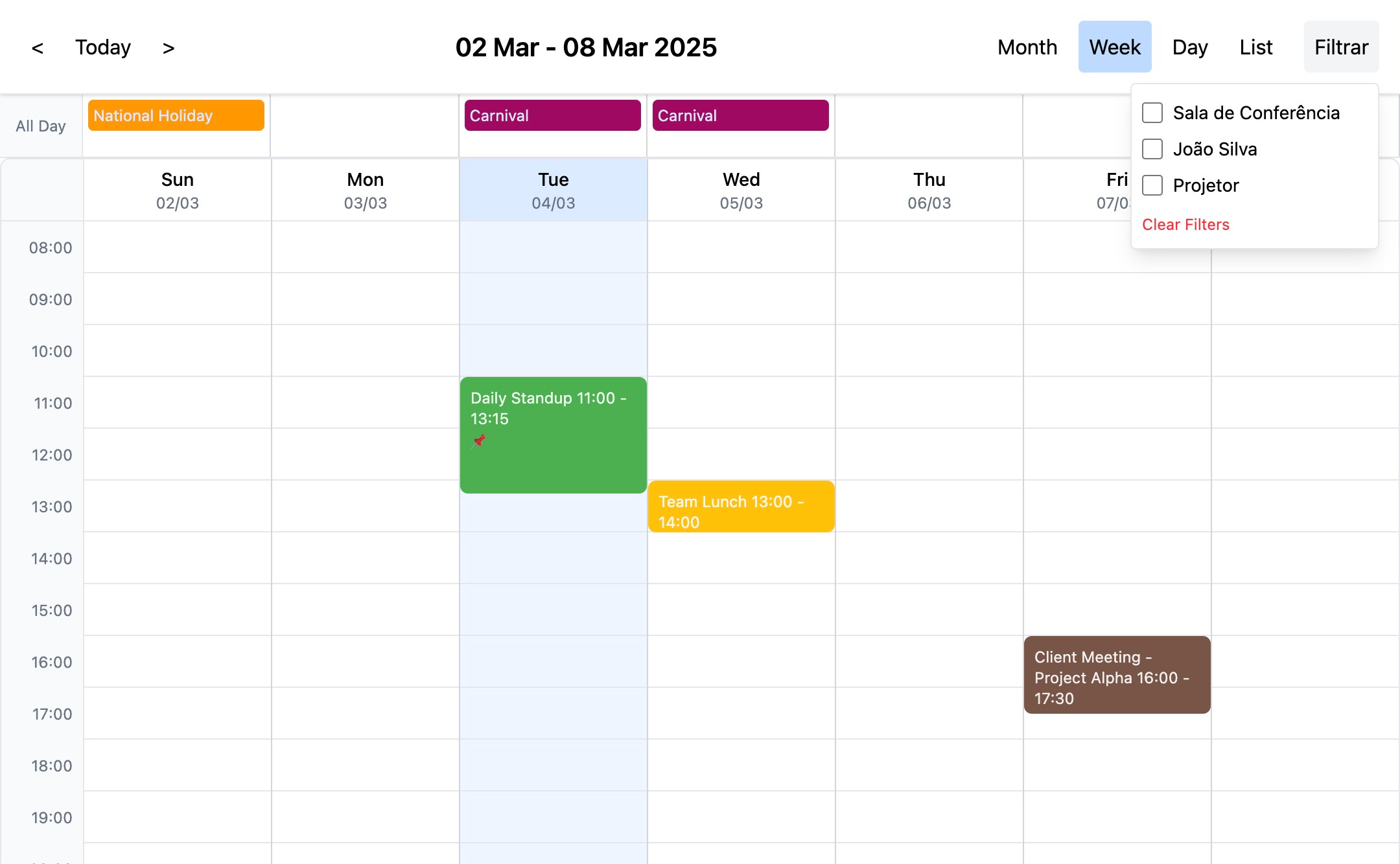
Resource Filtering
- Resource Definition: Define resources as an array of objects with
id,name, andtypeproperties. Pass this array to theresourcesprop of theCalendarcomponent. - Event Resources: Assign resources to events using the
resourcesproperty of the event object. - Filtering Interface: The calendar provides a built-in UI to filter events by resource type.
onResourceFilterChange(selectedResources: string[]): Callback function that is called when the resource filter changes, providing an array of selected resource IDs.filteredResources: string[]: Prop to control the resource filter externally. Pass an array of resource IDs to filter events displayed on the calendar.
Time Zones
React Agendfy is timezone-aware, leveraging the @date-fns/tz library.
Configuration: Set the
timezoneproperty in theconfigprop to your desired timezone (e.g.,'America/Sao_Paulo','UTC','Africa/Luanda'). Default timezone is 'UTC'.TZDate: Internally, the component uses
TZDateobjects from@date-fns/tzto handle dates and times, ensuring all calculations and displays are timezone-consistent.Event Dates: Event
startandendproperties should be provided in ISO 8601 format (e.g.,"2025-07-20T10:00:00.000Z"). While the component processes dates internally asTZDateobjects with the configured timezone, it's recommended to store and manage event dates in UTC or a consistent timezone format to avoid ambiguity.Example Config:
const config = useMemo(() => ({
    timezone: 'Africa/Luanda', // Example: Set timezone to Luanda
    // ... other configurations
}), []);
By configuring the
timezone, the calendar will display times and perform date calculations according to the specified timezone, ensuring accurate representation for users in different time zones.
Notifications (Alerts)
React Agendfy allows you to configure notifications or alerts for events using the alertBefore property in the event object. To enable email notifications, you need to implement and provide an EmailAdapter to the Calendar component.
alertBeforeProperty: In your event object, addalertBeforeproperty to specify a reminder in minutes before the event starts.{ id: "6", title: "Team Lunch", start: "2025-03-05T14:00:00.000Z", end: "2025-03-05T15:00:00.000Z", color: "#ffc107", isAllDay": false, isMultiDay": false, alertBefore: 15, // Alert 15 minutes before event start }EmailAdapterInterface: Define an adapter object that conforms to theEmailAdapterinterface:interface EmailAdapter { sendEmail: (subject: string, body: string, recipient: string) => Promise<void>; }Implementing
EmailAdapter: Create an object that implements theEmailAdapterinterface with your email sending logic. Example usingconsole.logfor demonstration:const myEmailAdapter = { sendEmail: async (subject, body, recipient) => { console.log("Sending email:", { subject, body, recipient }); // Implement your actual email sending logic here (e.g., using an API, SMTP, etc.) return Promise.resolve(); }, };emailAdapterProp: Pass your implementedEmailAdapterto theCalendarcomponent via theemailAdapterprop:<Calendar // ...other props emailAdapter={myEmailAdapter} />emailConfigProp: Configure email settings using theemailConfigprop:<Calendar // ...other props emailAdapter={myEmailAdapter} emailConfig={{ defaultRecipient: "[email address removed]" }} // Default recipient for notifications />defaultRecipient: (Optional) A default email address to be used if the event or user does not specify a recipient.
Notification Behavior:
- When an event with
alertBeforeis created or updated, and the current time approaches the alert time, the calendar component (specifically with a backend implementation for processing alerts) will trigger thesendEmailmethod of the providedEmailAdapter. - The email will be sent to the specified recipient (if available in
event.recipientor usingemailConfig.defaultRecipientas fallback). - The email subject and body are automatically generated by the calendar component, including event details.
- Note: The current component provides the front-end configuration and email sending interface. You will need to implement the backend logic that periodically checks for events nearing their alert times and triggers the notification sending mechanism. This backend logic is outside the scope of this React component.
Configuration Options (Config Prop)
The config prop is a JavaScript object that allows you to customize various aspects of the calendar. Below are the available configuration options:
| Option | Type | Default Value | Description |
|---|---|---|---|
timezone | string | 'UTC' | Sets the timezone for the calendar. Uses IANA timezone names (e.g., 'America/Sao_Paulo', 'Africa/Luanda'). |
defaultView | string | 'week' | Initial calendar view to display ('month', 'week', 'day', 'list'). |
slotDuration | number | 30 | Duration of time slots in minutes (Day and Week views). |
slotLabelFormat | string | 'HH:mm' | Format for time slot labels (uses date-fns format strings). |
slotMin | string | '00:00' | Start time for the Day and Week views. |
slotMax | string | '23:59' | End time for the Day and Week views. |
lang | string | 'en' | Language code for localization (currently supports basic text elements). |
today | string | 'Today' | Text for the "Today" button. |
monthView | string | 'Month' | Text for the Month view button. |
weekView | string | 'Week' | Text for the Week view button. |
dayView | string | 'Day' | Text for the Day view button. |
listView | string | 'List' | Text for the List view button. |
all_day | string | 'All Day' | Text for "All Day" events. |
clear_filter | string | 'Clear Filters' | Text for the "Clear Filters" button in resource filter. |
filter_resources | string | 'Filter' | Text for the "Filter" button in resource filter. |
businessHours | object | undefined | Configuration object for business hours highlighting (see below). |
Business Hours Configuration (businessHours in config)
To highlight business hours in the week and day views, use the businessHours config option. It accepts an object with the following structure:
businessHours: {
start: number; // Hour when business starts (0-23)
end: number; // Hour when business ends (0-23)
daysOfWeek?: number[]; // Optional: Array of days of the week to apply business hours (0=Sunday, 6=Saturday). If not provided, applies to all days.
}Example:
const config = useMemo(() => ({
timezone: 'UTC',
defaultView: "week",
slotDuration: 30,
businessHours: {
start: 9, // 9 AM
end: 18, // 6 PM
daysOfWeek: [1, 2, 3, 4, 5], // Monday to Friday (optional, defaults to all days if omitted)
},
// ... other configurations
}), []);Events Object Structure
The events prop expects an array of event objects. Each event object should have the following properties:
| Property | Type | Required | Description | |
|---|---|---|---|---|
id | string | number | Yes | Unique identifier for the event. |
title | string | Yes | Title of the event, displayed on the calendar. | |
start | string | Yes | Start date and time of the event in ISO 8601 format (e.g., "2025-07-20T10:00:00.000Z"). | |
end | string | Yes | End date and time of the event in ISO 8601 format (e.g., "2025-07-20T12:00:00.000Z"). | |
color | string | No | Background color for the event (e.g., "#3490dc", "red"). | |
isAllDay | boolean | No | Indicates if the event is an all-day event. Default is false. | |
isMultiDay | boolean | No | Indicates if the event spans multiple days. Default is false. | |
recurrence | string | No | RRule string for recurring events. | |
resources | array | No | Array of resource objects assigned to the event (see Resources Object Structure). | |
alertBefore | number | No | Reminder time in minutes before the event start (for email notifications, requires EmailAdapter). | |
[key: string] | any | No | Allows adding any other custom properties to the event object. |
Resources Object Structure
The resources prop in the main Calendar component expects an array of resource objects. The resources property in the event object also uses the same structure. Each resource object should have:
| Property | Type | Required | Description |
|---|---|---|---|
id | string | Yes | Unique identifier for the resource. |
name | string | Yes | Display name of the resource. |
type | string | Yes | Type or category of the resource (e.g., "room", "person", "equipment"). |
[key: string] | any | No | Allows adding any other custom properties. |
Email Adapter
To enable email notifications, you need to provide an EmailAdapter object to the emailAdapter prop of the Calendar component.
Interface:
interface EmailAdapter {
    sendEmail: (subject: string, body: string, recipient: string) => Promise<void>;
}Implementation Example:
const myEmailAdapter = {
sendEmail: async (subject, body, recipient) => {
console.log("Sending email:", { subject, body, recipient });
// Implement your email sending logic here
return Promise.resolve();
},
};Pass this adapter to the Calendar component:
<Calendar
    // ...other props
    emailAdapter={myEmailAdapter}
/>Localization (i18n)
Basic localization is supported for calendar text elements via the config prop. You can customize text for buttons and labels by setting the following properties in the config object to your desired language:
todaymonthViewweekViewdayViewlistViewall_dayclear_filterfilter_resourceslang: Set thelangproperty to a language code (e.g., 'pt' for Portuguese, 'en' for English) to apply basic localization. Currently, only text element translations need to be manually provided in theconfig.
Example (Portuguese Localization):
const config = useMemo(() => ({
    timezone: 'UTC',
    lang: 'pt',
    defaultView: "week",
    slotDuration: 30,
    today: 'Hoje',
    monthView: 'Mês',
    weekView: 'Semana',
    dayView: 'Dia',
    listView: 'Lista',
    all_day: 'Dia Inteiro',
    clear_filter: 'Limpar Filtro',
    filter_resources: 'Filtrar Recursos',
}), []);
Calendar Export (ICS Format)
The calendar component also includes built-in support for exporting calendar events in the widely compatible ICS (iCalendar) format. This feature allows users to easily download their calendar data and import it into other calendar applications such as Google Calendar, Outlook Calendar, Apple Calendar, and more. The export functionality can typically be triggered via a button or option in the calendar header.
Plugin Support
The calendar component also includes built-in support for exporting calendar events in the widely compatible ICS (iCalendar) format. This feature allows users to easily download their calendar data and import it into other calendar applications such as Google Calendar, Outlook Calendar, Apple Calendar, and more. The export functionality can typically be triggered via a button or option in the calendar header.
By default, the button for exporting the calendar is enabled (export: true in the configuration). You can customize the text displayed on this button by changing the value of the calendar_export attribute in the calendar's configuration object. For example, setting calendar_export: "Download Calendar" would change the button's text to "Download Calendar".
Plugin Types
The calendar currently supports the following types of plugins:
header: These plugins are displayed in the calendar's header. They can be positioned on the'left'or'right'side. Examples include filter and search controls.view: These plugins allow the addition of entirely new calendar views, identified by a uniqueviewName.filter: A specific type ofheaderplugin that provides UI for filtering calendar events based on certain criteria.search: A specific type ofheaderplugin that provides UI for searching through calendar events.dataSource: These plugins enable the calendar to fetch event data from external sources, such as third-party APIs (e.g., Google Calendar).
Plugin Structure
Plugins are passed to the Calendar component via the plugins prop as an array of objects. Each plugin object should have at least a type property and may include other properties depending on the plugin type:
type: (Required) A string indicating the type of the plugin (e.g.,'header','view','filter','search','dataSource').location: (Forheaderplugins) A string specifying the location in the header:'left'or'right'.viewName: (Forviewplugins) A unique string identifying the custom view.component: (Optional) A React component (functional or class) that renders the plugin's UI or functionality. FordataSourceplugins, this might handle configuration or initialization.props: (Optional) An object containing additional props that will be passed down to the plugin'scomponent.key: (Optional) A unique key for the plugin, useful for React's rendering optimization.
Usage
To use a plugin, you need to import its component (if it has one) and add a plugin object to the plugins array prop of the Calendar component.
import MyCustomFilter from './plugins/MyCustomFilter';
import GoogleCalendarPlugin from './plugins/GoogleCalendarPlugin';
import MyCustomView from './plugins/MyCustomView';

const App = () => {
  const calendarPlugins = [
    {
      type: 'filter',
      location: 'left',
      component: MyCustomFilter,
      key: 'custom-filter',
    },
    {
      type: 'view',
      viewName: 'customAgenda',
      component: MyCustomView,
      props: { label: 'Agenda View' },
      key: 'agenda-view',
    },
    {
      type: 'dataSource',
      ...GoogleCalendarPlugin, // Assuming your GoogleCalendarPlugin object has the necessary properties
      key: 'google-calendar-source',
    },
    // ... other plugins
  ];

  return (
    <Calendar
      // ... other Calendar props
      plugins={calendarPlugins}
    />
  );
};
Contributing
Contributions are welcome! Please see the CONTRIBUTING.md file for guidelines on how to contribute to this project.
License
```# react-agendfy1 year ago
1 year ago
1 year ago
1 year ago
1 year ago
1 year ago
1 year ago
1 year ago
1 year ago
1 year ago
1 year ago
1 year ago
1 year ago
1 year ago
1 year ago
1 year ago
1 year ago
1 year ago
1 year ago
1 year ago
1 year ago
1 year ago
1 year ago
1 year ago
1 year ago
1 year ago
1 year ago
1 year ago
1 year ago
1 year ago
1 year ago
1 year ago
1 year ago
1 year ago
1 year ago
1 year ago
1 year ago
1 year ago
1 year ago
1 year ago
1 year ago
1 year ago
1 year ago
1 year ago
1 year ago
1 year ago
1 year ago
1 year ago
1 year ago
1 year ago
1 year ago
1 year ago
1 year ago
1 year ago
1 year ago
1 year ago
1 year ago
1 year ago
1 year ago
1 year ago
1 year ago
1 year ago
1 year ago
1 year ago
1 year ago