2.1.4 • Published 3 years ago
react-alternating-timeline v2.1.4
react-alternating-timeline
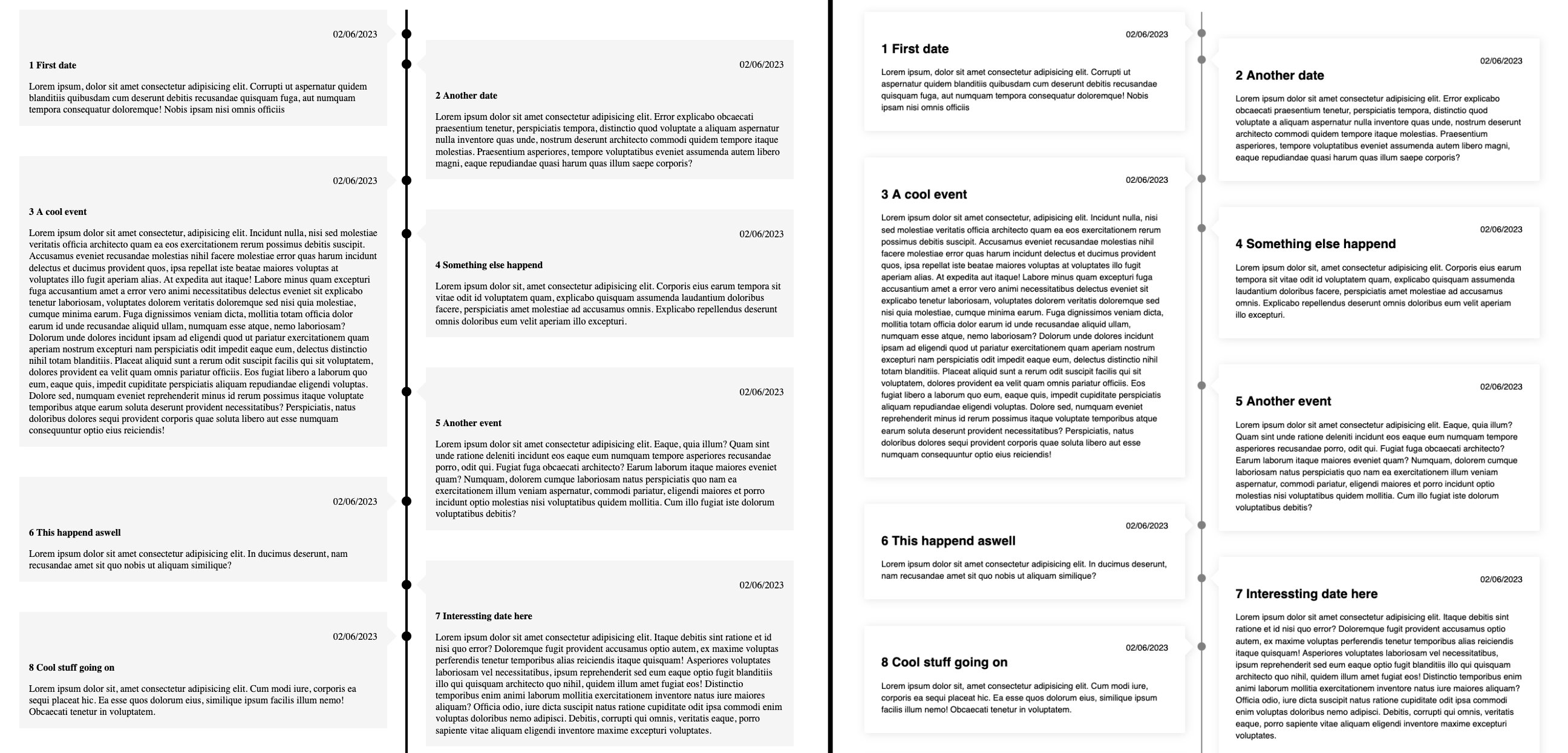
A simple and compact, true masonry style alternating timeline react component which is fully customizable and free stylable.

Features
- 🎛️ Customize everything.
- 🎨 Consistent (BEM) class naming for easy styling with CSS, emotion...
- ⏰ Custom date formatting.
- ⚖️ Alternating, left or right positioning.
- 🖼️ Render images and custom content.
- 🪄 Built with Typescript.
Installation
Add the package with the package manager via NPMs or GitHubs registry of choice to your project:
- yarn:
yarn add react-alternating-timeline - npm:
npm install react-alternating-timeline - pnpm:
pnpm add react-alternating-timeline - npx:
npx -p react-alternating-timeline
Usage
import { Timeline, TimelineItemsProps } from 'react-alternating-timeline';

const items: TimelineItemsProps = [
  {
    key: 'first',
    date: new Date(),
    title: 'Special event!',
  },
  {
    key: 'second',
    date: new Date(),
    title: 'Event',
    children: <img src="./test.jpg" alt="test" />,
  },
  ...
];

<Timeline items={items} />;
API
The available properties of the Timeline component:
| Property | Type | Description | Default |
|---|---|---|---|
items | TimelineItemsProps | Array of timeline items | |
positioning? | 'alternating' \| 'left' \| 'right' | How the items should be positioned relative to the timeline | 'alternating' |
minMarkerGap? | number | The minimum gap markers will have between each other | 50 (px) |
formatDate? | (date: Date) => string | Callback to format date | |
customMarker? | ReactElement | Custom maker element replacing the default | |
customPointer? | ReactElement | Custom pointer element replacing the default | |
styleConfig? | StyleConfig | Style config object for customizing timeline by setting css custom properties | |
className? | string | Additional class name |
TimelineItemsProps
An array of the following properties:
| Property | Type | Description |
|---|---|---|
key | Key | Unique key for each item |
title? | string | Optional title paragraph displayed bold |
date | Date \| string | Date either being formatted according to provided format or passed as a string |
children? | ReactNode | Pass custom content as children to the component |
formatDate? | (date: Date) => string | Callback to format date of specific item |
customMarker? | ReactElement | Overwriting customMarker property of parent Timeline |
customPointer? | ReactElement | Overwriting customPointer property of parent Timeline |
Styling
The style can either be passed as an object through the styleConfig property...
{
  line?: {
    width?: CSSProperties['width'];
    color?: CSSProperties['backgroundColor'];
    overhang?: CSSProperties['paddingBlock'];
  };
  item?: {
    gap?: CSSProperties['gap'];
    startOffset?: {
      left?: CSSProperties['marginTop'];
      right?: CSSProperties['marginTop'];
    };
  };
  marker?: {
    size?: CSSProperties['width'];
    color?: CSSProperties['backgroundColor'];
    radius?: CSSProperties['borderRadius'];
  };
  pointer?: {
    height?: CSSProperties['height'];
    width?: CSSProperties['width'];
    minOffset?: CSSProperties['marginTop'];
  };
  card?: {
    background?: CSSProperties['backgroundColor'];
    radius?: CSSProperties['borderRadius'];
    shadow?: CSSProperties['boxShadow'];
    padding?: CSSProperties['padding'];
    offset?: CSSProperties['gap'];
  };
}
...or can be set as custom properties directly in css
.timeline {
  --line-width: 0.2rem;
  --line-color: black;
  --line-overhang: 1rem;
  --item-gap: 1rem;
  --item-start-offset-left: 0;
  --item-start-offset-right: 5rem;
  --marker-size: 1rem;
  --marker-color: var(--line-color);
  --marker-radius: 50%;
  --pointer-height: 2rem;
  --pointer-width: 1rem;
  --pointer-min-offset: 5rem;
  --card-background: whitesmoke;
  --card-radius: 0.1rem;
  --card-shadow: unset;
  --card-padding: 1rem;
  --card-offset: 1rem;
}
StyleConfig
| Name | Description | Default |
|---|---|---|
| Line | The line the timeline items are place around/beside | |
– line-width | Width of the line | 0.2rem |
– line-color | Color of the line | black |
– line-overhang | How much the line should overhang the beginning and end of the timeline component | 1rem |
| Item | The timeline item as a whole, including the card, pointer and marker | |
– item-gap | The vertical space between the items | 1rem |
– item-start-offset-left | How much the items on the left side should be offset from the top | 0 |
– item-start-offset-left | How much the items on the right side should be offset from the top | 5rem |
| Marker | The markers on the line which marks the chronological order of the timeline items | 1rem |
– marker-size | Size of the default marker | 1rem |
– marker-color | Color of the default marker | line-color |
– marker-radius | Border radius (roundness) of the marker edges | 50% (round) |
| Pointer | The pointers pointing from the item cards to the markers on the line | |
– pointer-height | Height of the default pointer | 2rem |
– pointer-width | Width of the default pointer | 1rem |
– pointer-min-offset | Minimum offset of the pointer to the top of the card. The actual offset depends on the minMarkerGap property | 5rem |
| Card | The cards in which the timeline item content is displayed | |
– card-background | Background color of the card | whitesmoke |
– card-radius | Border radius of the card edges | 0.1rem |
– card-shadow | Configure drop shadow of the card | unset |
– card-padding | Padding of the card content | 1rem |
– card-offset | Space between the card and the timeline line | 1rem |
Demo
View a full demo of component as storybook: Storybook 📚