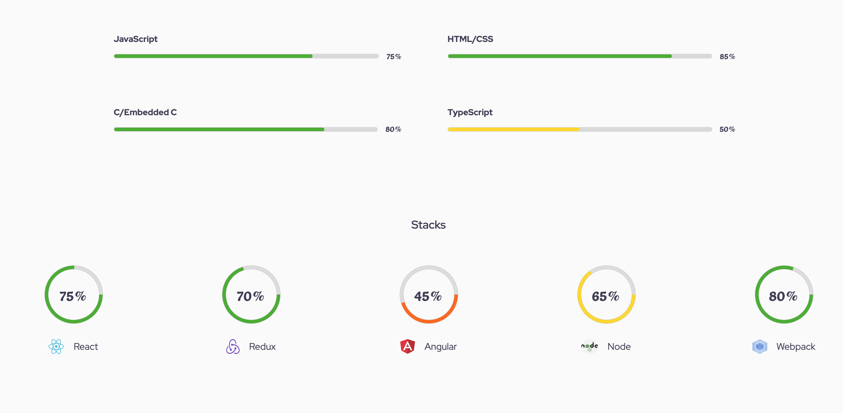
react-animated-progress-bar v1.1.2
react-animated-progress-bar
Animated progress bar using react
Use case scenario

Description
This package allows you to customize both circular and rectangular progress bar to various colors and sizes that suits your application or design.
- Progress bar animates when component is in view. By default it uses the document reference to check if component is in view or not. But you can pass the ref object which is scrollable to the scollArea props.
For example
const myRef = document.querySelector('.scrollable-div')

<ProgressBar width="230" trackWidth="13" percentage={score} scrollArea={myRef} />
Otherwise if scrollArea is not defined, document reference object is used.
Set up
To use package, Start by installing package
- npm i react-animated-progress-bar
on your react project file
For a circular progress bar
import ProgressBar from 'react-animated-progress-bar';

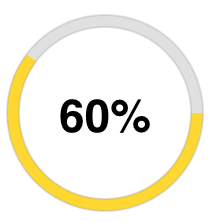
<ProgressBar width="230" trackWidth="13" percentage="60" />
Output

For a rectangular progress bar
Set the rect props on the component to true
import ProgressBar from 'react-animated-progress-bar';

<ProgressBar
        width="400px"
        height="10px"
        rect
        fontColor="gray"
        percentage="70"
        rectPadding="1px"
        rectBorderRadius="20px"
        trackPathColor="transparent"
        bgColor="#333333"
        trackBorderColor="grey"
      />
Output

Properties and description
width (must be a string): width of the progressbar in rectangle type and diameter for circular type,
percentage (must be a string): percentage of the progress bar
height (must be a string): height for rectangular bar. Needed only in rectangular type
rectPadding (must be a string): Padding around rectangular bar,
trackBorderColor (must be a string): Border color of the track
fontColor (must be a string): Percent font color
rectBorderRadius (must be a string): border radius of rectangular bar
trackPathColor (must be a string): color of the track path
hollowBackgroundColor (must be a string): required only in circular bar. it gives the background color of the circle
scrollArea (must be a dom element): the scrollable area. By default it is document
defColor (must be an object); defines custom color for each level of the percentage ( poor, fair, good, excellent)
| Score | Level | Color |
|---|---|---|
| poor | 0 - 25 | #F32013 |
| fair | 25 - 50 | #FF6700 |
| good | 50 - 70 | #FFD900 |
| excellent | 70 - 100 | #48AE2C |
Use case for the props in circular mode
const myRef = document.querySelector('.scrollable-div')

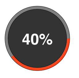
<ProgressBar
          width="500px"
          height="10px"
          fontColor="white"
          trackWidth="10"
          percentage="40"
          trackPathColor="grey"
          trackBorderColor="black"
          hollowBackgroundColor="#333333"
          defColor={{
            fair: 'orangered',
            good: 'yellow',
            excellent: 'green',
            poor: 'red',
          }}
          scrollArea={myAppRef}
        />
output
