react-audio-spectrogram-player v2.0.1
react-audio-spectrogram-player
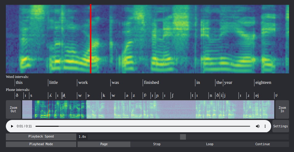
An audioplayer written in React that computes and shows a mel scale spectrogram along with the audio. The playhead on the spectrogram is synchronized with the audioplayer. You can zoom in on the spectrogram and slow down the audio. It acts almost as a microscope for audio.
The spectrogram is computed using web assembly. The Rust code for this can be found here.
If you use Python, there is also a jupyter widged based on this component. You can find it here.
Preview
See the demo.

Installation
npm i react-audio-spectrogram-playerUsage
Basic Usage
In a React component:
import SpectrogramPlayer from "react-audio-spectrogram-player";
import src from "./path/to/your/audio/file.wav";

const App = () => {
  return <SpectrogramPlayer src={src} />;
};
Customization
To override the spectrogram values, (supoose you precomputed the spectrogram values), you can use the sxx prop.
return (
  <SpectrogramPlayer
    src={src}
    sxx={sxx} // number[][]
  />
);
There are several other props to customize the spectrogram and the interface.
return (
  <SpectrogramPlayer
    src={src}
    sampleRate={16000}
    n_fft={1024}
    win_length={400}
    hop_length={160}
    f_min={20}
    f_max={8000.0}
    n_mels={128}
    top_db={80}
    annotations={annotations}
    navigator={true}
    settings={true}
    specHeight={300}
    navHeight={80}
    colormap="viridis"
    transparent={false}
    dark={true}
  />
);| Prop | Type | Default | Description |
|---|---|---|---|
src | string | required | Path to the wav audio file. |
sxx | number[][] | undefined | 2D array with spectrogram values. Will override the spectrogram computed from the audio. |
sampleRate | number | 16000 | Sample rate of the audio. |
n_fft | number | 1024 | Number of FFT bins. |
win_length | number | 400 | Window length. |
hop_length | number | 160 | Hop length. |
f_min | number | 0 | Minimum frequenc corresponding to the first mel band. |
f_max | number | sampleRate/2 | Maximum frequency corresponding to the last mel band. |
n_mels | number | 128 | Number of mel bands. |
top_db | number | 80 | Maximum decibel value. |
specHeight | number | 200 | Height of the main spectrogram. |
navigator | boolean | false | Allow user to zoom in with the navigator UI. |
navHeight | number | 50 | Height of the navigator UI. |
settings | boolean | false | Allow user to change some playback behaviour. |
colormap | string | 'viridis' | The colormap to use. |
transparent | boolean | false | Use rgba values for spectrogram image. |
dark | boolean | false | Use dark mode theme. |
Annotations
You can annotate intervals (such as words or phones) below the spectrogram.
First place your annotation data in one or more
(string | number)[][]objects.- Column 1: Start time in seconds
- Column 2: End time in seconds
- Column 3: Annotation as a string
For example:
const wordIntervals = [
    [0.54, 0.84, "this"],
    [0.84,  1.1, "little"],
    [ 1.1,  1.4, "work"],
    ...
]
const phoneIntervals = [
    [0.54, 0.62, "ð"],
    [0.62, 0.67, "ɪ"],
    [0.67, 0.84, "s"],
    ...
]
Now create a list of annotation objects that will be passed to the component:
const annotations = [
  {
    data: wordIntervals,
    title: "Word intervals:",
    height: 30,
    strokeWidth: 1,
  },
  {
    data: phoneIntervals,
    title: "Phone intervals:",
    height: 30,
    strokeWidth: 1,
  },
];
The
title,heightandstrokewidthentries are optional.Pass the list to the component via the
annotationsprop:return ( <SpectrogramPlayer src={src} sxx={sxx} specHeight={200} navHeight={50} annotations={annotations} /> );
Future Updates
- Start values for settings. E.g., start with 0.5x speed on load.
- Better touch screen compatibility.