1.0.6 • Published 1 year ago
react-blur-img v1.0.6
BlurImg Component
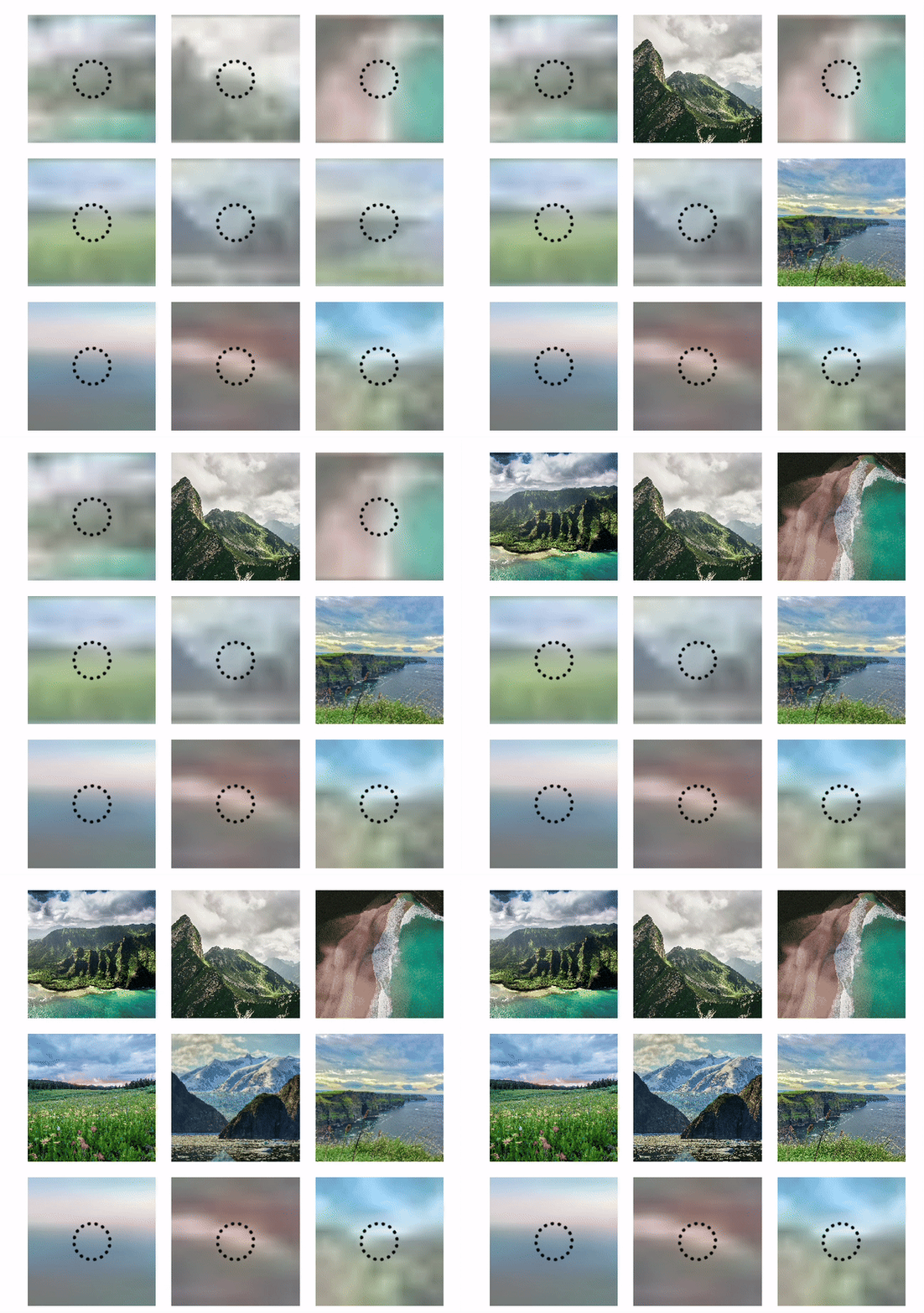
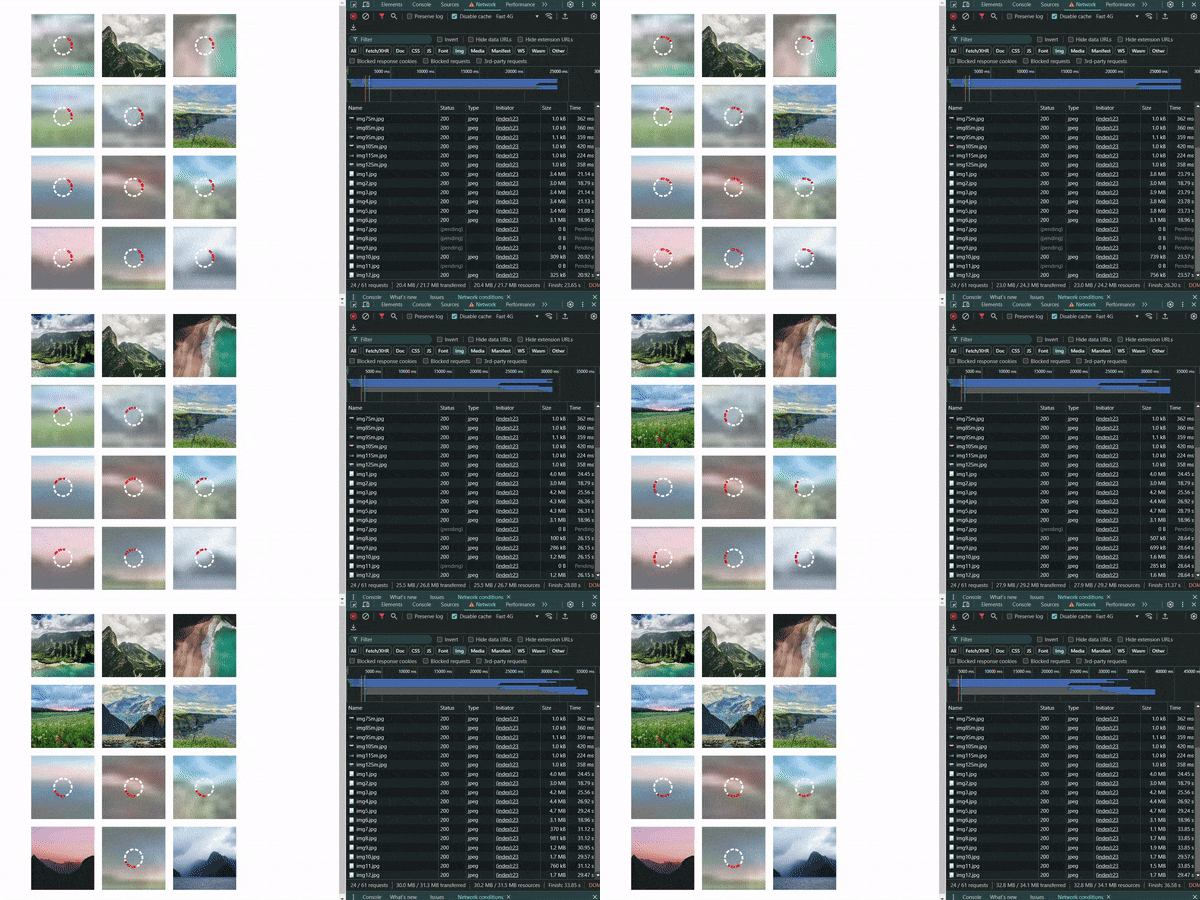
The BlurImg component is a React component that provides a blurred placeholder image until the main image finishes loading. It also supports an optional loading spinner for a better user experience.
Try the Demo

Features
- Lazy-loads images with a blurred placeholder.
- Displays a loading spinner while the image loads.
- Fully customizable via props for
aspectRatio,objectFit, andobjectPosition. - Easy to use and integrate into any React project.
Installation
- Download the package via NPM.
npm i react-blur-img- Import the component in your project
import { BlurImg } from "react-blur-img";- Usage
import { BlurImg } from "react-blur-img";
import { img } from "https://example.com/real-image.jpg";
import { placeHolder } from "https://example.com/placeholder.jpg";

function App() {
  return (
    <div>
      <BlurImg img={img} placeHolder={placeHolder} alt="Descriptive Alt Text" />
    </div>
  );
}
Props
Required props
| Prop | Type | Description |
|---|---|---|
| img | String | The image to render. |
| placeHolder | String | PlaceHolder to render while image is loading. |
| alt | String | The alt text |
Optional props
| Prop | Type | Default | Description |
|---|---|---|---|
| aspectRatio | React.CSSProperties["aspectRatio"] | 1/1 | Controls the aspect ratio of the image (e.g., "16/9") |
| objectFit | React.CSSProperties["objectFit"] | contain | Specifies how the image should fit within its container (e.g., "cover", "contain"). |
| objectPosition | React.CSSProperties["objectPosition"] | center | Determines the position of the image within its container (e.g., "center", "top"). |
| Spinner | SpinnerProps | Can change the default Spinner. |
Spinner Props structure
| Prop | Type | Default | Description |
|---|---|---|---|
| width | React.CSSProperties["width"] | 40px | Controls the width for the spinner. |
| height | React.CSSProperties["height"] | 40px | Controls the height for the spinner. |
| borderWidth | React.CSSProperties["borderWidth"] | 4px | Controls the thicknes for the spinner. |
| color | React.CSSProperties["borderColor"] | black | Controls the color for the spinner. |
| style | React.CSSProperties["borderStyle"] | dotted | Controls the style for the spinner. |
| borderTop | React.CSSProperties["borderTop"] | none | Controls Top border to create another rotating effect. |
CSS classes
| Name | Description |
|---|---|
| blur-load-container | The main wrapper for the image and the loading placeholder. |
| blur-load-img | Handle img style |
| loaded | Added to the container once the image has fully loaded, removing the placeholder and making the image visible. |
| blur-load-spinner | Defines the spinner's appearance and animation. |
Custom Spinner usage
import { BlurImg, SpinnerProps } from "react-blur-img";
import { img } from "https://example.com/real-image.jpg";
import { placeHolder } from "https://example.com/placeholder.jpg";

const spinner: SpinnerProps = {
  width: 40,
  height: 40,
  borderTop: "4px dashed red",
  color: "white",
  style: "dashed",
};

function App() {
  return (
    <div>
      <BlurImg
        img={img}
        placeHolder={placeHolder}
        alt="Descriptive Alt Text"
        spinner={spinner}
      />
    </div>
  );
}
Tip for Improving Placeholder Loading
To create a placeholder background similar to the original image, you can simply take the original image and resize it to a very small dimension, such as 20x20px or 30x30px. This way, the placeholder will visually resemble the final version, and its loading will be almost instantaneous due to the reduced size, providing a smoother user experience.