react-booking-selector v1.0.2
React Booking Selector

Getting Started
yarn add react-booking-selector styled-componentsimport BookingSelector from 'react-booking-selector'
class App extends React.Component {
state = { schedule = [], blocked = [] }
handleChange = newSchedule => {
this.setState({ schedule: newSchedule })
}
render() {
return (
<BookingSelector
selection={this.state.schedule}
blocked={this.state.blocked}
numDays={5}
minTime={8}
maxTime={22}
onChange={this.handleChange}
/>
)
}
}<BookingSelector />
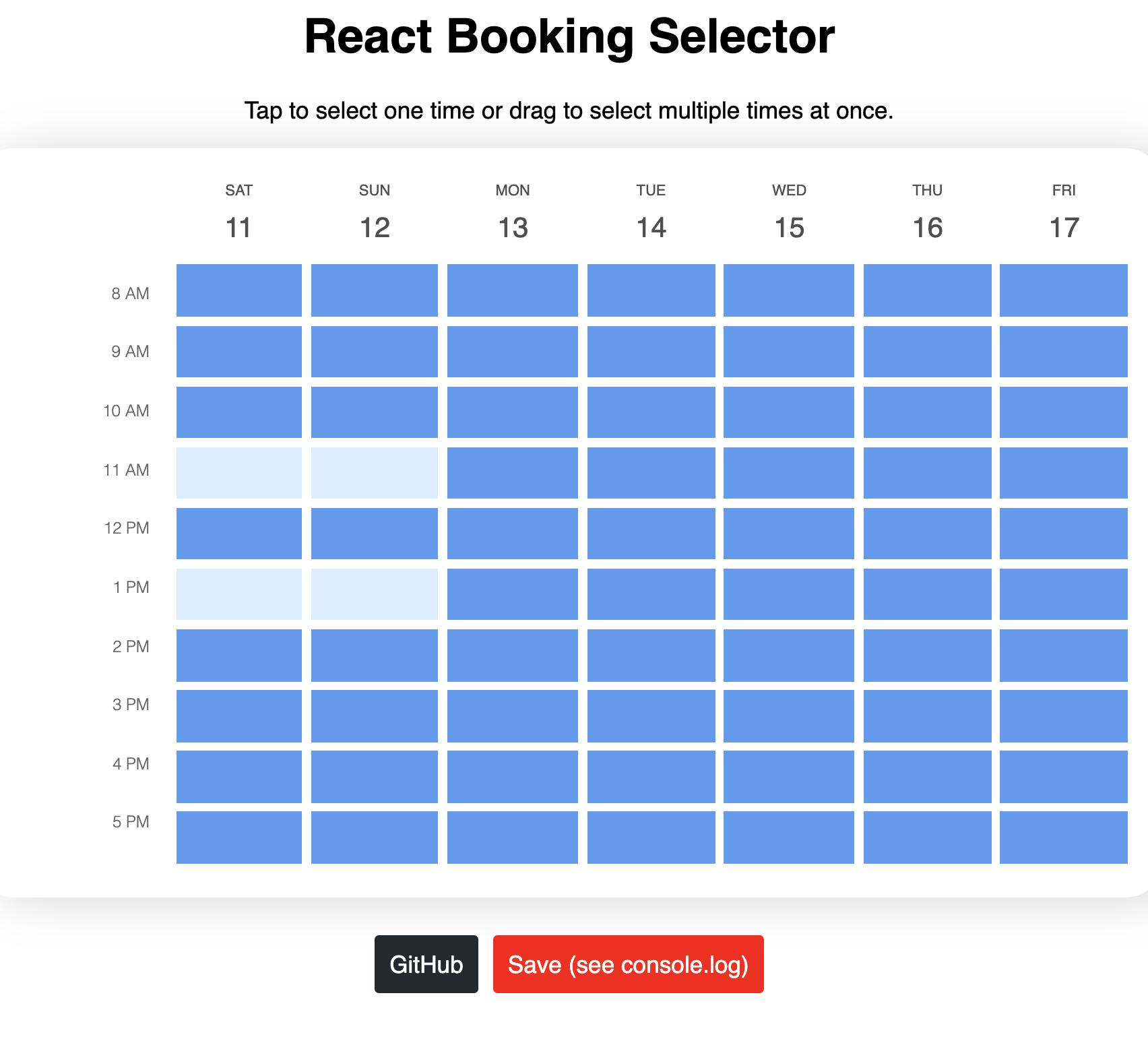
BookingSelector is a controlled component that can be used easily with the default settings. Just provide a controlled value for selection, blocked and include an onChange handler and you're good to go. Further customization can be done using the props outlined below.
To customize the UI, you can either:
- Specify values for the color, margin, format, etc. props
- Use the
renderDateCellrender prop to handle rendering yourself.
Props
selection
type: Array<Date>
description: List of dates/times that should be filled in on the grid (reflect the start time of each cell).
required: yes
blocked
type: Array<Date
description: These are blocked or unavailable dates/times on the calendar that will be filled in on the grid and unavailable to select.
required: yes
selectionScheme
type: 'square' | 'linear'
description: The behavior for selection when dragging. square selects a square with the start and end cells at opposite corners. linear selects all the cells that are chronologically between the start and end cells.
required: no
default value: 'square'
onChange
type: (Array<Date>) => void
description: Called when selected availability is changed. The new list of selected dates is passed in as the first parameter.
required: yes
startDate
type: Date
description: The date on which the grid should start (time portion is ignored, specify start time via minTime)
required: no
default value: today
numDays
type: number
description: The number of days to show, startin from today
required: no
default value: 7
minTime
type: number
description: The minimum hour to show (0-23)
required: no
default value: 9
maxTime
type: number
description: The maximum hour to show (0-23)
required: no
default value: 23
dateFormat
type: string
description: The date format to be used for the column headers
required: no
default value: 'M/D'
margin
type: number
description: The margin between grid cells (in pixels)
required: no
default value: 3
unselectedColor
type: string
description: The color of an unselected cell
required: no
default value: 'rgba(89, 154, 242, 1)'
selectedColor
type: string
description: The color of an unselected cell
required: no
default value: 'rgba(162, 198, 248, 1)'
hoveredColor
type: string
description: The color of a hovered cell
required: no
default value: '#dbedff'
blockedColor
type: string
description: The color of a blocked cell
required: no
default value: 'rgba(79, 79, 79, 1)'
renderDateCell
type: (time: Date, selected: boolean, refSetter: function) => React.Node
description: A render prop function that accepts the time this cell is representing and whether the cell is selected or not and returns a React element. It is your responsibility to apply the refSetter as a ref to the component you render -- neglecting to do so will cause the component to not work properly for touch devices. If you choose to use this custom render function, the color props above have no effect.
required: no