react-box-layout v2.0.7
react-layout - Programmatic layout for web applications
VBox and HBox for the web
react-layout uses the 'yoga' flex layout engine to provide predictable, programmatic layout to web applications. What's 'programmatic' layout? In this context it means using absolute CSS positioning that's calculated in JS.
Though react-layout does use CSS under the hood, the CSS it uses is boiled down to absolute layout, top, left, width, height, all the positional calculations are done in JS.
Why would you do this?
Mostly because I can, but also because I think this fits a niche. I know we've had flexbox for quite some time, but I've never been satisfied with a pure CSS approach to controlling the layout of a web application.
CSS was designed to create responsive, re-flowable documents and I've never felt was a great fit for complex application layouts, layouts that need some flexibility, but don't need to be 100% responsive.
That's crazy, why don't you just absolutely positive everything in your 'apps' and be done with it?
Absolute positing is far too inflexible because you can't deliver your app with a fixed viewport size (unless you've got a time machine to 1999). Between a fixed viewport and a purely responsive web application, there's a nice medium where you have a large, desktop sized viewport, and you want your content to adapt to the size of the viewport, within reason.
This implementation of VBox and HBox sits squarely in that goldilocks zone, providing fast, predictible and responsive layout for desktop sized viewports.
Why not just use flexbox?
react-layout uses 'yoga', a C++ implementation of the flexbox layout engine (compiled down to asm.js). But that's not really the point here. How easily have you ever been able to just create a flexbox layout that does what you want it to do? Is it align-items? Or is it justify-content. flex-grow? flex-shrink?
The flexbox CSS api is complex, and it's overkill in many situations. VBox and HBox prefers composition and nesting to complex configuration. With just a few properties and nested VBox/HBox layouts you can accomplish highly complex layouts that adapt and change as the available space changes.
Let's start with an example
<VBox centered={true}>
  <HBox centered={true} spacing="10%" height="75%">
    <VBox width="20%" />
    <VBox width="20%" />
    <VBox width="20%" />
  </HBox>
</VBox>
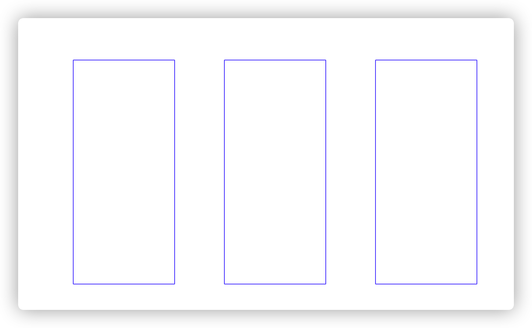
Here's two versions of that layout with different viewport aspect ratios:


The wrapping tag is a centered VBox, this means it will layout its children vertically within itself, splitting any left over space the children do not consume equally above and below the children.
Its only child is an HBox, which is also centered. Its height is 75%, meaning it will always consume 75% of the height of it's parent.
The HBox itself is centered, so its children will be layed out horizontally and centered. The HBox also has spacing set to "10%", this means space will be injected between elements, taking up 10% of the available width for each spacer.
This is one of the benefits of programmatic layout, as this is very difficult to accomplish with pure CSS.
Ok, that's kind nice, but isn't this incredibly slow?
No, not really. Run npm run start to see the torture test example. This has a deeply nested complex layout that's bound to the size of the viewpoint. Every time that viewport says changes, the entire layout is recalculated and every single child Box is re-rendered.