A high-performance React timeline component built on HTML5 Canvas — designed for rich interactivity, arbitrary time scales, and pixel-perfect rendering at any zoom level.
Most timeline and Gantt libraries render rows, bars, and labels as DOM elements. That works fine for small datasets — but it breaks down quickly.
Advantages of the Canvas approach:
- Performance at scale — 1,000+ task bars render and scroll smoothly because there is no DOM to reflow or repaint. The canvas is redrawn as a single raster operation.
- Unlimited shapes — Bars, pins, speech bubbles, clouds, stars, curly braces, baselines, circles with center text, and more. CSS cannot express these shapes; Canvas can draw anything.
- Pixel-precise layout — Every element is positioned and sized to the exact pixel, regardless of browser zoom level, screen DPI, or font scaling.
- Consistent cross-browser rendering — Canvas output is identical across all modern browsers. No CSS quirks, no layout engine differences.
- Print layout — A dedicated print mode produces clean, paginated output without additional styling effort.
- Parallel timelines — Multiple independent timeline instances on the same page work without interference, since each renders to its own canvas.
The common Canvas objection — addressed:
Canvas content is not readable by search engine crawlers or screen readers. react-canvas-timeline solves this by optionally rendering an invisible HTML representation of the timeline data alongside the canvas, making content indexable and accessible without sacrificing rendering performance.
npm install --save react-canvas-timeline
import { ReactCanvasTimeline, Resource, Task, LCal } from 'react-canvas-timeline';

const resources = [
  new Resource(0, 'Alice', 'Developer', false),
  new Resource(1, 'Bob',   'Designer',  false),
];

const now = new LCal().initNow();

const tasks = [
  new Task(0, now.clone(), now.clone().addDay(5),  0, 'Task A', '', null),
  new Task(1, now.clone().addDay(3), now.clone().addDay(10), 1, 'Task B', '', null),
];

export default function App() {
  return (
    <ReactCanvasTimeline
      resources={resources}
      tasks={tasks}
      width={900}
      height={400}
    />
  );
}
Run the Storybook for full working examples:
npm run storybook
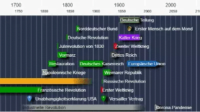
react-canvas-timeline uses its own calendar system, LCal, instead of JavaScript's Date. This allows representing any point in time from the Big Bang to the far future, internally stored as a Julian day number with minute resolution.
Every LCal value carries a precision that describes how accurately the point in time is known. This is used both for display (labels adapt to the granularity) and for rendering (bars representing geological epochs look different from bars representing a single day).
| Level |
Granularity |
| 0 |
1 Gigayear |
| 1 |
100 Megayears |
| 2 |
10 Megayears |
| 3 |
1 Megayear |
| 4 |
100 Kiloyears |
| 5 |
10 Kiloyears |
| 6 |
1 Kiloyear |
| 7 |
100 years |
| 8 |
10 years |
| 9 |
1 year |
| 10 |
1 month |
| 11 |
1 day |
| 12 |
1 hour |
| 13 |
1 minute |
A single timeline can mix tasks at different precision levels — a geological epoch alongside a modern calendar appointment.
| Story |
Feature |
01 |
1,000-bar stress test — 100 resources, 1,000 tasks rendered and scrolled without frame drops |
02 |
Hierarchy — Resources and tasks support parent–child nesting with collapse/expand |
32 |
Zoom & fit — Programmatic zoom-to-fit-all and zoom-to-selection |
| Story |
Feature |
12 |
Bar size — Configurable bar height per timeline |
13 |
Bar groups — Group bars by color and shape within a resource row |
16 |
Shapes & sizes — Full shape catalog: RECT, PIN_INTERVAL, SMALL_PIN_INTERVAL, CLOUD, CURLYBRACE, STAR, CIRCLE, SPEECHBUBBLE, CIRCLE_MIDDLETEXT, BASELINE, TRANSPARENTBACK with transparency and font templates |
20 |
Speech bubbles — Callout shapes with configurable direction |
21 |
Cloud shapes — Organic cloud-style task bars |
03 |
Icons — Per-resource and per-task icon images |
18 |
Short labels — Compact label mode for PIN_INTERVAL and SMALL_PIN_INTERVAL |
29 |
Multiline labels — Text wraps across multiple lines; bar expands vertically to fit |
35 |
Transparent shapes — Background-only shapes without fill |
37 |
Baseline — Render only a baseline marker with no bar body |
34 |
Circle with center text — Circle shape displaying text in the center |
| Story |
Feature |
31 |
Bright / dark background — Toggle between light and dark themes at runtime |
09 |
Wait overlay styling — Custom loading overlay with full style control |
| Story |
Feature |
05 |
Event callbacks — onClick, onPress, onLongPress, onMouseMove, onMousePan with full position and task context |
06 |
Drag & drop — Drag tasks to new times or resources; onDrop callback with position data |
07 |
Highlight & scroll-to — Programmatically highlight a task and scroll it into view |
08 |
Measure intervals — Draggable interval sliders for measuring durations on the canvas |
24 |
Dynamic shape changes — Change task shapes at runtime without full re-render |
| Story |
Feature |
19 |
Resource headers — Three modes: default (200 px sidebar), inline (40 px compact row), or no header |
10 |
Additional controls — Inject custom JSX into the vertical and horizontal slider areas |
27 |
No sliders — Render the timeline without any navigation sliders |
11 |
Print layout — Collapse indicators hidden; output optimized for printing |
14 |
Responsive resize — Adapt width and height dynamically as the container resizes |
15 |
Parallel timelines — Multiple independent timeline instances on the same page |
23 |
Config overrides — Fine-grained control over colors, fonts, spacing, and behavior via the config prop |
| Story |
Feature |
39 |
Connections — Draw labeled arrows between tasks across resources |
38 |
Resource decorations — Per-resource header colors and background decorations |
04 |
Task backgrounds — Custom painter for the area behind task bars (e.g. agreed-time shading) |
25 |
Embedded diagrams — Paint arbitrary chart data (line, bar, etc.) directly onto the canvas within a resource row |
26 |
Invisible HTML — Render an invisible HTML layer for SEO indexing and screen-reader accessibility |
33 |
Offscreen image rendering — Toggle offscreen canvas pre-rendering for complex scenes |
30 |
Position & bar group features — Combined demo of positioning and grouping capabilities |
40 |
Error handling — Graceful handling of invalid or missing task data |
| Story |
Feature |
17 |
All precision levels — Visual demonstration of all 14 precision levels on one timeline |
28 |
Precision with images & labels — Precision levels 7–13 combined with icons, labels, and multiple shapes |
| Story |
Feature |
36 |
Language switching — Switch between German, English, and Ukrainian at runtime via languageCode prop |
41 |
Current date indicator callbacks — Custom formatting for the date label shown at the cursor position |
| Prop |
Type |
Default |
Description |
resources |
Resource[] |
— |
Array of resource rows to display |
tasks |
Task[] |
— |
Array of tasks to render on the timeline |
| Prop |
Type |
Default |
Description |
width |
number |
window.innerWidth × 0.9 |
Canvas width in pixels |
height |
number |
window.innerHeight × 0.9 |
Canvas height in pixels |
headerHeight |
number |
55 |
Height of the time axis header in pixels |
widthOverlap |
number |
— |
Pixel bleed on the left/right edges |
heightOverlap |
number |
— |
Pixel bleed on the top/bottom edges |
| Prop |
Type |
Default |
Description |
start |
LCal |
auto |
Initial visible start time |
end |
LCal |
auto |
Initial visible end time |
timeZone |
string |
"Europe/Berlin" |
IANA timezone identifier |
languageCode |
string |
— |
Locale code for label formatting (e.g. "en", "de", "uk") |
| Prop |
Type |
Default |
Description |
barSize |
number |
40 |
Height of task bars in pixels |
headerType |
string |
— |
Resource header mode: "default" (200 px), "inline" (40 px), or omit for no header |
brightBackground |
boolean |
— |
Optimize contrast for light backgrounds |
paintShadows |
boolean |
— |
Enable drop shadows on task bars |
printLayout |
boolean |
— |
Optimize rendering for print output |
workWithOffscreenImage |
boolean |
— |
Use an offscreen canvas for pre-rendering |
shortLabels |
boolean |
— |
Show short labels on PIN_INTERVAL and SMALL_PIN_INTERVAL shapes |
longlabels |
boolean |
— |
Allow labels to extend beyond the bar to the screen edge |
| Prop |
Type |
Description |
onClick |
(event: TimelineEvent) => void |
Fired on click; event contains time, task, resource, and canvas coordinates |
onPress |
(event: TimelineEvent) => void |
Fired on pointer down |
onLongPress |
(event: TimelineEvent) => void |
Fired after a long press gesture |
onMouseMove |
(event: TimelineEvent) => void |
Fired on pointer move |
onMousePan |
(event: TimelineEvent) => void |
Fired while panning |
onPanEnd |
(timeline) => void |
Fired when a pan gesture ends |
onDrop |
(timeline, obj, x, y) => void |
Fired when an item is dropped onto the timeline |
onZoomChange |
(start: LCal, end: LCal) => void |
Fired when the visible time window changes |
onOffsetChange |
(startTime, endTime, resOffset) => void |
Fired when the scroll offset changes |
onToolTip |
(event: TimelineEvent) => void |
Fired to request a tooltip |
onMeasureIntervalChanged |
(interval, isAligning) => void |
Fired when the measure sliders move |
| Prop |
Type |
Description |
additionalPainter |
(ctx, height) => void |
Paint additional content on top of the canvas |
resourcePainter |
(ctx, resource, x, y, width, height, printLayout, positionCollector) => void |
Fully custom resource row painter |
taskBackgroundPainter |
(ctx, timeline, task) => void |
Paint behind individual task bars |
dateFormatter |
(date: LCal) => string |
Override the default date label formatter |
| Prop |
Type |
Description |
initialMeasureInterval |
{ start: LCal, end: LCal } |
Initial position of the measure sliders |
measureDurationLock |
boolean |
Keep the interval duration fixed while moving |
sliderValues |
SliderValue[] |
Predefined zoom level options shown in the slider control |
| Prop |
Type |
Description |
config |
object |
Partial config object merged with the defaults (see Config Reference below) |
InstrumentedTimeline wraps ReactCanvasTimeline and adds navigation controls (now-button, sliders, zoom buttons). It accepts all props above plus:
| Prop |
Type |
Description |
instrumentedTimelineCallback |
(ref) => void |
Receives the component ref for programmatic control |
onNowButtonLongPress |
(date: LCal) => void |
Long-press on the "now" navigation button |
onNowDialogClose |
() => void |
Fired when the "now" button dialog is dismissed |
yearPositions |
number |
Number of year tick positions to display (e.g. 12) |
highlightArrow |
JSX |
Custom element shown as the scroll-to-task arrow |
measureResult |
(interval) => JSX |
Render the measure result display |
measureButtons |
JSX |
Custom buttons shown during measurement mode |
verticalAdditionalControl |
JSX |
Extra controls in the vertical slider area |
horizontalAdditionalControl |
JSX |
Extra controls in the horizontal slider area |
nowbuttonChildren |
JSX |
Content rendered inside the "now" button |
waitOverlay |
(width, height) => JSX |
Custom loading overlay renderer |
showWaitOverlay |
boolean |
Show or hide the loading overlay |
dragEnabled |
boolean |
Enable drag-and-drop of task bars |
currentDateIndicatorLeftCallback |
(date: LCal) => string |
Format the left side of the cursor date indicator |
currentDateIndicatorRightCallback |
(date: LCal) => string |
Format the right side (duration) of the cursor date indicator |
children |
JSX |
Children rendered inside the timeline container |
All pointer callbacks receive a TimelineEvent with these properties:
| Property |
Type |
Description |
time |
LCal |
Time at the cursor position |
task |
Task | null |
Task under the cursor, if any |
resource |
Resource | null |
Resource row under the cursor, if any |
_x, _y |
number |
Canvas-relative coordinates |
_absX, _absY |
number |
Absolute document coordinates |
timeheaderPressed |
boolean |
Whether the time header was the target |
resourceheaderPressed |
boolean |
Whether the resource header was the target |
resourceCheckboxPressed |
boolean |
Whether the resource checkbox was the target |
mouseOverStartMeasureSlider |
boolean |
Cursor is over the start measure slider |
mouseOverEndMeasureSlider |
boolean |
Cursor is over the end measure slider |
Pass a partial object to the config prop. Only the keys you provide will override the defaults.
| Key |
Default |
Description |
ARROWHEADLENGTH |
20 |
Arrow head length in pixels |
OVERLAYHEADERWIDTH |
150 |
Width of the overlay resource header |
OVERLAYHEADERHEIGHT |
70 |
Height of the overlay resource header |
OVERLAY_CHECKBOX_X |
10 |
Checkbox x-offset inside the overlay header |
OVERLAY_CHECKBOX_Y |
20 |
Checkbox y-offset inside the overlay header |
CHART_INSET |
25 |
Padding around chart areas in pixels |
INLINE_RES_HEIGHT |
40 |
Row height in inline header mode |
| Key |
Default |
Description |
resMainFont |
"14px Roboto, sans-serif" |
Primary font for resource labels |
resSubFont |
"12px Roboto, sans-serif" |
Secondary font for resource details |
timelineMainFont |
"16px Roboto, sans-serif" |
Primary font for time axis labels |
timelineSubFont |
"12px Roboto, sans-serif" |
Secondary font for time axis details |
resourceMainFont |
"12px Roboto, sans-serif" |
Font for resource element labels |
currentDateOnMousePositionFont |
"14px Roboto, sans-serif" |
Font for the cursor date indicator |
overlayMessageFont |
"16px Roboto, sans-serif" |
Font for overlay messages |
positionDecorationFont |
"Roboto, sans-serif" |
Font for position decorations |
connectionFont |
"Roboto, sans-serif" |
Font for connection line labels |
| Key |
Default |
Description |
resMainFontColor |
"#000" |
Primary resource label color |
resSubFontColor |
"#CCC" |
Secondary resource label color |
timelineMainFontColor |
"#000" |
Primary time axis label color |
timelineSubFontColor |
"#555" |
Secondary time axis label color |
currentDateOnMousePositionColor |
"rgba(44,60,80,0.7)" |
Background of the cursor date box |
currentDateOnMousePositionBorderColor |
"#FFF" |
Border of the cursor date box |
timelineHeaderColor |
"#F7F7F7" |
Time axis header background |
timelineHeaderMainTickColor |
"rgba(50,50,50,0.5)" |
Major tick marks in the time header |
timelineMainTickColor |
"rgba(200,200,200,0.8)" |
Major tick lines on the timeline body |
timelineSubTickColor |
"rgba(200,200,200,0.5)" |
Minor tick lines on the timeline body |
resourceOverlayInlineColor |
"rgba(120,120,120,0.8)" |
Overlay color in inline header mode |
saturdayColor |
"rgba(255,240,240,0.2)" |
Saturday column highlight |
sundayColor |
"rgba(255,220,220,0.2)" |
Sunday column highlight |
| Key |
Default |
Description |
hideResourceHeaderIfOnlyOneRes |
true |
Hide the resource header when only one resource is visible |
getTaskBarInset |
function |
Returns the pixel inset for a task bar based on its group's collapse state |
getTaskBarInsetByCollapseState |
function |
Returns 2 if the group is collapsed, 5 if expanded |
https://github.com/peterrank/timeline
Apache-2.0