react-card-slide v1.0.13
geeknection/react-card-slide
React Jsx component used to create Card Item and Slide of Card Items
Getting started
yarn add react-card-slide
or
npm install react-card-slide --save
Usage
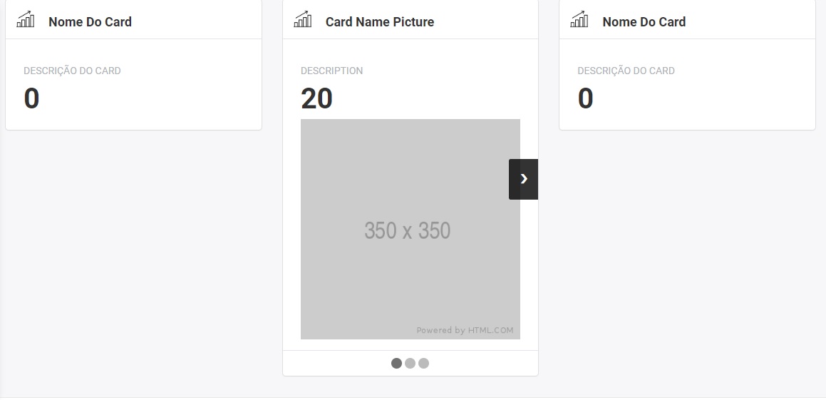
Example with slide
import { CardSlide } from 'react-card-slide/dist'; <CardSlide items={[{
cardName: 'Card Name',
cardDescription: 'Description',
cardTotal: 0,
showBodyImage: true,
bodyImage: 'https://via.placeholder.com/350x350'
},{
cardName: 'Card Name 2',
cardDescription: 'Description 2',
cardTotal: 1
},{
cardName: 'Carde Name 3',
cardDescription: 'Description 3',
cardTotal: 2
}]}/>Example without slide
import { CardSlideItem } from 'react-card-slide/dist'; <CardSlideItem
cardName='Card Name'
cardDescription='Description',
cardTotal={0},
showBodyImage={true},
bodyImage='https://via.placeholder.com/350x350'/>Props
itemscardSelectedcardHeaderIconcardNamecardDescriptioncardTotalcardDatacardGraphLineColorcardGraphBgColorshowFootershowBodyImageshowBodyTextbodyImage
items
Used to render layout list of CardSlide.
| Type | Required |
|---|---|
| Array | Yes |
cardSelected
Used to know what is CardSlideItem that will show in slide list.
| Type | Required |
|---|---|
| Boolean | No |
cardHeaderIcon
Icon that will be show on top-left of header CardSlideItem.
| Type | Required |
|---|---|
| Image | Year |
cardName
Card name that will be show on top-left of header CardSlideItem.
| Type | Required |
|---|---|
| String | Yes |
cardDescription
Card description that will be show on body of CardSlideItem.
| Type | Required |
|---|---|
| String | No |
cardTotal
Total value that will be show on body of CardSlideItem.
| Type | Required |
|---|---|
| Number | No |
cardData
Graphic data that will be show on body of CardSlideItem.
| Type | Required |
|---|---|
| Array | No |
cardGraphLineColor
Line that is defined to points in Graphic (In future).
| Type | Required |
|---|---|
| String | No |
cardGraphBgColor
Background color of Graphic (In future).
| Type | Required |
|---|---|
| String | No |
showFooter
Show footer in CardSlideItem.
| Type | Required |
|---|---|
| Boolean | No |
showBodyImage
Show image on body of CardSlideItem.
| Type | Required |
|---|---|
| Boolean | No |
bodyImage
Image body of CardSlideItem.
| Type | Required |
|---|---|
| Image | No |
showBodyText
Show card description on body of CardSlideItem.
| Type | Required |
|---|---|
| Boolean | No |
Contributors
This module was extracted from React Js core. Please reffer to https://github.com/geeknection/react-card-slide/graphs/contributors for the complete list of contributors.
License
The library is released under the MIT licence. For more information see LICENSE.
