react-circular-multi-progressbar v0.6.5
React Circular Multi Progressbar
This is a fork of Kevin Qi's react-circular-progressbar that adds support for multiple bars within a single progressbar ring.
Multibar usage
<CircularProgressbar percentage={0} stackPercentages={[10, 20, 70]} />Original README follows
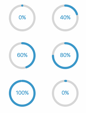
A circular progress indicator component, built with SVG. Easily customizable with CSS. See a live demo.
Installation
Install the npm module:
npm install react-circular-progressbarImportant: you'll also need to copy src/styles.css into your repo to use the default styling!
Usage
Import the component:
import CircularProgressbar from 'react-circular-progressbar';..and use the component in your JSX:
<CircularProgressbar percentage={60} />For more in-depth examples, take a look at the demo code to see JSX for the live demo page.
Props
| Name | Description |
|---|---|
percentage | Numeric percentage to display, from 0-100. Required. |
className | Classes to apply to the svg element |
strokeWidth | Width of circular line as a percentage relative to total width of component. Default: 8. |
background | Whether to display background color. Default: false. |
backgroundPadding | Padding between background and edge of svg as a percentage relative to total width of component. Default: 0. |
initialAnimation | Toggle whether to animate progress starting from 0% on initial mount. Default: false. |
counterClockwise | Toggle whether to rotate progressbar in counterclockwise direction. Default: false. |
classForPercentage | Function which returns an additional class to apply to top-level svg element, which can be used for coloring/styling percentage ranges differently. Example: (percent) => percent < 100 ? 'incomplete' : 'complete'. |
textForPercentage | Function which returns text to display, can be configured based on percentage. Example: (pct) => `${pct}%`. |
classes | Object mapping to override classNames of each svg element (root, trail, path, text, background). Enables styling with react-jss. See this PR for more detail. |
Customizing styles
Use plain CSS to customize the styling - the default CSS is a good starting point, but you can modify it as needed.
CSS hooks
There are CSS hooks for the path, trail, text, and background of the progressbar which you can customize, e.g.:
.CircularProgressbar-path       { stroke: red; }
.CircularProgressbar-trail      { stroke: gray; }
.CircularProgressbar-text       { fill: yellow; }
.CircularProgressbar-background { fill: green; }
Using multiple themes
You can use the className prop to add different classes to the top-level SVG element, and then use that to add different themes to different instances, e.g.:
<CircularProgressbar percentage={25} className="progressbar-red" />
<CircularProgressbar percentage={25} className="progressbar-blue" />
.progressbar-red .CircularProgressbar-path { stroke: red; }
.progressbar-blue .CircularProgressbar-path { stroke: blue; }Advanced usage
A lot of use cases can be covered with CSS. A few examples:
- Rotating progressbar
- Making the progressbar a gradient
- Putting progressbar around an image
- Customizing the background
Development
To run demo locally on localhost:8080:
yarn install
yarn start
Keep tests passing by running yarn test and yarn run lint.
