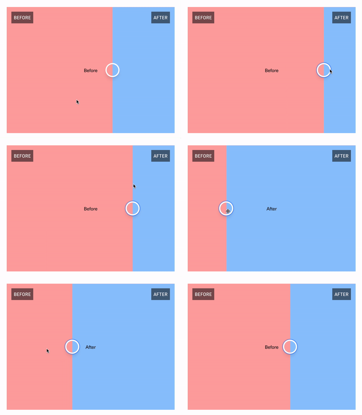
react-comparison-swiper v0.3.0
react-comparison-slider
https://react-comparison-slider.vercel.app/
React Comparison Slider is a fully customizable component for building bespoke, keyboard-accessible "before & after" sliders for the web. You bring the content and the visuals, and it'll handle the heavy lifting.


The "Hello World" example
The key ingredients to this component are:
- An
aspectRatio, expressed either as a fraction (e.g.,16/9), or as a string (e.g.,16x9or16:9). Providing an aspect ratio ensures that the before and after "images" (or HTML elements, whatever you decide to provide) line up with one another. - A
beforeComponentof typeReact.ReactNode(read: virtually any valid JSX element) - An
afterComponentof typeReact.ReactNode(read: virtually any valid JSX element) - A
defaultValue, if you'd like to use the component in an uncontrolled fashion
export const HelloWorldExample = () => {
  return (
    <ComparisonSwiper
      defaultValue={50}
      beforeComponent={<div css={{ background: 'tomato' }}></div>}
      afterComponent={<div css={{ background: 'cornflowerblue' }}></div>}
      aspectRatio={16 / 9}
    />
  );
};
Customization
React Comparison Slider does ship with some very lightweight styling, but encourages you to bring your own styling (BYOS)™️. Customization is handled via a set of render props that expose all of the underlying components for your needs. There is a total of 4 of these visual elements
// For adding a vertical "bar" or "scrubber" behind the handle
handleDecorationComponent?: React.FC<DecorationRenderProps>;

// For adding a visual indicator or label on the "before" slide (e.g., the "Before" badge in the GIF above)
beforeDecorationComponent?: React.FC<DecorationRenderProps>;

// For adding a visual indicator or label on the "after" slide (e.g., the "After" badge in the GIF above)
afterDecorationComponent?: React.FC<DecorationRenderProps>;

// For customizing the slider handle itself
handleComponent?: React.FC<CustomSliderHandleProps>;
handleDecorationComponent
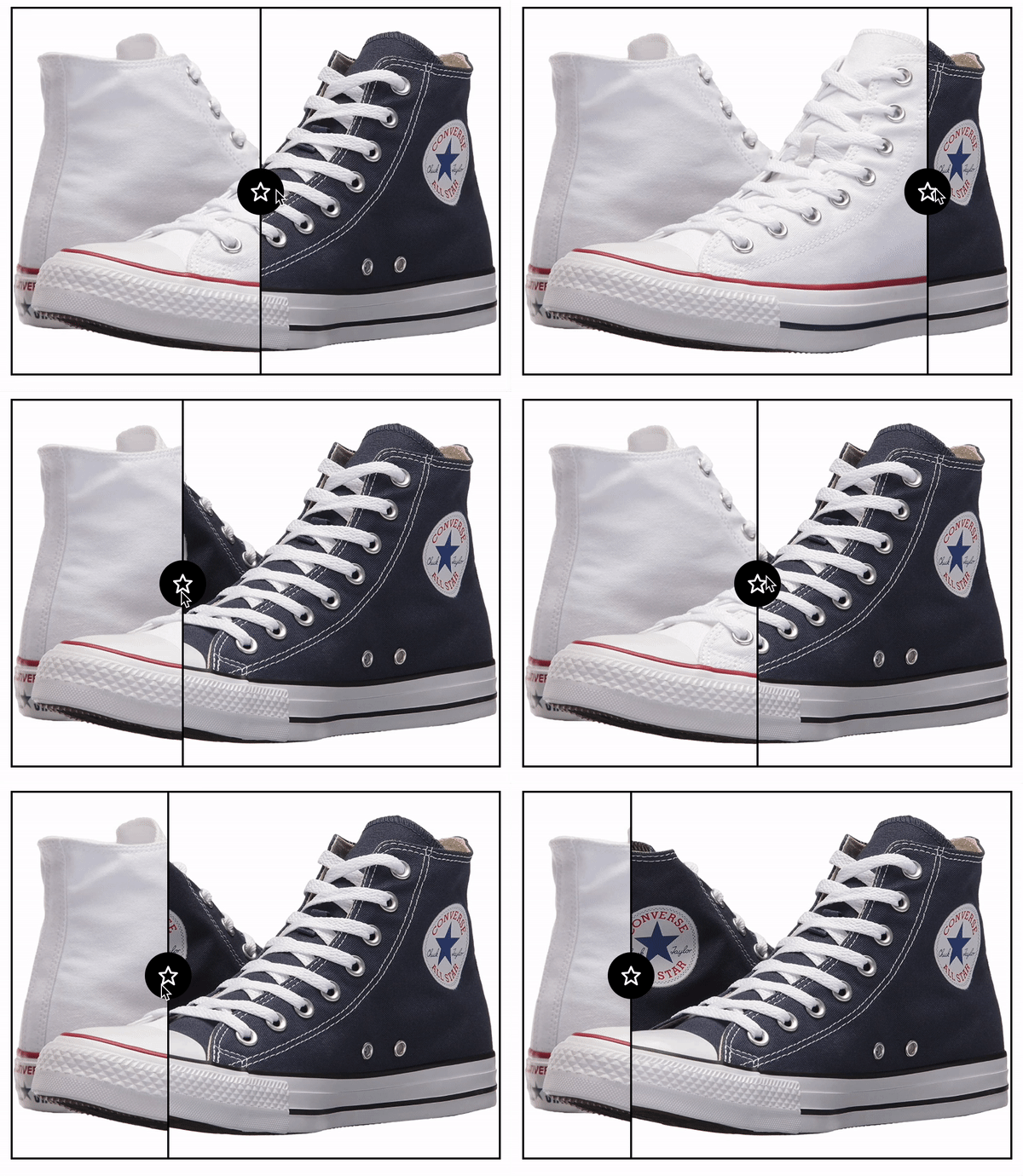
This is a fairly generic render prop, but since it passes through the current value of the slider, it allows you to add visual indicators such as a scrubbing bar to the slider itself. In the example below, we add a thin white bar above and below the handle as shown in the screenshot below.
export const CustomHandleDecorations = () => {
  return (
    <ComparisonSwiper
      defaultValue={50}
      beforeComponent={<div css={{ background: 'tomato' }}></div>}
      afterComponent={<div css={{ background: 'cornflowerblue' }}></div>}
      aspectRatio={16 / 9}
      handleDecorationComponent={({ value }) => {
        return (
          <Fragment>
            <div
              css={css`
                position: absolute;
                width: 4px;
                background: linear-gradient(
                  to top,
                  rgba(255, 255, 255, 1),
                  rgba(255, 255, 255, 0.2)
                );
                z-index: 10;
                pointer-events: none;
              `}
              style={{
                left: `calc(${value}% - 1px)`,
                height: `calc(50% - 0px)`,
              }}
            ></div>
            <div
              css={css`
                position: absolute;
                bottom: 0;
                width: 4px;
                background: linear-gradient(
                  to bottom,
                  rgba(255, 255, 255, 1),
                  rgba(255, 255, 255, 0.2)
                );
                z-index: 10;
                pointer-events: none;
              `}
              style={{
                left: `calc(${value}% - 1px)`,
                height: `calc(50% - 0px)`,
              }}
            ></div>
          </Fragment>
        );
      }}
    />
  );
};
beforeDecorationComponent and afterDecorationComponent
Let's say you want to add an indicator to both the "before" and "after" elements themselves. A label makes sense, right? 👇 You can access the current value of the slider, should you need that in your visual design.
export const CustomElementDecorations = () => {
  return (
    <ComparisonSwiper
      defaultValue={50}
      beforeComponent={<div css={{ background: 'tomato' }}></div>}
      afterComponent={<div css={{ background: 'cornflowerblue' }}></div>}
      beforeDecorationComponent={({ value }) => (
        <div
          css={css`
            position: absolute;
            left: 16px;
            top: 16px;
            background: black;
            color: white;
            padding: 8px;
          `}
        >
          Before ({value}%)
        </div>
      )}
      afterDecorationComponent={({ value }) => (
        <div
          css={css`
            position: absolute;
            right: 16px;
            top: 16px;
            background: black;
            color: white;
            padding: 8px;
          `}
        >
          After ({value}%)
        </div>
      )}
      handleDecorationComponent={() => null}
      aspectRatio={16 / 9}
    />
  );
};
handleComponent
Of course, you can fully style the handle itself. You can make it bigger, add an icon, add fancy shadows... You name it! One caveat that you must pay attention to is that you need to manually pass ref={props.forwardedRef} to the parent-most element in your custom component. Under the hood, this ref is used to ensure that the handle component lines up in the dead center of the viewport. There's likely a better way to do this, and I welcome a PR to this end 😜
export const CustomHandle = () => {
  return (
    <ComparisonSwiper
      defaultValue={50}
      beforeComponent={<div css={{ background: 'tomato' }}></div>}
      afterComponent={<div css={{ background: 'cornflowerblue' }}></div>}
      aspectRatio={16 / 9}
      handleComponent={(props) => {
        return (
          <div
            css={css`
              background: white;
              width: 48px;
              height: 48px;
              border-radius: 100%;
              display: inline-flex;
              align-items: center;
              justify-content: center;
              color: rgba(0, 0, 0, 0.5);
              cursor: pointer;

              &:hover {
                color: rgba(0, 0, 0, 1);
              }
            `}
            ref={props.forwardedRef}
            {...props}
          >
            <BiMoveHorizontal size={24} />
          </div>
        );
      }}
    />
  );
};
The API
Below is a high-level interface definition for the component. Note that because this component can be used in both a controlled and uncontrolled fashion, the first three props – value, defaultValue, and onChange are actually totally dynamic. That is to say, if you provide a defaultValue you won't be asked for value or onChange. In fact, you'll get a compilation error if you try to use them. Conversely, if you provide value and onChange, you won't be asked for defaultValue and will error out accordingly if you provide it.
// SPECIAL
value?: number;
onValueChange?: (value: number) => void;
defaultValue?: number;
// /SPECIAL

beforeComponent: React.ReactNode;
afterComponent: React.ReactNode;
aspectRatio: number | string;
handleDecorationComponent?: React.FC<DecorationRenderProps>;
beforeDecorationComponent?: React.FC<DecorationRenderProps>;
afterDecorationComponent?: React.FC<DecorationRenderProps>;
handleComponent?: React.FC<CustomSliderHandleProps>;