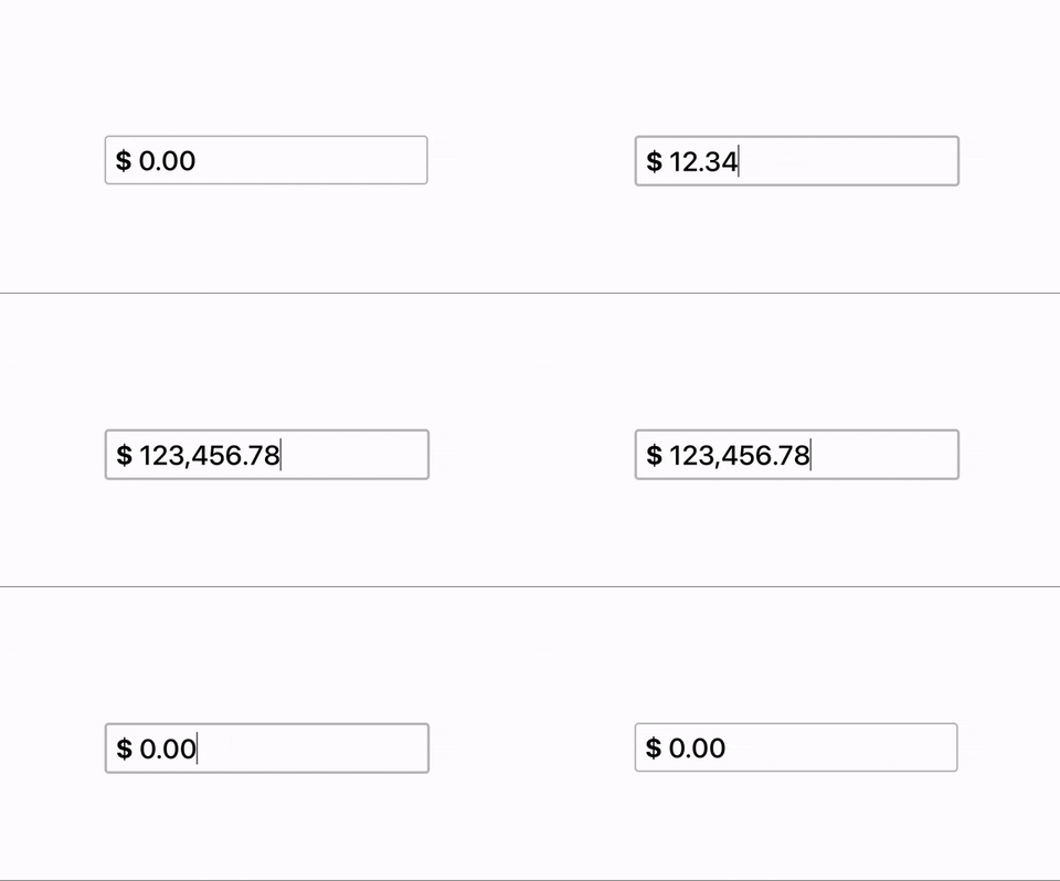
react-currency-input-formatter v1.0.4
React Decimal Currency Input Component

The Decimal Currency Input React component is a customizable and user-friendly input field for entering decimal currency values. It allows users to input and format currency values with decimal precision. This component is designed to simplify the process of collecting currency data in your web applications.
Features
- Input and display currency values with decimal precision.
- Customizable formatting options for currency symbols, and styles.
- Input validation to ensure valid numeric values.
- Lightweight and easy to integrate into your projects.
Installation
You can install the Decimal Currency Input component using npm or yarn.
npm install react-currency-input-formatter
# or
yarn add react-currency-input-formatter
In your component
import CurrencyInput from 'react-currency-input-formatter';Props
The "Currency Input" component accepts several props to customize its behavior and appearance. This guide explains each prop and its purpose.
onChange (Dispatch<SetStateAction> | (value: string | number) => void), required
A callback function that is called when the input value changes. It can be either a set state or any other fn that will pickup the input value and pass it to a variable that needs it.
currencySymbol (CurrencyCode) - optional
- Description: Takes in a 3 char currency code and converts it to currency symbol.
- Currency Code Refference
defaultValue (string | number, optional)
- Description: The default value for the input field when it is first rendered.
type ('text' | 'number', required)
- Description: This prop is REQUIRED for the component to able to know whether to set a string or a number value to your onChnage callback. This is set up in this way so it would work when the state you are setting doesnt have a type set with JS version of React.
customStyles (object, optional)
- Description: An object containing custom styles to apply to the input field.
- All styles are optional and if passed they will replace their matching default styles while the other styles will remain
Default styles
{
  display: 'flex',
  width: 'fit-content',
  alignItems: 'center',
  height: '40px',
  padding: '7px 10px',
  fontSize: '2rem',
  color: '#000000',
  border: '2px solid #C0C0C0',
  borderRadius: '5px',
  fontWeight: '500',
}
Example Usage
Here's an example of how to use these props to create a Decimal Currency Input component:
import DecimalCurrencyInput from 'decimal-currency-input';

const [value, setValue] = useState();

<DecimalCurrencyInput
  onChange={setValue}
  currencyCode="USD"
  defaultValue={1000.5}
  type="number"
  currencyCode="USD"
  customStyles={{
    width: '200px',
    height: '30px',
    fontSize: '16px',
    border: '1px solid #ccc',
    borderRadius: '5px',
  }}
/>