1.0.2 • Published 1 year ago
react-custom-kanban-board v1.0.2
KanbanBoard React Component
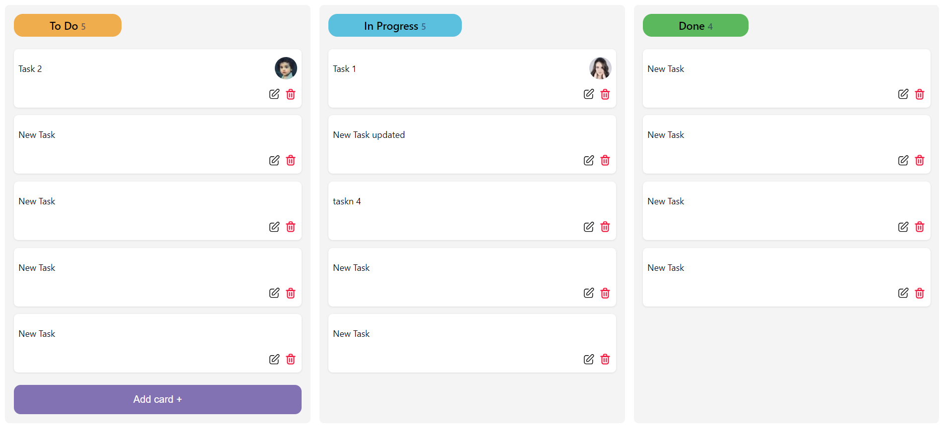
A flexible and customizable Kanban board component for React applications. The KanbanBoard component allows you to create interactive and draggable task cards organized into columns, making it ideal for project management and task tracking.
KanbanBoard Component
Here are some visual examples of the Kanban board component:
Features
- Drag and Drop Functionality: Move task cards between columns with ease.
- Customizable Card Rendering: Tailor the appearance of task cards to fit your design.
- Add, Edit, and Delete Tasks: Manage tasks directly from the Kanban board.
- Support for Avatars: Display avatars on task cards for better team representation.
- Customizable Actions: Define custom actions for task cards.
Installation
Install the KanbanBoard component via NPM:
npm install react-custom-kanban-boardor using yarn:
yarn add react-custom-kanban-boardUsage
Basic Example
Import and use the Kanban board in your React project:
import React from 'react';
import KanbanBoard from 'react-custom-kanban-board';

const columns: Column[] = [
    { title: "To Do", key: "todo", color: "#BDBDCD" },
    { title: "In Progress", key: "in-progress", color: "#FDDDE3" },
    { title: "Done", key: "done", color: "#71C781" },
  ];

const initialCards: Card[] = [
    {
      id: "1",
      title: "Task 1",
      status: "todo",
      avatarPath: "https://i.pravatar.cc/40?img=1",
    },
    {
      id: "2",
      title: "Task 2",
      status: "in-progress",
      avatarPath: "https://i.pravatar.cc/40?img=2",
    },
  ];

const App = () => {
  return (
    <div>
      <h1>My Kanban Board</h1>
      <KanbanBoard
        columns={columns}
        initialCards={initialCards}
        columnForAddCard="todo"
      />
    </div>
  );
};

export default App;
Custom Example
Customize the Kanban board's card rendering and actions:
import React from 'react';
import KanbanBoard, { Card, Column } from 'react-custom-kanban-board';

const columns : Column[] = [
  { title: "To Do", key: "todo", color: "#f0ad4e" },
  { title: "In Progress", key: "in-progress", color: "#5bc0de" },
  { title: "Done", key: "done", color: "#5cb85c" },
];

const initialCards : Card[] = [
  {
    id: "1",
    title: "Task 1",
    status: "todo",
    avatarPath: "https://i.pravatar.cc/40?img=1",
  },
  {
    id: "2",
    title: "Task 2",
    status: "in-progress",
    avatarPath: "https://i.pravatar.cc/40?img=2",
  },
];

const renderCard = (card: Card, handleDragStart: (e: React.DragEvent<HTMLDivElement>, card: Card) => void) => (
  <div
    draggable
    onDragStart={(e) => handleDragStart(e, card)}
    style={{
      backgroundColor: "#f9f9f9",
      border: "1px solid #ddd",
      borderRadius: "8px",
      padding: "16px",
      margin: "8px 0",
      boxShadow: "0 2px 4px rgba(0, 0, 0, 0.1)",
      transition: "transform 0.2s",
    }}
    onMouseEnter={(e) => (e.currentTarget.style.transform = "scale(1.02)")}
    onMouseLeave={(e) => (e.currentTarget.style.transform = "scale(1)")}
  >
    <div
      style={{
        display: "flex",
        justifyContent: "space-between",
        alignItems: "center",
      }}
    >
      <h3
        style={{
          fontSize: "1.2rem",
          color: "#333",
          margin: 0,
        }}
      >
        {card.title}
      </h3>
      {card.avatarPath && <img src={card.avatarPath} alt={`image ${card.avatarPath}`} style={{ width: "32px", height: "32px", borderRadius: "50%", border: "2px solid #007bff" }} />}
    </div>
  </div>
);

const renderAddCard = (column: string, setCards: React.Dispatch<React.SetStateAction<Card[]>>) => (
  <div style={{ margin: "16px 0" }}>
    <button
      onClick={() =>
        setCards((prev) => [
          ...prev,
          {
            id: Math.random().toString(),
            title: "New Task",
            status: column,
          },
        ])
      }
      style={{
        backgroundColor: "#007bff",
        color: "white",
        border: "none",
        borderRadius: "4px",
        padding: "10px 16px",
        cursor: "pointer",
        transition: "background-color 0.2s",
      }}
      onMouseEnter={(e) => (e.currentTarget.style.backgroundColor = "#0056b3")}
      onMouseLeave={(e) => (e.currentTarget.style.backgroundColor = "#007bff")}
    >
      + Add a card
    </button>
  </div>
);

const App = () => {
  return (
    <div>
      <h1>My Custom Kanban Board</h1>
      <KanbanBoard
        columns={columns}
        initialCards={initialCards}
        columnForAddCard="todo"
        renderCard={renderCard}
        renderAddCard={renderAddCard}
      />
    </div>
  );
};

export default App;
Props
KanbanBoard Component Props
| Prop | Type | Default | Description |
|---|---|---|---|
columns | Column[] | [] | Array of columns to display. Each object should include title, key, and color. |
initialCards | Card[] | [] | Array of cards to display initially. Each object should include id, title, status, and optionally avatarPath. |
columnForAddCard | string | - | Key of the column where new cards will be added. |
onCardMove | (cardId: string, newStatus: string) => void | - | Callback function when a card is moved. |
onCardEdit | (cardId: string, newTitle: string) => void | - | Callback function when a card is edited. |
onCardDelete | (cardId: string) => void | - | Callback function when a card is deleted. |
onTaskAddedCallback | () => void | - | Callback function when a new task is added. |
renderCard | (card: Card, handleDragStart: (e: React.DragEvent<HTMLDivElement>, card: Card) => void) => React.ReactNode | - | Custom function to render cards. |
renderAddCard | (column: string, setCards: React.Dispatch<React.SetStateAction<Card[]>>) => React.ReactNode | - | Custom function to render the add card button. |
Column Interface
| Property | Type | Description |
|---|---|---|
title | string | Title of the column. |
key | string | Unique key for the column. |
color | string | Background color for the column. |
Card Interface
| Property | Type | Description |
|---|---|---|
id | string | Unique identifier for the card. |
title | string | Title of the card. |
status | string | Status of the card, corresponds to column key. |
avatarPath | string | URL to the avatar image. |
Contributing
Contributions are welcome! Please open an issue or submit a pull request on GitHub.
Contact
For any questions or issues, please contact HamdyIIbarhim.


