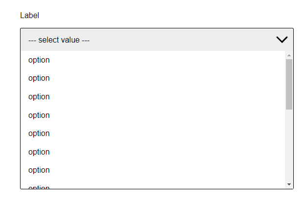
react-custom-simpledropdown v1.3.1
react-custom-simpledropdown
Customisable select dropdown for React
Features
- Accessibility friendly
- Native select
- configurable via
props
Installing
The package can be installed via npm:
npm install react-custom-simpledropdown --saveOr via yarn:
yarn add react-custom-simpledropdownQuick Start
import React  from 'react';
import { Dropdown } from 'react-custom-simpledropdown';

export default class MyComponent extends React.Component {
    render() {
        return (
            <Dropdown options={options}/>
        );
    }
}
Outputs:
<label for="Label" class="mainLabel__lib-EM">Label</label>
<select name="Label" id="Label-select" class="select__lib-EM">
    <option value="1">Option 1</option>
    <option value="2">Option 2</option>
    <option value="3">Option 3</option>
</select>
<div class="dropdown__lib-EM close">
  <div class="select-label__lib-EM close">
    <span class="placeholder__lib-EM">placeholder value</span>
    <div class="arrow__lib-EM">
      <svg width="48px" height="48px"><path d="M 30,35 L 20,25 L30,15" stroke-width="3" stroke-linecap="round" style="fill: none; stroke: black;"></path></svg>
    </div>
  </div>
  <ul class="dropdown__deroulant__lib-EM close">
    <li class="dropdown__option__lib-EM" value="option">
      <span>Option 1</span>
    </li>
    <li class="dropdown__option__lib-EM" value="option">
      <span>Option 2</span>
    </li>
    <li class="dropdown__option__lib-EM" value="option">
      <span>Option 3</span>
    </li>
  </ul>
</div>
Usage
import:
import Dropdown from "react-custom-simpledropdown";and use as:
<Dropdown options={options} />How to get the returned value ?
*You can get the returned value by listenting the event onSelectDropdownOption*
Props
The component supports the following props. All props are optionals except the options prop.
options (required)
options={array}
The options prop is required so the component can render the dropdown list.
The options prop is an array of objects. Each object must have the following properties: name with the option name that you want to show on the dropdown list.
const states = [
  {
    "name": "option",
  }
  {
    "name": "option",
  }
  {
    "name": "option",
  }
];
label
label={string}
By default the component will not show a label but if you want you can set a label by adding the prop label
Set the label as "label"
import React  from 'react';
import { Dropdown } from 'react-custom-simpledropdown';

export default class MyComponent extends React.Component {
    render() {
        return (
            <Dropdown label="label" options={options} />
        );
    }
}
placeholder
placeholder={string}
By default the component will not show any placeholder but if you want you can set it by adding the prop placeholder
Set the placeholder as "placeholder"
import React  from 'react';
import { Dropdown } from 'react-custom-simpledropdown';

export default class MyComponent extends React.Component {
    render() {
        return (
            <Dropdown placeholder="placeholder" options={options} />
        );
    }
}
startValue
startvalue={string}
By default the component doesn't have startvalue and the user have to select one so a value is returned but, if you want to set a default startValue from the options list you can add the prop startValue with a string that matches the name of the option you want to set as startValue.
Set the startValue as "option 3"
import React  from 'react';
import { Dropdown } from 'react-custom-simpledropdown';

export default class MyComponent extends React.Component {
    render() {
        return (
            <Dropdown starValue="option 3" options={options} />
        );
    }
}
:warning: if you set a startValue the placeholder will be overwritten by the startValue
fontFamily
fontFamily={string}
By default the component font family is Arial, Helvetica, sans-serif; but if you want you can set a font family by adding the prop fontFamily
hoverTextColor
hoverTextColor={string}
By default the component hover text color is #121212 but if you want you can set a hover text color by adding the prop hoverTextColor
hoverBackground
hoverBackground={string}
By default the component hover background color is #8d8d8d28 but if you want you can set a hover background color by adding the prop hoverBackground
License
Copyright (c) 2022 Eloi Magnien. Licensed under MIT license, see LICENSE for the full license.

