React Describe
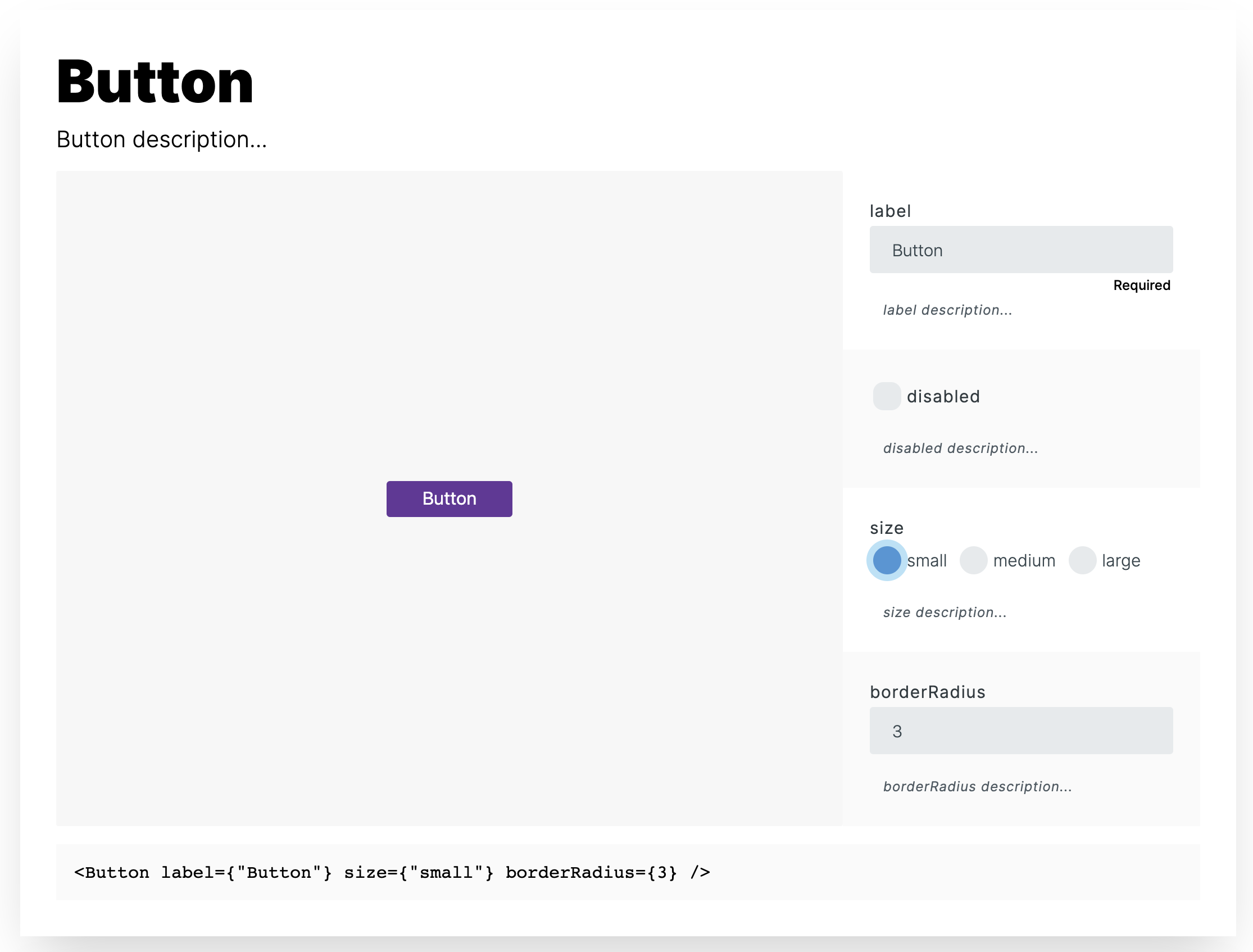
React Describe generates a component playground with editable prop values and a live preview that you can include in your own docs.
| Table of Contents |
|---|
| Runnable example |
| Installation |
| Usage |
| Licensing |
Runnable example
Installation
with Yarn:
yarn add react-describewith npm:
npm install react-describeUsage
- Define
propTypesanddefaultPropsfor your component props - Add a comment above each prop to describe it
import React from "react";
import PropTypes from "prop-types";

/**
 * Button description...
 */
export default function Button({ label, disabled, size, borderRadius }) {
  const sizes = {
    small: 32,
    medium: 48,
    large: 64
  };

  return (
    <button
      style={{
        paddingLeft: sizes[size],
        paddingRight: sizes[size],
        fontSize: sizes[size] / 2,
        height: sizes[size],
        backgroundColor: "rebeccapurple",
        color: "#fff",
        border: "none",
        borderRadius,
        opacity: disabled ? 0.5 : 1
      }}
      disabled={disabled}
    >
      {label}
    </button>
  );
}

Button.defaultProps = {
  size: "medium",
  disabled: false,
  borderRadius: 0
};

Button.propTypes = {
  /**
   * label description...
   */
  label: PropTypes.string.isRequired,

  /**
   * disabled description...
   */
  disabled: PropTypes.bool,

  /**
   * size description...
   */
  size: PropTypes.oneOf(["small", "medium", "large"]),

  /**
   * borderRadius description...
   */
  borderRadius: PropTypes.number
};- Import
react-describe - Import your component and place it as child of
Describe - Import your component as a string and pass it to
src
import React from "react";
import ReactDOM from "react-dom";
import { Describe } from "react-describe";
import Button from "./Button";
import RawButton from "!raw-loader!./Button.js";
function App() {
return (
<div className="App">
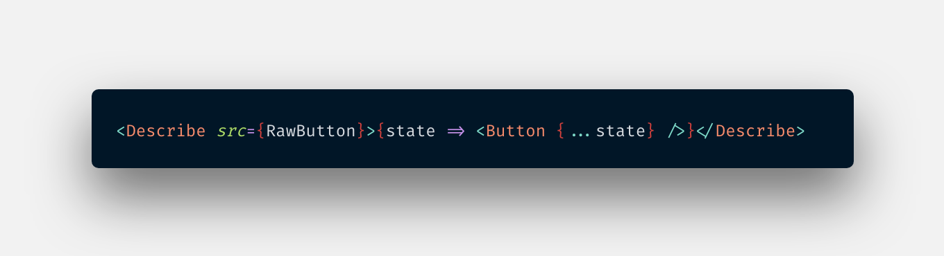
<Describe src={RawButton}>{state => <Button {...state} />}</Describe>
</div>
);
}
const rootElement = document.getElementById("root");
ReactDOM.render(<App />, rootElement);- You can provide an initial state to override default prop values
<Describe
  src={RawButton}
  initialState={{
    label: "Button",
    disabled: true,
    size: "small",
    borderRadius: 3
  }}
>
  {state => <Button {...state} />}
</Describe>
Available playground inputs
| PropType | input |
|---|---|
| string | text input |
| number | number input |
| bool | checkbox |
| oneOf | radio-button group |
Licensing
React Describe is licensed under the MIT License