1.0.36 • Published 11 months ago
react-draggable-layout-2 v1.0.36
react-draggable-layout-2
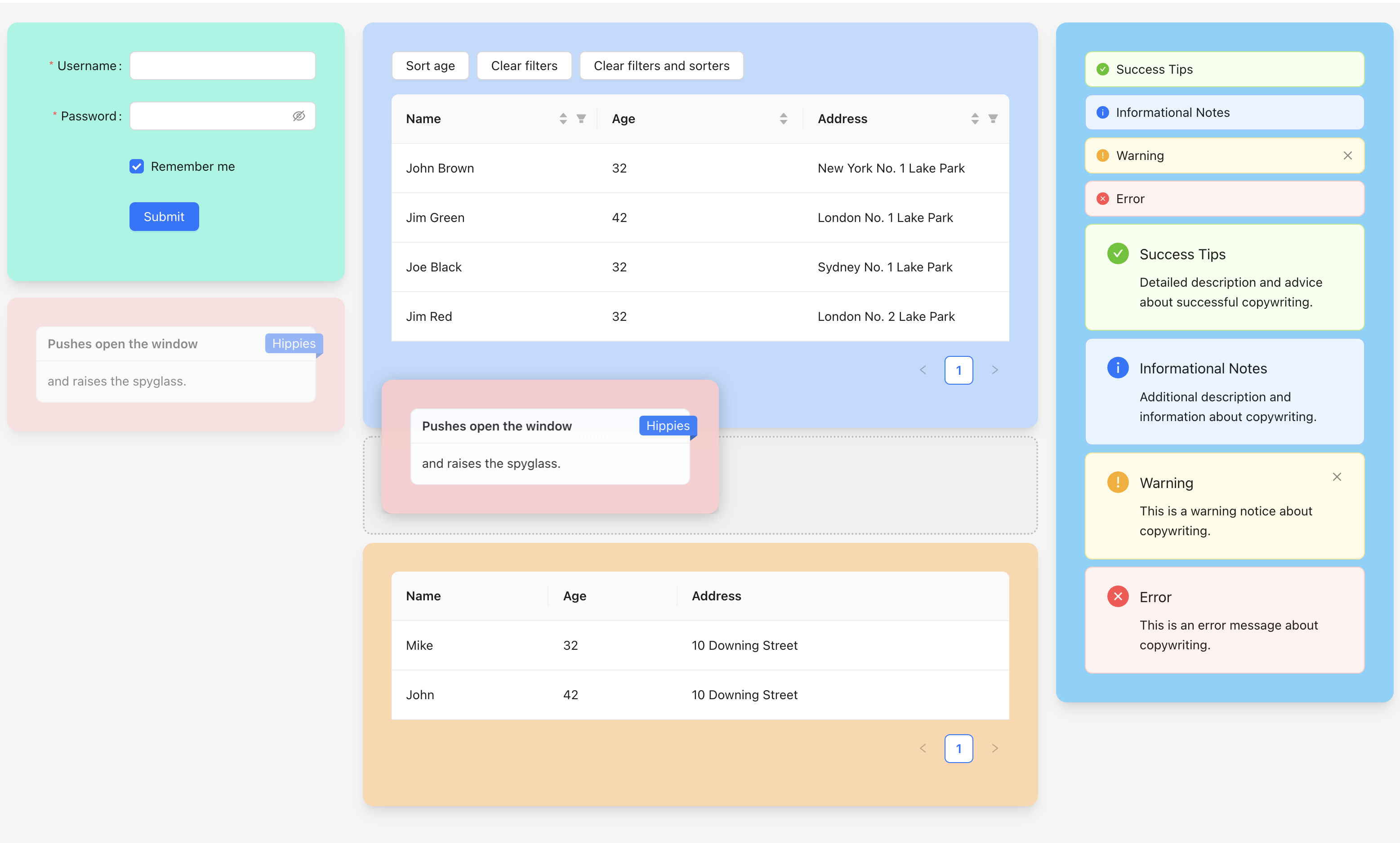
Put your React.js components into a draggable column layout.
This is a new implementation of react-draggable-layout.

Pages
Install
yarn add react-draggable-layout-2npm install --save react-draggable-layout-2Usage
import DraggableLayout2 from "react-draggable-layout-2";

export default function App() {
  const components = [
    { col: 0, id: "Component 1", component: <div style={{ height: "120px", backgroundColor: "rgb(125 211 252)", borderRadius: "1rem", padding: "24px", boxShadow: "0 8px 10px -4px #cccccc" }}>Component #1</div> },
    { col: 0, id: "Component 2", component: <div style={{ height: "180px", backgroundColor: "rgb(153 246 228)", borderRadius: "1rem", padding: "24px", boxShadow: "0 8px 10px -4px #cccccc" }}>Component #2</div> },
    { col: 1, id: "Component 3", component: <div style={{ height: "300px", backgroundColor: "rgb(254 202 202)", borderRadius: "1rem", padding: "24px", boxShadow: "0 8px 10px -4px #cccccc" }}>Component #3</div> },
    { col: 1, id: "Component 4", component: <div style={{ height: "250px", backgroundColor: "rgb(191 219 254)", borderRadius: "1rem", padding: "24px", boxShadow: "0 8px 10px -4px #cccccc" }}>Component #4</div> },
    { col: 2, id: "Component 5", component: <div style={{ height: "180px", backgroundColor: "rgb(254 215 170)", borderRadius: "1rem", padding: "24px", boxShadow: "0 8px 10px -4px #cccccc" }}>Component #5</div> },
  ];

  const handleOnChange = (c) => {
    console.log("onChange()", c);
  };

  return (
    <div style={{ height: "100vh", backgroundColor: "#f4f4f4" }}>
      <DraggableLayout2 defaultComponents={components} columns={3} mainColumnIndex={1} onChange={handleOnChange} />
    </div>
  );
}
To exclude controls from being draggable, you can set the className to draggable-layout-exclude.
Properties
- defaultComponents
- An array of components that you want to place into DraggableLayout. Each object must contain following props:
- id - a unique id
- col - an index of column where you want to place your component
- component - a component you want to place
- An array of components that you want to place into DraggableLayout. Each object must contain following props:
- onChange
- An event that is fired when a user draggs the component to another place.
- columns
- Number of columns in the layout.
- mainColumnIndex
- Index of the main column. The main column is wider than others.
- isDarkMode
- A true/false flag that changes a placeholder styling.
- hiddenIds
- An array of component IDs that you want to hide.
1.0.26
12 months ago
1.0.25
12 months ago
1.0.24
12 months ago
1.0.29
12 months ago
1.0.28
12 months ago
1.0.27
12 months ago
1.0.33
12 months ago
1.0.32
12 months ago
1.0.31
12 months ago
1.0.30
12 months ago
1.0.36
11 months ago
1.0.35
12 months ago
1.0.34
12 months ago
1.0.19
1 year ago
1.0.18
1 year ago
1.0.17
1 year ago
1.0.16
1 year ago
1.0.22
1 year ago
1.0.21
1 year ago
1.0.20
1 year ago
1.0.23
1 year ago
1.0.15
1 year ago
1.0.14
1 year ago
1.0.13
1 year ago
1.0.12
1 year ago
1.0.11
1 year ago
1.0.10
1 year ago
1.0.9
2 years ago
1.0.8
2 years ago
1.0.7
2 years ago
1.0.6
2 years ago
1.0.5
2 years ago
1.0.4
2 years ago
1.0.3
2 years ago
1.0.2
2 years ago
1.0.1
2 years ago
1.0.0
2 years ago