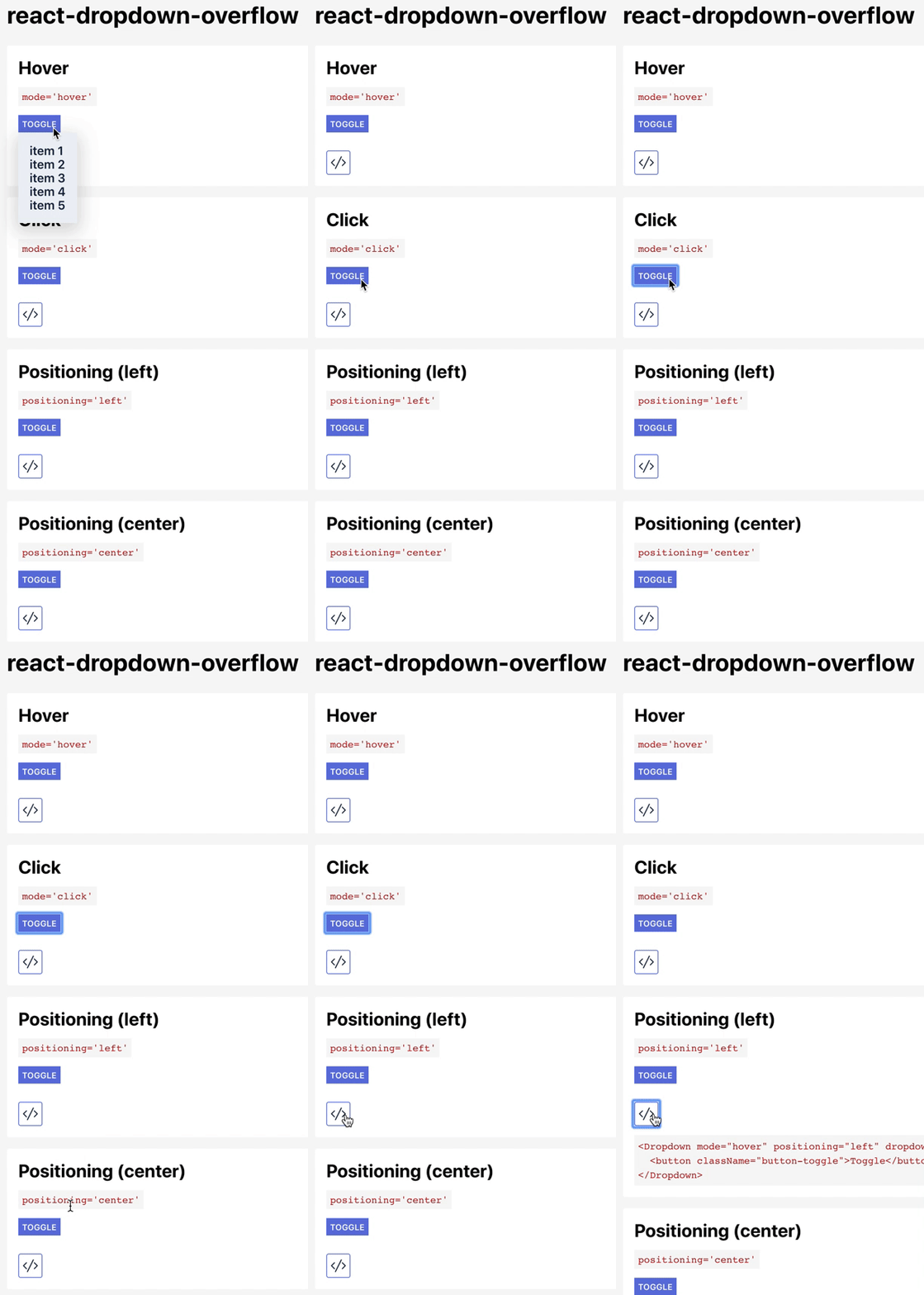
react-dropdown-overflow v1.7.4
Links
npm: https://www.npmjs.com/package/react-dropdown-overflow
Demo

Installation
yarn add react-dropdown-overflowor
npm install react-dropdown-overflowImporting
import Dropdown from 'react-dropdown-overflow'Usage
import Dropdown from 'react-dropdown-overflow'

class MyComponent extends React.Component {
  render() {
    <Dropdown dropdown={
      <div className='dropdown-list'>
        <ul>
         <li>item1</li>
         <li>item2</li>
         <li>item3</li>
       </ul>
      </div>
    }>
      <button>Toggler</button>
    </Dropdown>
  }
}
Props
mode?: "hover" | "click" = "hover"
Sets the behavior of the toggling element. Defaults to hover. Valid values are:
hover | click :: Whether the dropdown is triggered with a mouse click or on hover event.
children: ReactNode
A React component responsible for the toggling of the dropdown.
dropdown: ReactNode
A React component to be displayed as a dropdown.
positioning?: "center" | "left" | "right" = "left"
A string prop responsible for the positioning of the menu. Valid values are:
left | center | right :: The position of the dropdown menu.
zIndex?: "auto" | number = "auto"
A number specifying the z-index of the dropdown. Valid values are numbers.
hasClickOutsideListener?: boolean = false
A boolean prop specifying whether the dropdown should be closed when the mouse event is located outside of the entire component. Useful with click mode.
wrapperId?: string = undefined
id of the newly created element wrapping the children prop.
className?: string = "dropdown"
Class name of the newly created element wrapping the dropdown.
dropdownWrapperId?: string = undefined
id of the newly created element wrapping the dropdown.
isOpen?: boolean = undefined
A boolean prop responsible for the state of the component (closed/open). Valid values are:
true | false :: Whether the menu is visible.
WARNING: This changes the component from an uncontrolled to a controlled one.
1 year ago
6 years ago
6 years ago
6 years ago
6 years ago
7 years ago
7 years ago
7 years ago
7 years ago
7 years ago
7 years ago
7 years ago
7 years ago
7 years ago
7 years ago
7 years ago
7 years ago
7 years ago
7 years ago
7 years ago
7 years ago
7 years ago
7 years ago
7 years ago
7 years ago
7 years ago
7 years ago
7 years ago
7 years ago
7 years ago
7 years ago
7 years ago
7 years ago
7 years ago
7 years ago
7 years ago
7 years ago
7 years ago
7 years ago
7 years ago
7 years ago
7 years ago
7 years ago
7 years ago
7 years ago
7 years ago
7 years ago
7 years ago
7 years ago
7 years ago