1.0.12 • Published 7 years ago
react-droppad v1.0.12
react-droppad
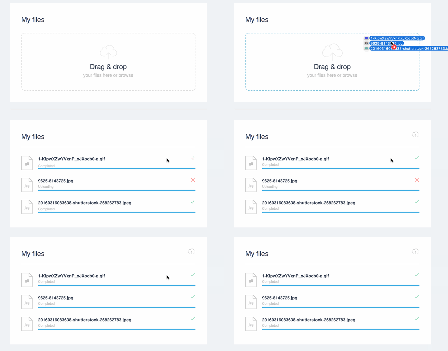
React-droppad is a simple to use component that provides drag'n'drop file uploads with nice UI

Installation
yarn add react-droppad
or
npm install react-droppad
Usage
Import react-droppad in your React component:
import Droppad from 'react-droppad'Then In your render function
<Droppad url="UPLOAD_URL" onUploaded={this.onUploaded}/>Supported props
| Prop | Type | Defualt | Description |
|---|---|---|---|
| url | string | '' | Upload file to |
| maxFiles | integer | 20 | How many files in multiple |
| maxFilesSize | integer | 8 | define in MB |
| acceptedFiles | string | jpeg, jpg, png, gif | Comma seperated string |
| label | string | My files | |
| title | string | Drag & drop | |
| subTitle | string | your files here or browse | |
| headers | object | Added to the xhr request headers | |
| onUploaded | function | ()=>{} | fired after upload with the response |
You can find example of usage in the demo directory, which you can run in a local development server using npm start or yarn run start
layout inspired by : https://dribbble.com/shots/2473854-Daily-UI-Day-031-File-Upload