1.0.15 • Published 2 years ago
react-dynamic-accordion v1.0.15
# react-dynamic-accordion

A simple, reusable React accordion component that auto-manages accordion sections based on an array of items.

## Installation

```bash
npm install react-dynamic-accordion


```bash
npm install react-face-login
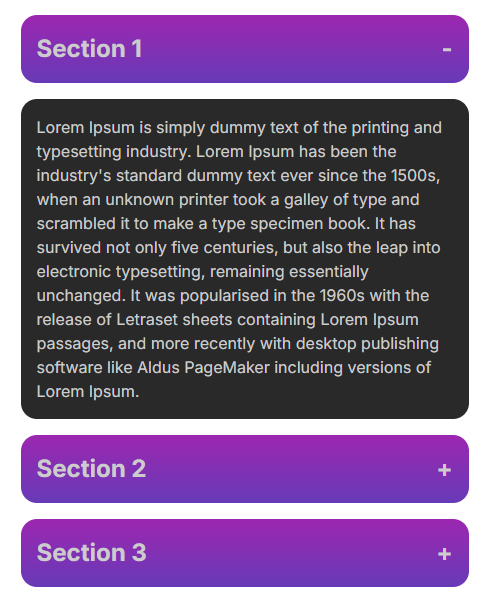
Demo
Demo Screenshot

Usage
Importing the Package
import React from 'react';
import { Accordion } from 'react-dynamic-accordion';
import 'react-dynamic-accordion/dist/Accordion.css';

const App = () => {
  const accordionItems = [
    {
      title: 'Section 1',
      content: <p>Content for section 1.</p>,
    },
    {
      title: 'Section 2',
      content: <p>Content for section 2.</p>,
    },
    {
      title: 'Section 3',
      content: <p>Content for section 3.</p>,
    },
  ];

  return (
    <div>
      <Accordion items={accordionItems} className='design-class'/>
    </div>
  );
};

export default App;
How to styles?
Need style like as demo (screenshot) copy and paste into your exiting stylesheet that you have
    <style>
      .design-class{
        color: #ffffff;
      }
      .design-class .accordion-title{
        display: flex;
        justify-content: space-between;
        width: 100%;
        color: #cccccc;
        margin-bottom: 1rem;
        padding: 1rem;
        background: linear-gradient(0deg, #673AB7, #9C27B0);
        border-radius: 1rem;
        font-size: 1.5rem;
        font-weight: bold;
      }
      .design-class .accordion-content{
        color: #cccccc;
        margin-bottom: 1rem;
        padding: 1rem;
        background: #292929;
        border-radius: 1rem;
      }
    </style>