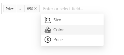
1.0.2 • Published 5 years ago
react-filter-easy v1.0.2
React-Filter-Easy


Pretty and reusable filter box for React.
Currently filter component require Antd design as peer dependency, but in future it will be provided as self-contained component with zero dependencies.
Advantages:
💅 - fully customizable;
🔥 - a lot of advanced functionality.

Installation and usage
The easiest way to use react-filter-easy is to install it from npm and build it into your app with Webpack.
npm i react-filter-easyExample of using:
import 'antd/dist/antd.css'; // Antd styles

import React, { useState } from 'react';
import ReactFilterEasy from 'react-filter-easy';

const fields = [{
  label: 'Field #1',
  name: 'field-1',
  valueEditor: {
    component: <input type="text"/>,
  },
}, {
  label: 'Field #2',
  name: 'field-2',
  availableOperators: ['more', 'less'],
  valueEditor: {
    component: <input type="number"/>,
  },
}];

export default function App() {
  const [conditions, setConditions] = useState([]);

  return (
    <div className="app">
      <ReactFilterEasy
        fields={fields}
        conditions={conditions}
        onChange={setConditions}
      />
    </div>
  );
}
Props
Common props of filter component:
className- apply a className to the control;styles- apply styles to the control;theme- customize theme of control;placeholders- customize placeholders;fields- fields available for creating new conditions;loading- control loading state of control;operators- customize available operators;conditions- set showing conditions;onChange- subscribe to change events.
