react-form-viewer v1.0.9


This is a fully customizable form builder based on React
 Table of Contents
- Demo
- Playground
- Features
- When do you need it
- Usage
- Highlight 🔥
- Playground
- Screenshots
- Items in queue
- Contribution 🍰
- License
Demo
Visit https://react-form-viewer.vercel.app/
Playground
Visit https://codesandbox.io/s/react-form-viewer-smw51
Features
- JSON based.
- Redux based.
- Fully Responsive
- Customizable
- Quick and easy.
- Styled component based.
- Theme supported
- Full validation support
- Custom theme
When do you need it
- You have complex form to be created?
- Forms are dynamic in nature?
- You don't want to manage the form?
- You need a structured/organised form rendering?
- You are providing forms as service
Usage
- Simple Form
- Dynamic Form
- Quiz
- Exams
- Tutorial
- Sky is the only limit
Install 🐙
npm install react-form-vieweror
yarn add react-form-viewerHighlight 🔥
This project contains an advanced Form Builder and a Form Viewer.
Form Builder
- Capable of creating form of any type.
- Styled component theme support
- Endlesss Customization
- Add your own style
- Add your own properties
How to use
Import FormPlanner component
import { FormPlanner } from 'react-form-viewer'Just drop it to desired place
<FormPlanner
  onControlValueChanged={() => {
    console.log('onControlValueChanged')
  }}
  onFormValueChanged={() => {
    console.log('onFormValueChanged')
  }}
  theme={dark}
/>
Supported Elements
FormPlanner comes with tons of prebuilt elements which are already grouped for convenience. Few of them are visible by default. Rest can be turned on when required
| Group | Element | Internal Name | Availability |
|---|---|---|---|
| Basic | Header | header | Default |
| Medium Header | mediumheader | Default | |
| Small Header | smallheader | Default | |
| Label | label | Default | |
| Form Control | Text Box | text | On Demand |
| Number Box | number | On Demand | |
| Multiline Box | multiline | On Demand | |
| Date Picker | date | On Demand | |
| Date Time Picker | datetime | On Demand | |
| Time Picker | time | On Demand | |
| Checkbox | checkbox | On Demand | |
| Radio | radio | On Demand | |
| Select | select | On Demand | |
| Color Picker | color | On Demand | |
| Media | Image | image | On Demand |
| Video | video | On Demand | |
| On Demand | |||
| Quiz | Question | question | On Demand |
| Advanced | Grid | grid | On Demand |
| Rich Text | richtext | On Demand | |
| Multi Values | multivalue | On Demand | |
| Uploads | Image Upload | imageupload | On Demand |
| Multiple Image Upload | imagesupload | On Demand | |
| Miscellaneous | Divider | divider | On Demand |
Form Properties
Allows to add/update form meta information like
- Title
- Description
- Header background image
- Header background color
- Background image
- Background color
Form Parameters
| Name | Description | Default Value |
|---|---|---|
| showFormProperties | Show form properties button to update form level values | false |
| showPreview | Integrated button to show form preview | false |
| allowCustomStyles | Allow user to set custom css styles | false |
| allowCustomProps | Allow user to set custom field properties | false |
| advancedFeatures | Enable advanced features | false |
| fields | List of control types to be shown | All |
Preview your form
Preview your form while editing
Form Viewer
This is a full fledged form viewer.
- Capable of rendering complex form layout.
- Multi line and multi row
- Theme support
How to use
Import FormPlanner component
import { FormPlanner } from 'react-form-viewer'Just drop it to desired place
<FormViewer
  onChange={(key_name, balue, field_definition) => {
    console.log('Value received')
  }}
  template={<template_data>}
/>
Playground
Getting built
Screenshots
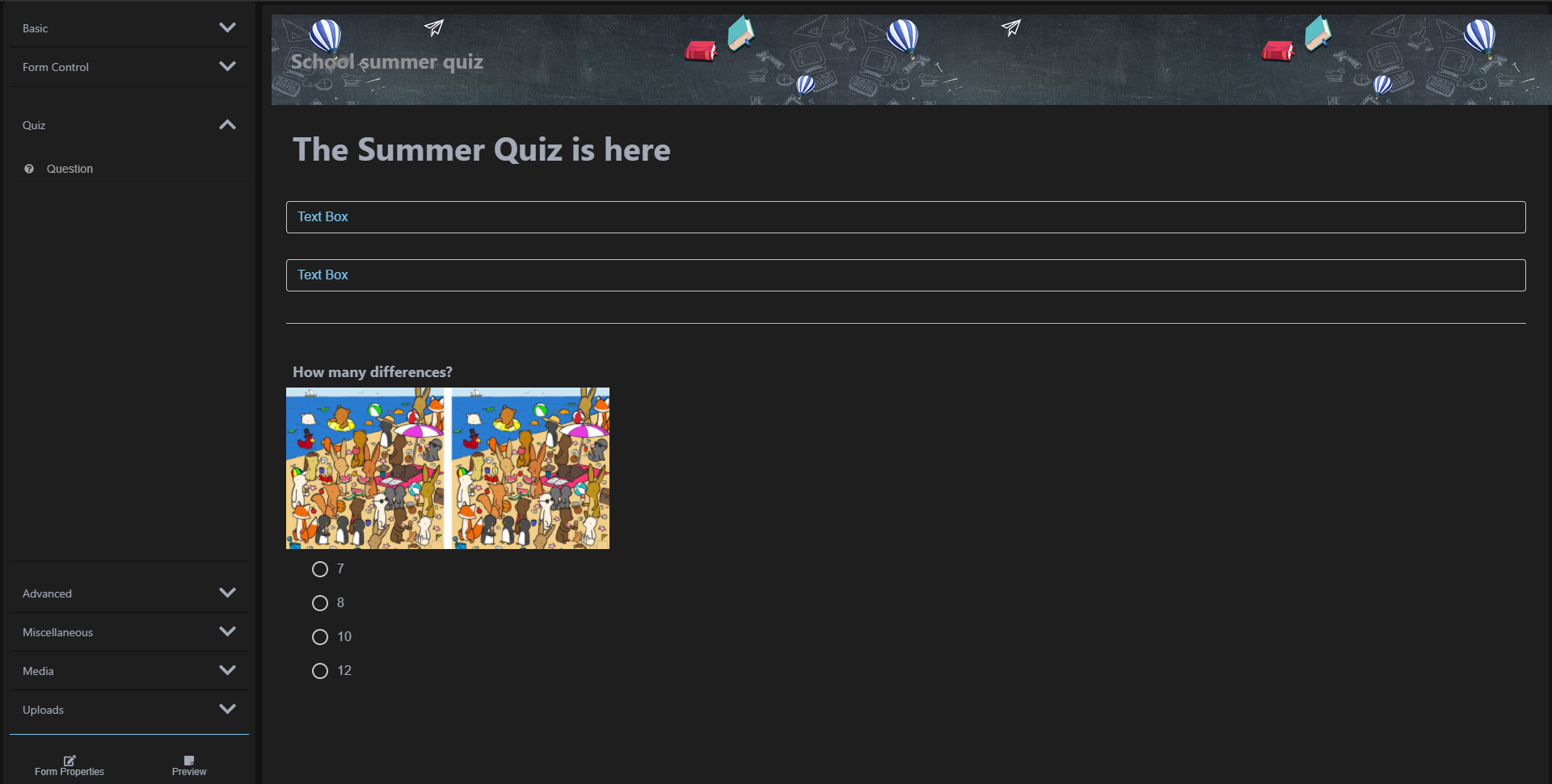
Form Planner example
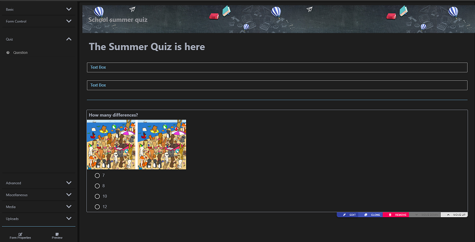
Edit element on hover
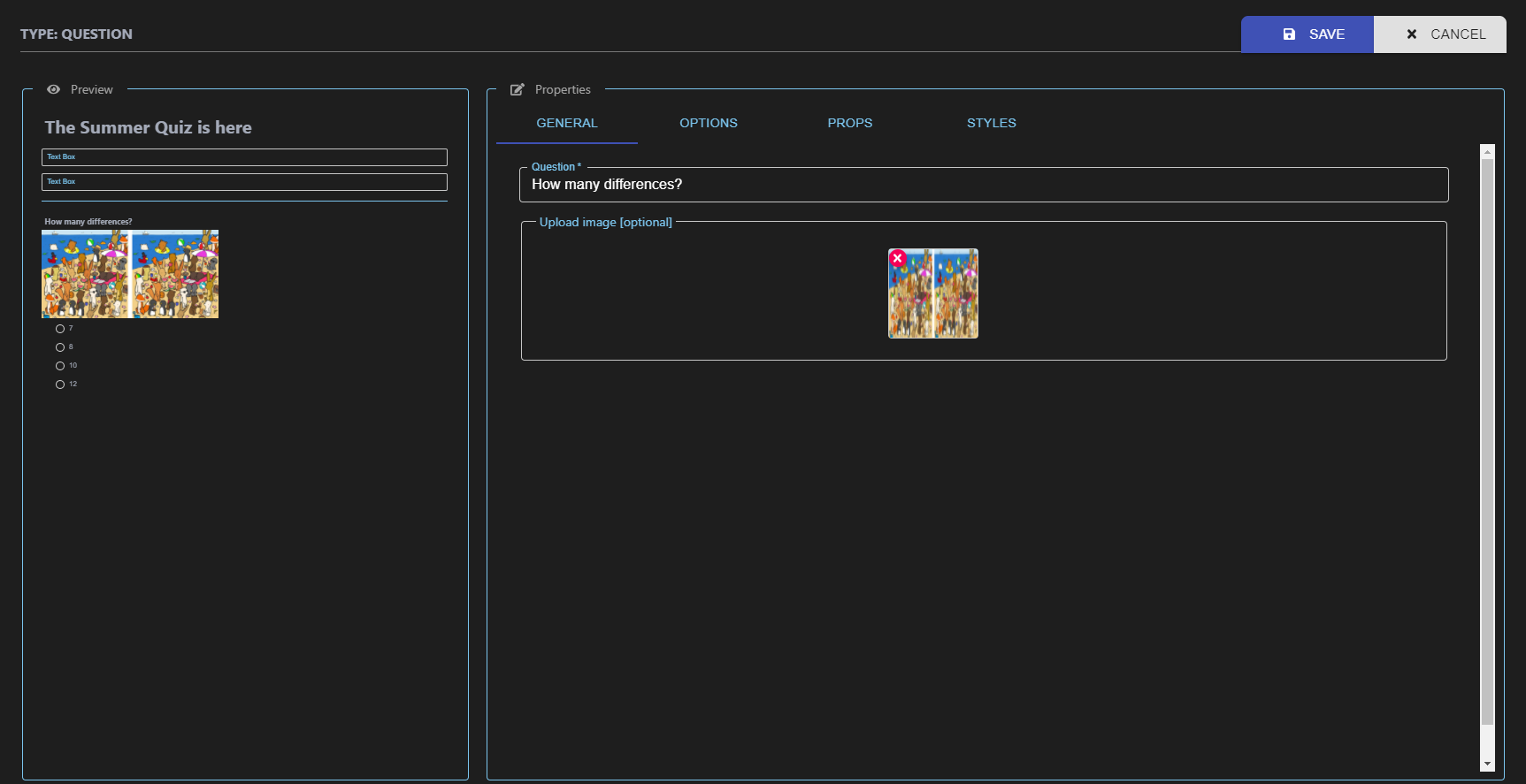
Edit element
Prebuilt Customization
Or add your own custmization
Items in queue
- Localization
Contribution 🍰
Feel free to create issue and make pull request
Refer code of conduct
Refer contributing
License
MIT © Koustov


