0.0.8-rc.1 • Published 4 years ago
react-fullscreen-mobile-modal v0.0.8-rc.1
React Full Screen Modal
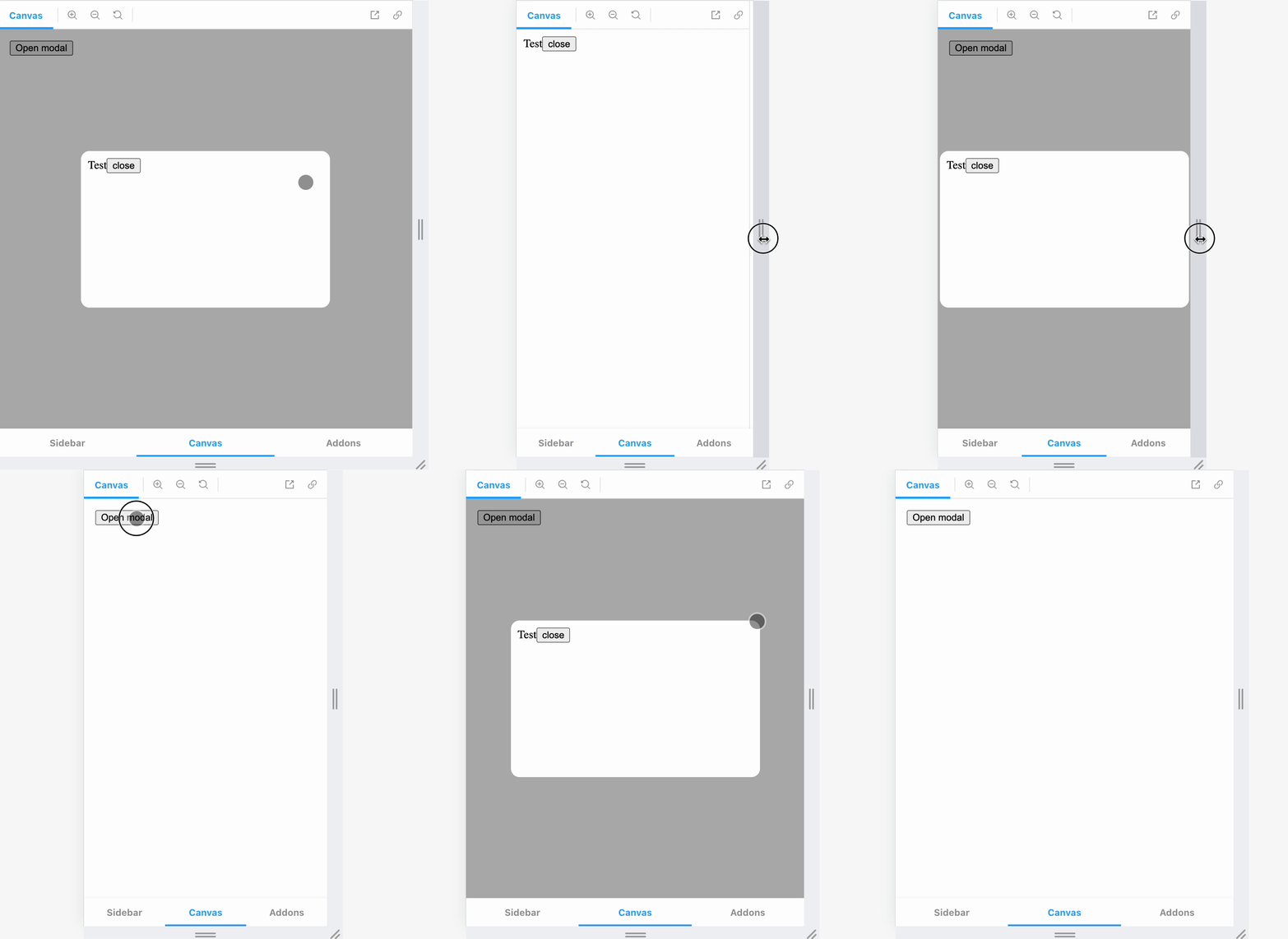
Why?
Modals typically don't work well for mobile. They take up a lot of space and often squish their contents.
This library aims to solve that by turning the modal into full screen after a certain break point.
Goals
- Do one thing - Modal on desktop, full screen on mobile
- Do what you want - Outside of basic animations and modal utilities, this does nothing more and nothing less than Goal #1
- Simple API
Demo

Props
- isOpen:
boolean- Determines whether the modal is open. * - children:
React.ReactNode- Children components of modal. * - overlay:
boolean- Determines whether or not to have a background overlay for desktop modal. Default:true - breakpoint:
number- Width of screen at which to switch between modal and full screen. Default:350 - outsideClick:
(event: MouseEvent) => void- On click that fires when a use clicks outside of the modal (best used to close modal). Default:noop - mobileStyles:
React.CSSProperties- Css styles to pass to mobile full screen wrapper. - desktopStyles:
{ modal: ReactCSSProperties, overlay: React.CSSProperties }- Object that contains two properties of css styles to pass to the modal or overlay components.
* Required props
Example
export const Test1 = () => {
  const [isOpen, setIsOpen] = useState(false)

  return (
    <>
      <button onClick={() => setIsOpen((o) => !o)}>Open modal</button>
      <Modal
        isOpen={isOpen}
        outsideClick={() => {
          setIsOpen(false)
        }}
      >
        <div style={{ height: 200, width: 330, padding: 10 }}>
          Test
          <button onClick={() => setIsOpen(false)}>close</button>
        </div>
      </Modal>
    </>
  )
}