react-giphy-picker-advanced v1.0.3
react-giphy-picker-advanced

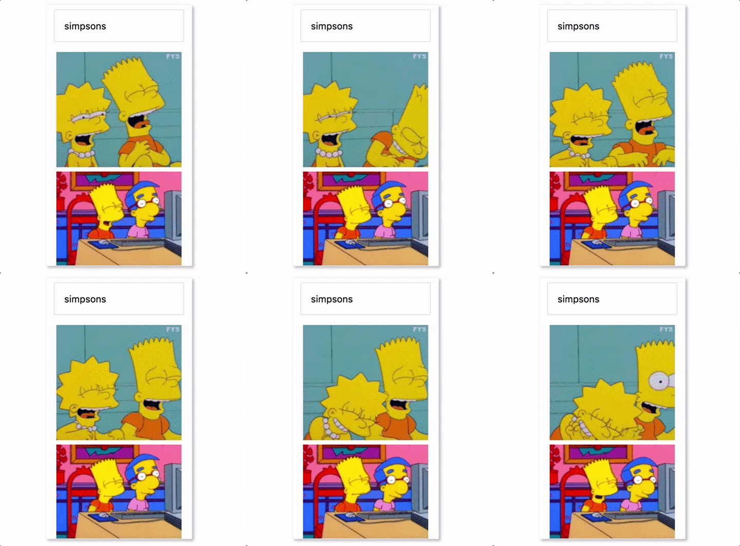
react-giphy-picker-advanced is a simple gif picker component using giphy API
On select it returns a Gif object in the format specified for an image from Giphy's search API giphy sample-response-search
Install
npm install react-giphy-picker-advanced --save
Usage basic
import Picker from "react-giphy-picker-advanced";
import ReactDOM from "react-dom";
import React, { Component, PropTypes } from "react";

class TestComponent extends Component {
  this.state = {
    visible: false
  }

  log(gif) {
    console.log(gif);
  }

  render() {
    return (
      <div>
         <Picker
            onSelected={this.log.bind(this)}
            visible={visible}
            modal={true}
            handleClose={() => this.setState({ visible: false })}
          />
      </div>
    );
  }
}

ReactDOM.render(<TestComponent />, document.getElementById("root"));
Props
onSelected (required)
Handler returns the emoji character selected from the emoji picker.
visible
Opacity to show or hide the picker. Defaults to true .
modal
If you want the emoji picker to be a modal.
true will set the wrapper as position: absolute .
Or false , which is the default will be position: static .
handleClose
This is a method that should toggle visibility of the picker. For example, assuming you have a state for to toggle visibility, you could use handleClose={() => this.setState({ visible: false })}
Styles
Uses styled-components 💅 for the base styling.
Development
yarn
yarn dev
Test
yarn testBuild
yarn
yarn build
Publish
npm login
npm version patch
git add -A
git push origin master
npm publish