react-giphy-selector v0.0.1
react-giphy-selector
A search and select React.JS component for picking the perfect giphy.

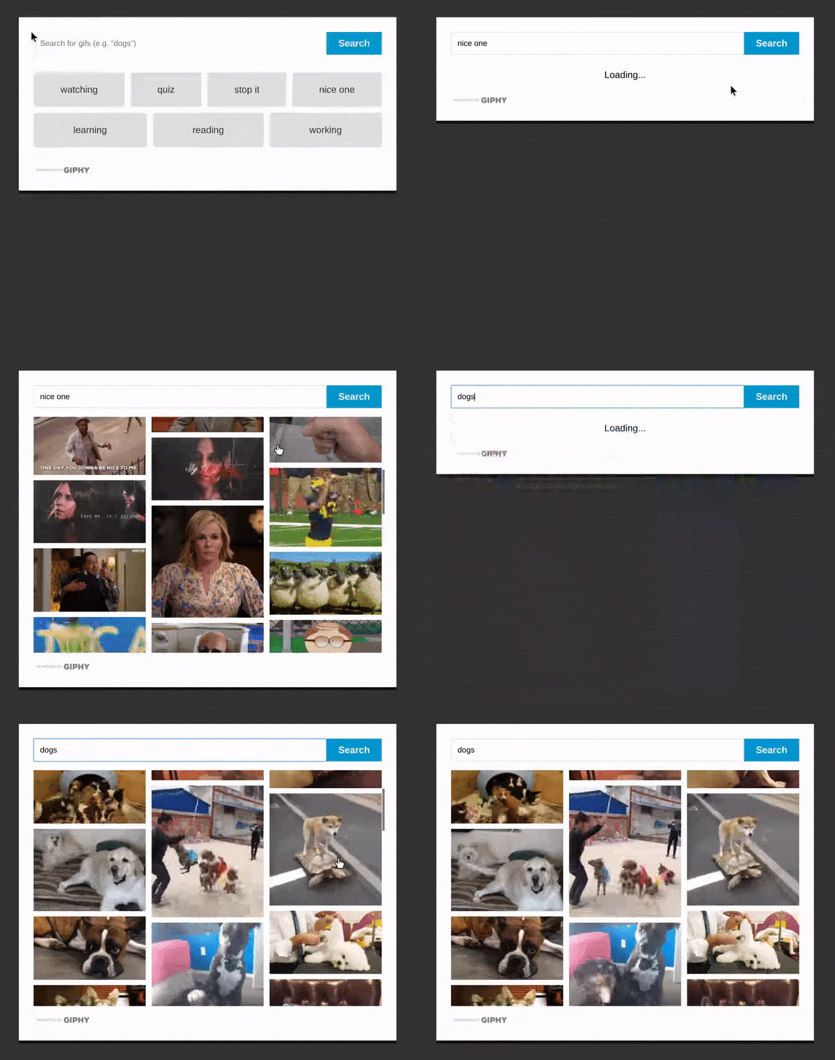
This component is highly-customizable and only provides basic styling out-of-box. The example above includes simple customization to a few elements. You can view this example in
/example/src.
Table of Contents
Installation
You just install react-giphy-selector the good ole' fashion way through NPM:
npm install --save react-giphy-selectorUsage
This package exports the Selector React component and then two helper enums:
import {Selector, ResultSort, Rating} from "react-giphy-selector";Selector
The selector component contains all of the search, display, and selection logic. The only required properties are apiKey and onGifSelected.
<Selector
	apiKey={'myKey'}
	onGifSelected={this.saveGif} />
That said, there are a bunch of props that allow you to make this component your own. Note: the ? included at the end of a property name denotes it as optional.
apiKey: string: Your Giphy Project API Key.onGifSelected?: (gifObject: IGifObject) => void: The function to fire when a gif search result has been selected. TheIGifObjectrepresents the full GIF Object returned via the Giphy API.rating?: Rating: The maximum rating you want to allow in your search results. Use the exported Rating enum for help. Default:Rating.G.sort?: ResultSort: The sort order of the search results. Use the helper enum ResultSort. Default:ResultSort.Relevant.limit?: number: The number of results to return. Default:20.suggestions?: string[]: An array containing one-click searches to make it easy for your user. Will not show suggestions section if none are passed. Default:[].queryInputPlaceholder?: string: The placeholder text for the search bar text input. Default'Enter search text'.resultColumns?: number: The number of columns to divide the search results into. Default:3.showGiphyMark?: boolean: Indicates whether to show the "powered by Giphy" mark in the selector. This is required when using a Giphy Production API Key. Default:true.
Styling your Selector
There are a bunch of props to help you customize the style of the the selector. Both the className and the style methods are available. react-giphy-selector is very intentionally unopinionated about how exactly each section of the selector should look. Instead, the package offers a lot of customization and flexibility through the props below.
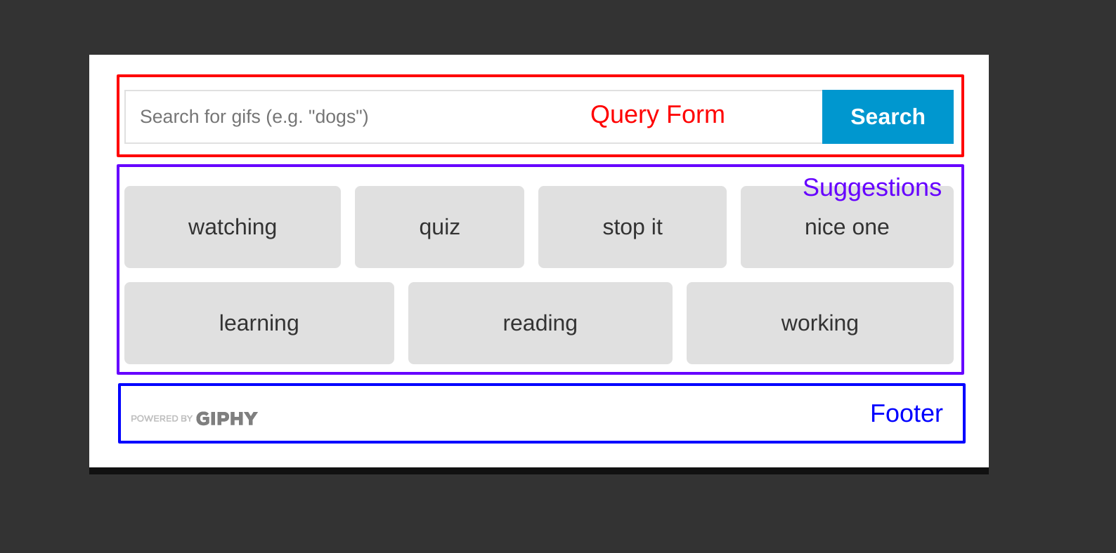
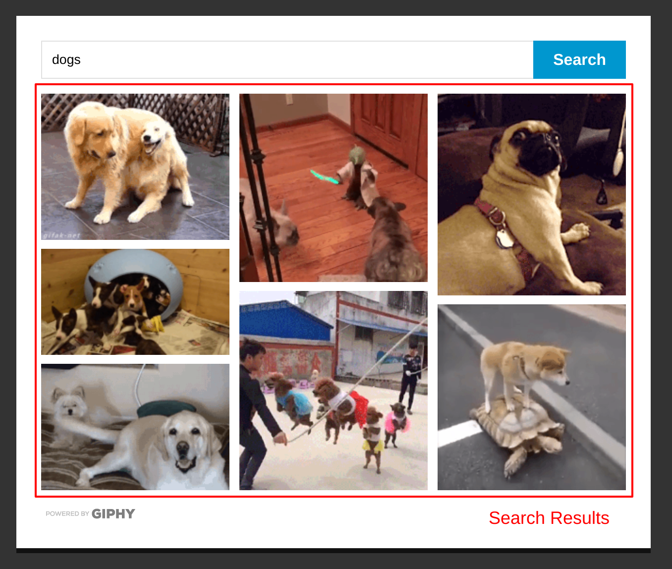
The images below will help you understand the nomenclature of the components:


Here are all the props available for styling the component:
queryFormClassName?: string: AdditionalclassNamefor the query form section of the component. You can find the default style applied insrc/components/QueryForm.css.queryFormInputClassName?: string: AdditionalclassNamefor the text input in the query form. You can find the default style applied insrc/components/QueryForm.css.queryFormSubmitClassName?: string: AdditionalclassNamefor the submit button in the query form. You can find the default style applied insrc/components/QueryForm.css.queryFormStyle?: object: A style object to add to the query form style. You can find the default style applied insrc/components/QueryForm.css.queryFormInputStyle?: object: A style object to add to the text input in the query form. You can find the default style applied insrc/components/QueryForm.css.queryFormSubmitStyle?: object: A style object to add to the submit button in the query form. You can find the default style applied insrc/components/QueryForm.css.queryFormSubmitContent?: string or Component: You can pass in astringor your own component to render inside the submit button in the query form. This allows you to pass in things like custom icons. Default:'Search'.searchResultsClassName?: string: AdditionalclassNamefor the search results component. You can find the default style insrc/components/SearchResults.css.searchResultsStyle?: object: A style object to the add to the search results container. You can find the default style insrc/components/SearchResults.css.searchResultClassName?: string: AdditionalclassNameto add to a search result. Search results areaelements. You can find the default style insrc/components/SearchResult.css.searchResultStyle?: object: A style object to add to a search result. Search results areaelements. You can find the default style insrc/components/SearchResult.css.suggestionsClassName?: string: AdditionalclassNameto add to the suggestions container. You can find the default style insrc/components/Suggestions.css.suggestionsStyle?: object: A style object to add to the suggestions container. You can find the default style insrc/components/Suggestions.css.suggestionClassName?: string: AdditionalclassNameto add to a suggestion. This is anaelement. You can find the default style insrc/components/Suggestion.css.suggestionStyle?: object: A style object to add to a suggestion. This is anaelement. You can find the default style insrc/components/Suggestion.css.loaderClassName?: string: AdditionalclassNameto add to the loader container. You can find the default style insrc/components/Selector.css.loaderStyle?: object: A style object to add to the loader container. You can find the default style insrc/components/Selector.css.loaderContent?: string or Component: You can pass in astringor customer component to display when results are loading. Default'Loading'....searchErrorClassName?: string: AdditionalclassNameto add to the error message shown on broken searches. You can find the default style insrc/components/Selector.css.searchErrorStyle?: object: A style object to add to the error message shown on broken searches. You can find the default style insrc/components/Selector.css.footerClassName?: string: AdditionalclassNameto add to footer of selector. You can find the default style insrc/components/Selector.css.footerStyle?: object: A style object to add to footer of selector. You can find the default style insrc/components/Selector.css.
If you have a cool style you'd like to share, please make an issue.
Rating
The Rating enum contains all the possible ratings you can limit searches to:
Rating.Y
Rating.G
Rating.PG
Rating.PG13
Rating.R
ResultSort
The ResultSort enum contains the different sort methods supported by the Giphy API.
ResultSort.Recent // ordered by most recent
ResultSort.Relevant // ordered by relevance8 years ago