1.0.2 • Published 9 years ago
react-grid-uploader v1.0.2
react-grid-uploader
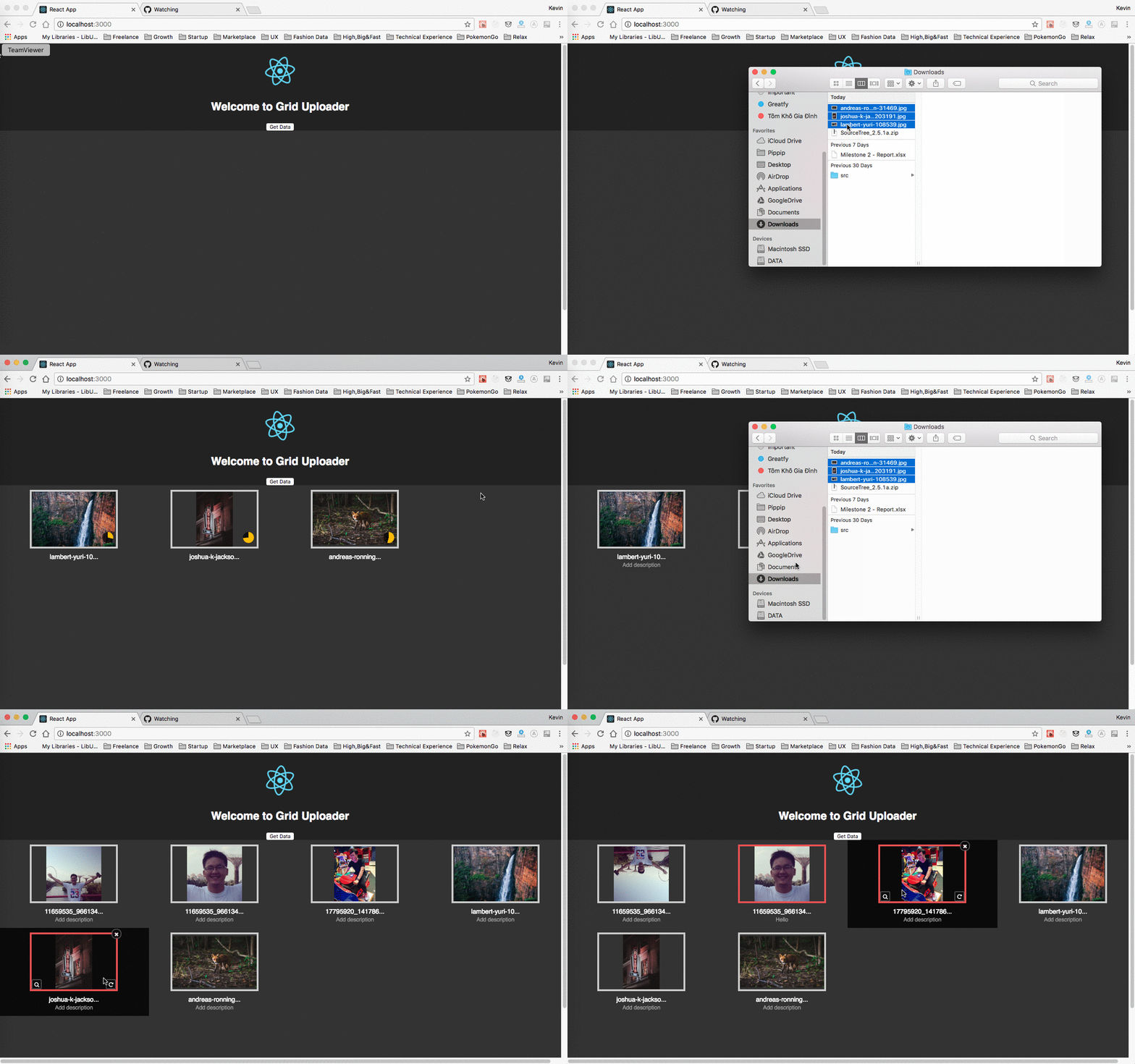
The grid uploader for Amazon S3 in ReactJS. Please see features in below:
- Upload multiple files at same times by drag-n-drop (using react-dropzone)
- Upload directly to S3 with signed url (using react-s3-uploader
- Rotate/Delete.
- View gallery in lightbox with react-image-lightbox

Installation
npm i --save react-grid-uploader
or
yarn add react-grid-uploader
Please file an issue if you have any trouble!
Usage
import React, { Component } from 'react';
import logo from './logo.svg';
import './App.css';
import GridUploader from 'react-grid-uploader';

class App extends Component {

  onGetData = () => {
    console.log(this.gridContainer.getData());
    alert('check console to see the data structure');
  }

  render() {
    return (
      <div className="App">
        <div className="App-header">
          <img src={logo} className="App-logo" alt="logo" />
          <h2>Welcome to Grid Uploader</h2>
          <button onClick={this.onGetData}>Get Data</button>
        </div>
        <div>
          <GridUploader ref={(ref) => { this.gridContainer = ref; }}
            signingUrl="http://localhost:8000/s3/sign" />
        </div>
      </div>
    );
  }
}

export default App;
Props
| Name | Type | Info |
|---|---|---|
| signingUrl | String | Your backend service that uses to generate signed url from AWS_ACCESS_KEY_ID & AWS_SECRET_ACCESS_KEY. See at for example service https://github.com/odysseyscience/react-s3-uploader |
| onUploadFinish | Function | the callback function when upload completely. |
| onUploadError | Function | the callback function when upload failed. |
| onUploadProgress | Function | the callback function when upload in progress. |
| onItemSelect | Function | the callback function when select an image item. |
| onItemDelete | Function | the callback function when delete an image item. |
| customStyle | Function | the custom style for grid uploader. |
customStyle Object
| Property Name | Type | Info |
|---|---|---|
| containerStyle | Object | style for grid container. Default is width: '100%', backgroundColor: '#333333', minHeight: '600px' |
| nameStyle | Object | style of image name. |
| descriptionStyle | Object | style of image description. |
| imageBorderColor | String | border color of image in normal state. |
| imageBorderActiveColor | String | border color of image in active state. |
| iconContainerStyle | Object | style of icon container |
| iconStyle | Object | style of icon |
| progressColor | String | color of cirle progress. Default is #fbba00 |
Response data structure
To get grid data, we call getData() and receive array of image data. Each item has the structure as below:
| Property Name | Type | Info |
|---|---|---|
| s3Data | Object | The uploaded response from AWS S3. |
| description | String | Description of image. |
| rotate | Integer | Rotage degree of image. |
| Others | Properties from react-dropzone. |
License
MIT