A simple headless chatbox React component that consists of:
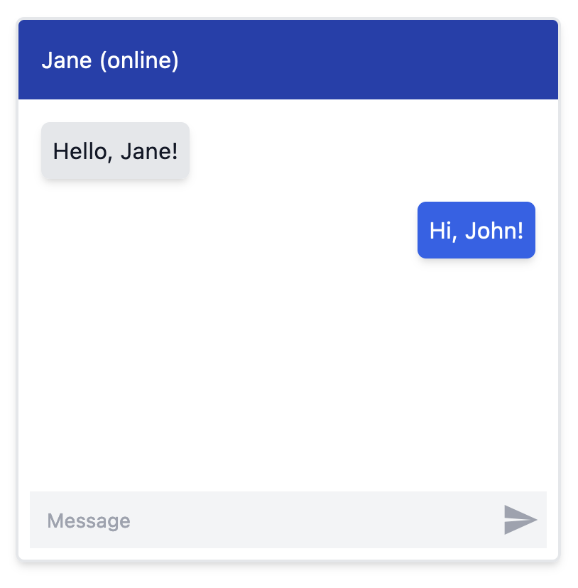
- A messages container that is scrolled automatically
- Chat messages that are styled differently per participant in the chat (e.g. aligned left/right)
- A textbox that grows with content and is cleared after submission
- A trigger button
With this headless implementation, you can fully style and position the messages, the textbox and the trigger.
npm install react-headless-chatbox
yarn add react-headless-chatbox
The following code example uses tailwind to style the chatbox, as shown in the image above:
import { useState } from "react";
import { Chatbox, Message as ChatboxMessage, Participant as ChatboxParticipant } from "react-headless-chatbox";
import { ReactComponent as TriggerSVG } from "./trigger.svg";
interface Participant extends ChatboxParticipant {
}
interface Message extends ChatboxMessage {
id: string;
text: string;
}
const PARTICIPANTS = [
{ id: "john", side: "left"},
{ id: "jane", side: "right" },
] satisfies Participant[];
const MESSAGES = [
{
id: "1",
participantId: "john",
text: "Hello, Jane!",
},
{
id: "2",
participantId: "jane",
text: "Hi, John!",
},
] satisfies Message[];
function MyChatbox() {
const [messages, setMessages] = useState(MESSAGES);
const onMessageSend = (text: string) => {
const newMessage = {
id: Math.random().toString(),
participantId: "jane",
text,
};
setMessages((prevMessages) => [...prevMessages, newMessage]);
};
return (
<div className="w-full h-full bg-white">
<Chatbox
participants={PARTICIPANTS}
messages={messages}
onMessageSend={onMessageSend}
className="m-20 border-2 border-gray-200 rounded-md shadow-md w-96 h-96 relative overflow-hidden"
>
<div className="bg-blue-800 p-4 text-white rounded-t-md">
Jane (online)
</div>
<Chatbox.Messages className="p-2 flex-1">
{messages.map((message) => (
<Chatbox.Message
key={message.id}
message={message}
className={(participant) => {
return `p-2 rounded-md shadow-md m-2 ${
participant.side === "right"
? "bg-blue-600 text-white ml-8"
: "bg-gray-200 text-gray-900 mr-8"
}`;
}}
>
{message.text}
</Chatbox.Message>
))}
</Chatbox.Messages>
<Chatbox.Textbox className="block self-stretch m-2 bg-gray-100 py-2 pl-3 pr-9 text-gray-900 placeholder:text-gray-400 focus:ring-0 sm:text-sm sm:leading-6 outline-none" />
<Chatbox.Trigger className="cursor-pointer absolute bottom-3.5 right-3">
<TriggerSVG className="w-7 h-7 text-gray-400" />
</Chatbox.Trigger>
</Chatbox>
</div>
);
}
The trigger.svg file:
<?xml version="1.0" encoding="utf-8"?>
<svg fill="currentColor" version="1.1" id="Layer_1" xmlns="http://www.w3.org/2000/svg" xmlns:xlink="http://www.w3.org/1999/xlink"
	 viewBox="0 0 24 24" xml:space="preserve">
<style type="text/css">
	.st0{fill:none;}
</style>
<g id="surface1">
	<path d="M2,3v7.8L18,12L2,13.2V21l20-9L2,3z"/>
</g>
<rect class="st0" width="24" height="24"/>
</svg>
| Prop Name |
Type |
Description |
onMessageSend |
(text: string) => void |
Callback function to be called when the user submits a message. |
messages |
Array<Message> |
An array of Message objects to display in the chatbox. |
participants |
Array<Participant> |
An array of Participant objects representing the participants in the chat. |
autoScrollDown? |
boolean |
If true, the container will scroll down automatically (default: true). |
className |
string |
Additional CSS classes to apply to the component. |
style |
React.CSSProperties |
Inline styles to apply to the component. |
ref |
React.Ref<HTMLDivElement> |
ref object to the HTML container element. |
| Prop Name |
Type |
Description |
className |
string |
Additional CSS classes to apply to the component. |
style |
React.CSSProperties |
Inline styles to apply to the component. |
| Prop Name |
Type |
Description |
message |
Message |
The message object being rendered |
className |
string | ((participant: Participant) => string); |
Additional CSS classes to apply to the component. You can also use the function to style each message based on the participant |
style |
React.CSSProperties |
Inline styles to apply to the component. |
| Prop Name |
Type |
Description |
ref |
React.Ref<HTMLTextAreaElement | null> |
ref object to the textarea element. |
className |
string |
Additional CSS classes to apply to the component. |
style |
React.CSSProperties |
Inline styles to apply to the component. |
placeholder |
string |
Placeholder text to display in the textarea. |
maxLength |
number |
Maximum number of characters allowed in the textarea. |
onChange |
ChangeEventHandler<HTMLTextAreaElement> |
Callback function to be called when the value of the textarea changes. |
aria-label |
string |
ARIA label for the textarea (default: "Message to send"). |
| Prop Name |
Type |
Description |
ref |
React.Ref<HTMLButtonElement> |
ref object to the button element. |
className |
string |
Additional CSS classes to apply to the component. |
style |
React.CSSProperties |
Inline styles to apply to the component. |
aria-label |
string |
ARIA label for the button (default: "Send Message"). |
