react-highlightjs-logs v1.1.0
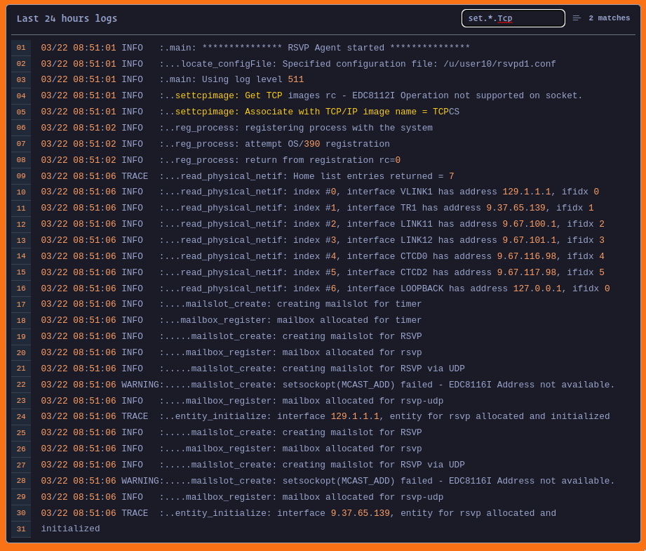
React HighlightJs Logs

Demo
https://react-highlightjs-logs.netlify.app/ code-sandbox
Usage
Installation
Run the following command in your terminal to install the package.
npm i react-highlightjs-logsImporting
You can import the component as shown below.
import { HighlightJsLogs } from "react-highlightjs-logs"Importing Styles
You can import the component as shown below.
import 'react-highlightjs-logs/dist/index.css'Importing Themes
This package provides default theme that's tokyo-night which can be overriden by importing the theme of your choice from highlight.js website. for that you have to add one attribute removeDefaultTheme
<HighlightJsLogs
    removeDefaultTheme
/>
You can also use any of the highlight.js themes. you can get themes from highlight.js themes or you visit the highlight.js demo for more.
With plain data
If you have plain data then you can use the component as shown below.
function App() {
  return (
    <div className="p-6">
      <HighlightJsLogs
        title="Last 24 hours logs"
        text={`your logs`}
      />
    </div>
  );
}
With url
With url you can use the component as shown below.
function App() {
  return (
    <div className="p-6">
      <HighlightJsLogs
        title="Last 24 hours logs"
        url="https://example.com"
      />
    </div>
  );
}
With websocket
If you wanna use with websocket then use as the shown below.
function App() {
  return (
    <div className="p-6">
      <HighlightJsLogs
        title="Last 24 hours logs"
        url="wss://example.com"
        websocket={true}
      />
    </div>
  );
}
enablesearch, follow, selectableLines
You can also enable searching, autoscroll to last line, and highlight line on hover by the following properties.
function App() {
  return (
    <div className="p-6">
      <HighlightJsLogs
        title="Last 24 hours logs"
        data="Hello World!"
        enablesearch={true}
        follow={true}
        selectableLines={true}
        />
    </div>
  );
}
By default all the values are true you can disable this by changing it's value to false.
Hide scrollbar
You can hide the scrollbar by simpaly adding noScrollBar attribute as shown below. The default value is false so scrollbar will be visible if you don't add.
function App() {
  return (
    <div className="p-6">
      <HighlightJsLogs
        title="Last 24 hours logs"
        data="Hello World!"
        noScrollBar
        />
    </div>
  );
}
Width and Height
You need to specify width and height for better fit in your ui. by default width is 600px and height is 400px. you can specify these as shown below.
function App() {
  return (
    <div className="p-6">
      <HighlightJsLogs
        title="Last 24 hours logs"
        data="Hello World!"
        height='400px',
        width='600px',
        />
    </div>
  );
}
Font Size
You can also manage Font Size by adding fontSize property. It's Number value and can be provided as shown below. default fontSize is 14.
function App() {
  return (
    <div className="p-6">
      <HighlightJsLogs
          title="Last 24 hours logs"
          url={`/logs.txt`}
          fontSize={14}
        />
    </div>
  );
}
Define your own loading component
You can also define your own loading component as shown below.
function App() {
  return (
    <div className="p-6">
      <HighlightJsLogs
          title="Last 24 hours logs"
          url={`/logs.txt`}
          fontSize={14}
          loadingComponent={<span>Loading...</span>}
        />
    </div>
  );
}
Define your own loading component
Define your action components easily by providing component to the property actionComponent as shown below.
function App() {
  return (
    <div className="p-6">
      <HighlightJsLogs
          title="Last 24 hours logs"
          url={`/logs.txt`}
          actionComponent={
            <button>
              Refresh
            </button>
          }
        />
    </div>
  );
}
Technology
- highlight.js for syntax highlighting
- websocket for socket connection
- axios for fetching url data
- react-icons for icons
- tailwindcss for design
- tokyo-night default theme
Development and Contributing
This repository uses highlight.js, websocket, axios, react-icons and tailwindcss for developing, previewing and building react components. to get started
- Fork and clone this repo
- Install the dependencies with npm or pnpm
- Start development server with npm start. This will launch a preview screen. Open a browser to http://localhost:3000 to preview the React Component.
- Use CTRL-C to exit the preview.
- Use npm run build to generate the compiled component for publishing to npm.
Feel free to open an issue, submit a pull request, or contribute however you would like. Understand that this documentation is still a work in progress, so file and issue or submit a PR to ask questions or make imporvements. Thanks!
3 years ago
3 years ago
3 years ago
3 years ago
3 years ago
4 years ago
4 years ago
4 years ago
4 years ago
4 years ago
4 years ago
4 years ago
4 years ago
4 years ago
4 years ago
4 years ago
4 years ago
4 years ago
4 years ago
4 years ago
4 years ago
4 years ago
4 years ago
4 years ago
4 years ago
4 years ago
4 years ago
4 years ago
4 years ago
4 years ago
4 years ago
4 years ago
4 years ago
4 years ago
4 years ago
4 years ago
4 years ago
4 years ago
4 years ago
4 years ago
4 years ago
4 years ago
4 years ago
4 years ago
4 years ago
4 years ago
4 years ago
4 years ago