react-image-splitter v1.0.0
React image splitter
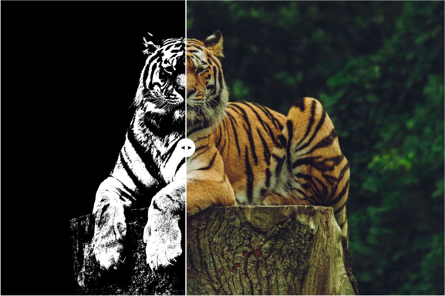
React Image Splitter is a versatile and user-friendly React component that enables users to interactively split an image into two parts by dragging a separator divider. This component offers a straightforward and highly customizable solution to create engaging split-screen effects for a variety of applications. It is especially useful in scenarios where you want to showcase the results of changes made to the same background, such as before and after image comparisons, displaying different color schemes or finishes on the same pattern, and more.
Key Features
Draggable Separator: Users can easily drag the separator divider left or right to adjust the split position.
Customizable Starting Position: The component allows you to define a default starting position for the separator, providing a balanced split view by default.
Effortless Integration: With simple integration into your React applications, you can utilize this component to add a dynamic and interactive split-screen feature.
Ideal for Before and After Galleries: React Image Splitter is a perfect fit for showcasing "before and after" images, making it easy for users to compare changes side by side.
Flexible Applications: Use this component in various contexts, including presenting different design options, color schemes, or finishes on the same pattern.
Installation
You can install the package using npm:
npm install react-image-splitter
Usage
Using React Image Splitter in your React application is a breeze. Import the component and provide the required source and content props to display the image and its split version, respectively.
Props
The React Image Splitter component accepts the following props:
source: The content to be displayed on one side of the splitter (e.g., the "before" image). content: The content to be displayed on the other side of the splitter (e.g., the "after" image). startPosition (optional): The initial position of the separator (a number between 0 and 100, where 0 represents fully left and 100 fully right). Default is set to 50.
import React from 'react';
import ImageSplitter from 'react-image-splitter';

const App = () => {
  return (
    <ImageSplitter
      source={<img src="/path/to/image.jpg" alt="Source" />}
      content={<img src="/path/to/image.jpg" alt="Content" />}
      startPosition={70}
    />
  );
};

export default App;
Sample style
.content-splitter *
{
    box-sizing: border-box;
    user-select: none;
}
.content-splitter
{
    width:1200px;
    max-width:100%;
    margin: auto;
    position: relative;
}
.content-splitter-main
{  position: relative;
    z-index: 1;}
.content-splitter img{
    width: 100%;
    display: block;
}
.content-splitter-layer{
    z-index: 2;
    position: absolute;
    top: 0;
    left: 0;
    width: auto;
    height: 100%;
    overflow: hidden;
}
.content-splitter-layer img{
    position: absolute;
    height: 100%;
    width: auto;
    left: 0;
    position: absolute;
    top: 0;
}
.splitter-divider
{
    position: absolute;
    top: 0;
    height: 100%;
    background-color: #fff;
    width: 3px;
    transform: translateX(-50%);
    display: block;
    z-index: 3;
}
.splitter-divider span{
    display: block;
    width:50px;
    height: 50px;
    position: absolute;
    top: 50%;
    left: 50%;
    transform: translate(-50%,-50%);
    background-color: #fff;
    border-radius: 50%;
    cursor: pointer;
}

.splitter-divider span::before
{
    content: '';
    display: block;
    position: absolute;
    top: 50%;
    transform: translate(0,-50%);
    left: 12px;
    width: 0;
    height: 0;
    border-top: 5px solid transparent;
    border-right: 10px solid #000;
    border-bottom: 5px solid transparent;
}

.splitter-divider span::after
{
    content: '';
    display: block;
    position: absolute;
    top: 50%;
    transform: translate(0,-50%);
    right: 10px;
    width: 0;
    height: 0;
    border-top: 5px solid transparent;
    border-left: 10px solid #000;
    border-bottom: 5px solid transparent;
}
Contribution
Contributions are welcome! If you find any issues or have suggestions for improvements, feel free to create a pull request or open an issue on GitHub.
License
This project is licensed under the MIT License.