1.1.8 • Published 6 years ago
react-input-with-keyboard v1.1.8
React Input with Keyboard ⌨️
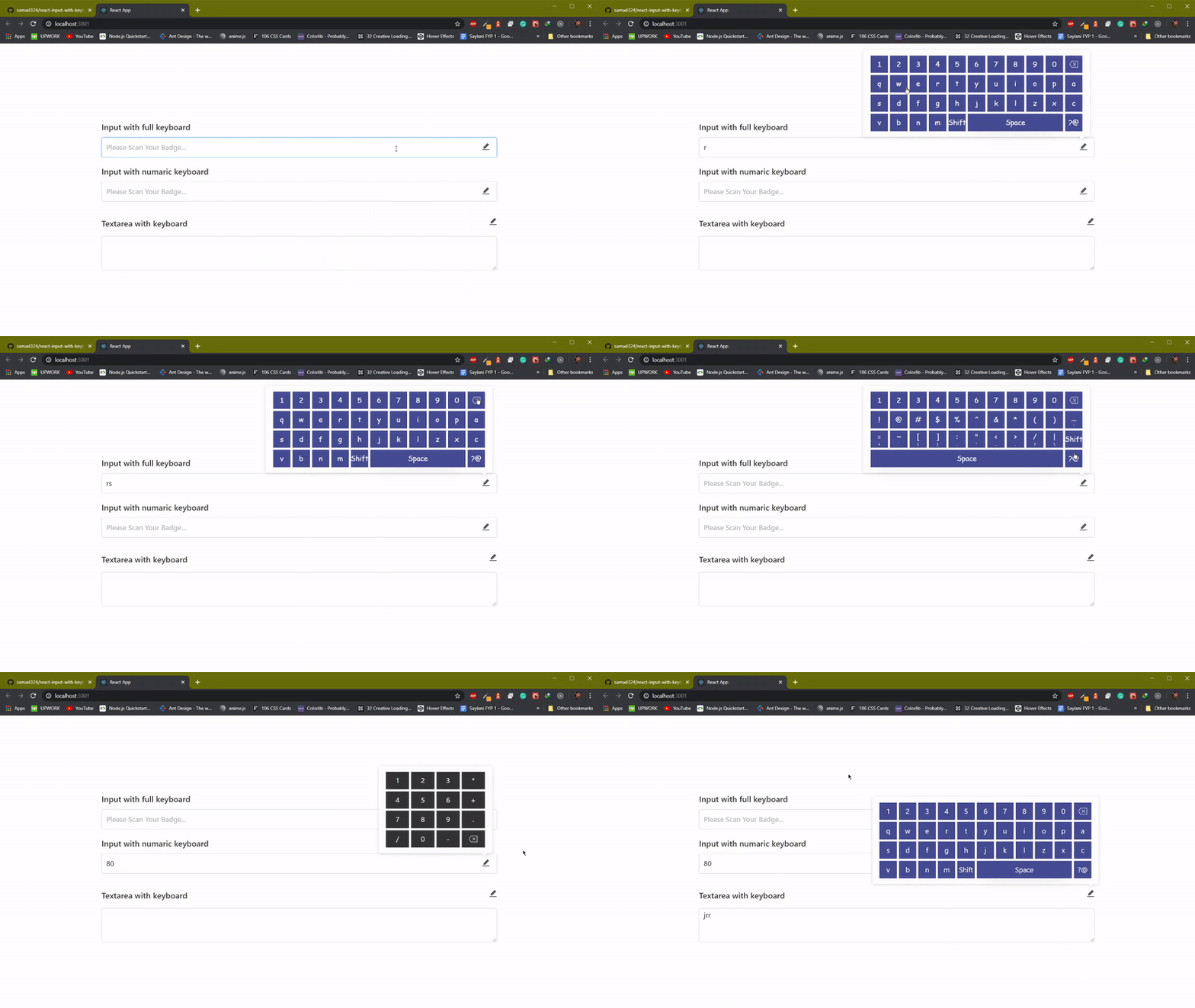
Preview

Watch Demo Here
Installation
You can install this package with the following command:
yarn add react-input-with-keyboard
or
npm install react-input-with-keyboard
How to use
you can also see this example
Usage
import React, { Component } from "react";
import { TextInput, Textarea } from "react-input-with-keyboard";
import "./App.css";

// don't forget to import css file.
import "react-input-with-keyboard/dist/index.css";

class App extends Component {
  constructor(props) {
    super(props);

    this.state = {
      input1Val: "",
      input2Val: "",
      input3Val: ""
    };
  }
  onChangeTextField = (key, value) => {
    this.setState({
      [key]: value
    });
  };

  render() {
    const { input1Val, input2Val, input3Val } = this.state;
    return (
      <div className="App">
        <TextInput
          text={"Input with full keyboard"}
          placeholder="Please Scan Your Badge..."
          value={input1Val}
          containerClassName="inpContainer"
          keyboardKeyClassName="keyboardKeyStyles"
          onChange={text => this.onChangeTextField("input1Val", text)}
        />
        <TextInput
          text={"Input with numaric keyboard"}
          placeholder="Please Scan Your Badge..."
          value={input2Val}
          fullKeyboard={false}
          type="number"
          keyboardKeyContainerClassName="keyContainerClass"
          containerClassName="inpContainer"
          onChange={text => this.onChangeTextField("input2Val", text)}
        />
        <Textarea
          text={"Textarea with keyboard"}
          value={input3Val}
          fullKeyboard={true}
          onChange={value => this.onChangeTextField("input3Val", value)}
          containerClassName="inpContainer"
        />
      </div>
    );
  }
}

export default App;
Props
| Props | Type | Notes |
|---|---|---|
| containerClassName | string | className of the main Input wrapper. |
| text | string | Heading of Input. |
| textStyles | string | Heading className |
| error | bool | for showing error |
| inputClassName | string | input className |
| placeholder | string | placeholder of the input |
| value | string | value of the input |
| size | string | size of the input, i.e. large default and small |
| onFocus | function | callback function for onFocus event |
| onBlur | function | callback function for onBlur event |
| onChange | function | callback function for onChange event |
| type | string | type of input, i.e text number etc. |
| disabled | bool | flag for disable the input or not. |
| id | string | id for the input. |
| fullKeyboard | bool | flag for allow full keyboard on input or just numaric keyboard |
| hideOnSmallDevice | bool | if you want to hide keyboard icon on small devices like moble and tablets |
| keyboardIcon | React.node | icon for the keyboard, which is show on right side of the input |
| keyboardIconColor | string | color of the keyboard icon |
| iconClassName | string | className for keyboard icon |
| keyboardKeyClassName | string | className for the text inside the keyboard's key |
| keyboardKeyContainerClassName | string | className for the keyboard's key |