1.0.1 • Published 1 year ago
react-modal-stelda v1.0.1
react-modal-stelda
Description
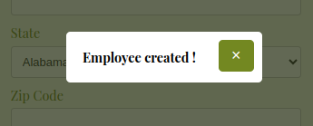
This Modal component enables the display a simple and customizable modal window in React.

Installation
You can install the component via npm or by cloning the GitHub repository.
Via npm
npm install react-modal-steldaVia github
git clone https://github.com/stelda/react-modal-stelda.git
cd react-modal-stelda
npm install
Usage
Here is an example of how to use the Modal component:
import React, { useState } from 'react';
import Modal from 'react-modal-stelda';
import './App.css'; // Import the CSS file

function App() {
    const [isModalOpen, setIsModalOpen] = useState(false);

    const openModal = () => setIsModalOpen(true);
    const closeModal = () => setIsModalOpen(false);

    return (
        <div>
            <button onClick={openModal}>Open Modal</button>
            <Modal
                isOpen={isModalOpen}
                onClose={closeModal}
                message="This is a message."
                overlayClassName="custom-overlay"
                contentClassName="custom-content"
                closeButtonClassName="custom-close-button"
            />
        </div>
    );
}

export default App;
Props
The Modal component accepts the following props:
isOpen(boolean): Whether the modal is open or not.onClose(function): Function to call when the modal is closed.message(string): The message to display in the modal.overlayClassName(string): The CSS class for the overlay.contentClassName(string): The CSS class for the modal content.closeButtonClassName(string): The CSS class for the close button.
Styles
To customize the modal styles, you can modify the CSS classes provided by the component. The following classes are available:
.modal-overlay: The overlay behind the modal..modal-content: The modal window..modal-close: The close button..modal-message: The message inside the modal.
Contribution
If you wish to contribute to the development of this component, follow these steps:
- Fork the repository.
- Create a branch for your changes (
git checkout -b feature/your-feature). - Commit your changes (
git commit -m 'Add some feature'). - Push to the branch (
git push origin feature/your-feature). - Open a Pull Request.