react-month-picker v2.2.1
React-Month-Picker
Month-Picker Component offers a popup month selection panel with responsive layouts.
Installation
yarn add react-month-pickeror
npm install react-month-picker --saveSnapshots
Desktop View (Picking A Month)
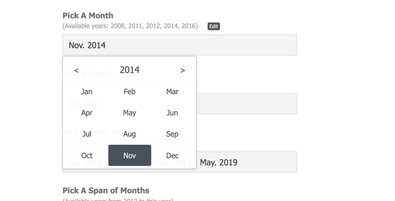
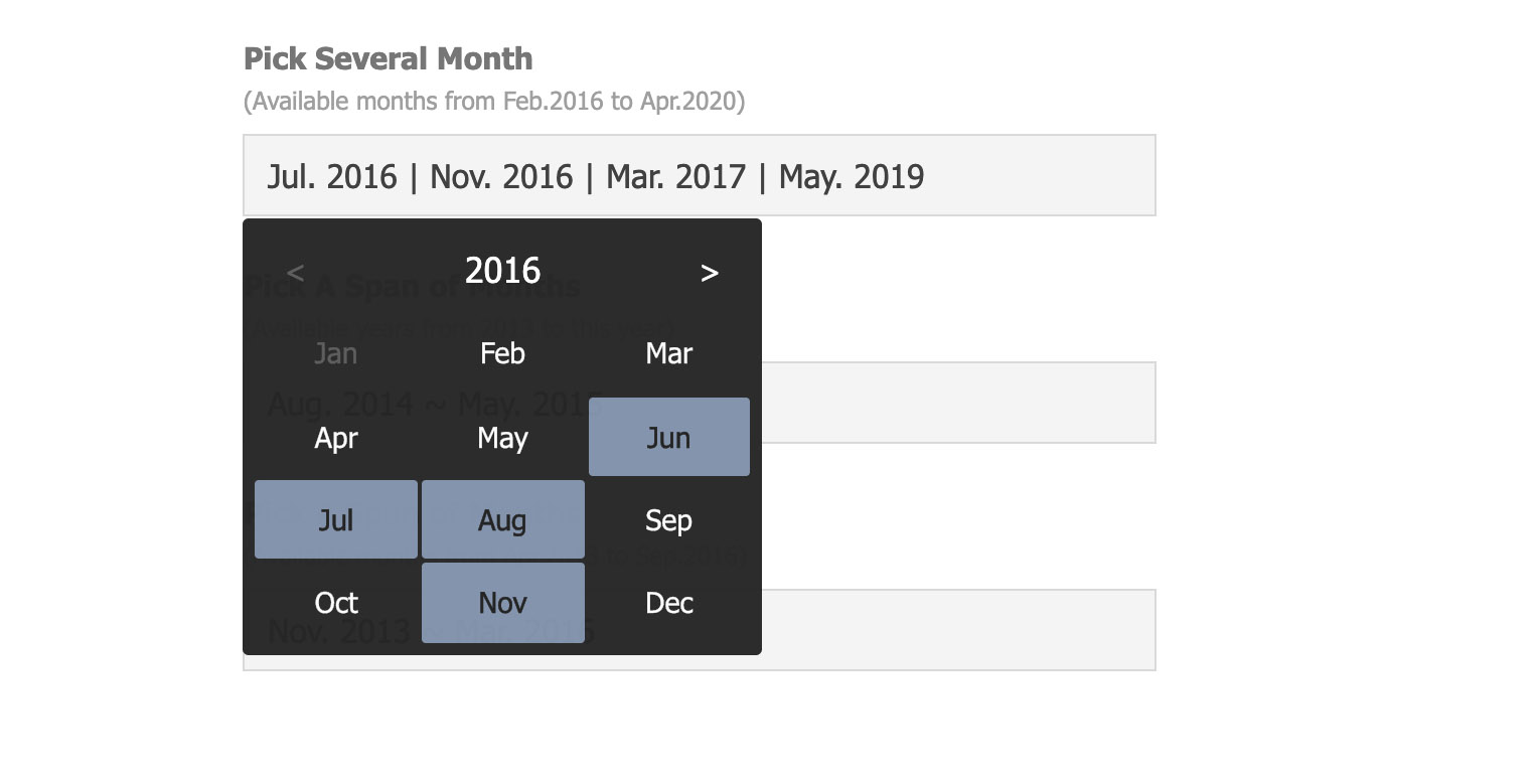
Desktop View (Picking Several Months)
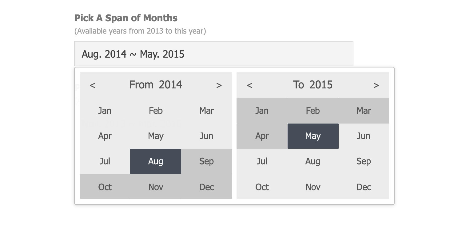
Desktop View (Picking Span of Months)
Mobile View (Picking A Month)
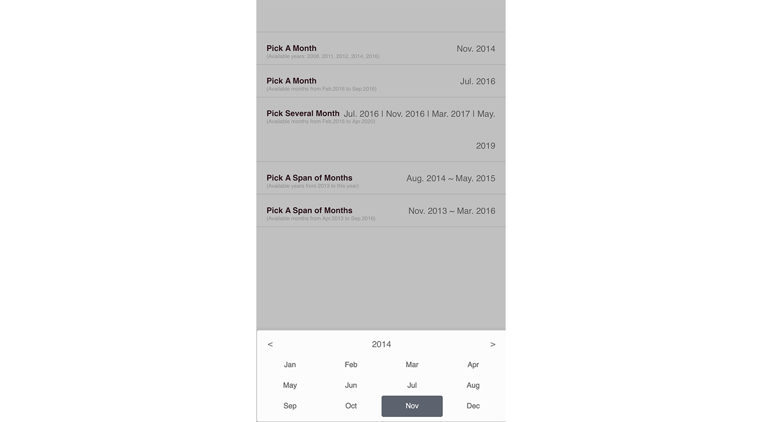
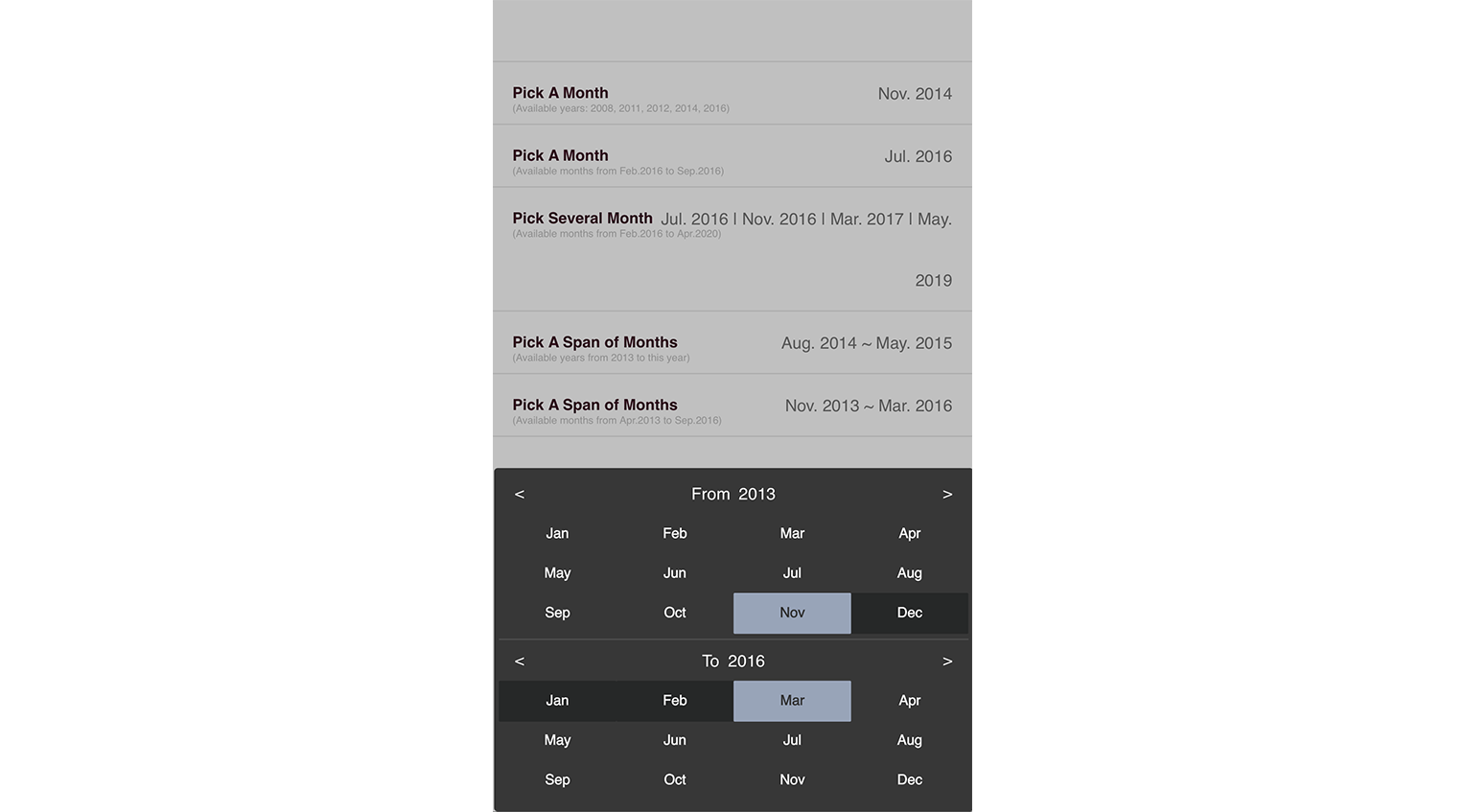
Mobile View (Picking Span of Months)
Online Demo
Example
./examples/demo.jsx
Import component into your react project
import Picker from 'react-month-picker' constructor(props, context) {
super(props, context)
this.state = {
singleValue: {year: 2014, month: 11},
singleValue2: {year: 2016, month: 7},
multiValue: [ {year: 2016, month: 7}, {year: 2016, month: 11}, {year: 2017, month: 3}, {year: 2019, month: 5}, ],
rangeValue: {from: {year: 2014, month: 8}, to: {year: 2015, month: 5}},
rangeValue2: {from: {year: 2013, month: 11}, to: {year: 2016, month: 3}},
}
this.pickAMonth = React.createRef()
this.pickAMonth2 = React.createRef()
this.pickMulti = React.createRef()
this.pickRange = React.createRef()
this.pickRange2 = React.createRef()
}
render() {
const pickerLang = {
months: ['Jan', 'Feb', 'Mar', 'Apr', 'May', 'Jun', 'Jul', 'Aug', 'Sep', 'Oct', 'Nov', 'Dec'],
from: 'From', to: 'To',
}
const { singleValue, singleValue2, multiValue, rangeValue, rangeValue2, } = this.state
const makeText = m => {
if (m && m.year && m.month) return (pickerLang.months[m.month-1] + '. ' + m.year)
return '?'
}
return (
<ul>
<li>
<label><b>Pick A Month</b><span>(Available years: 2008, 2011, 2012, 2014, 2016)</span></label>
<div className="edit">
<Picker
ref={this.pickAMonth}
years={[2008, 2011, 2012, 2014, 2016, 2018, 2020]}
value={singleValue}
lang={pickerLang.months}
onChange={this.handleAMonthChange}
onDismiss={this.handleAMonthDissmis}
>
<MonthBox value={makeText(singleValue)} onClick={this.handleClickMonthBox} />
</Picker>
</div>
</li>
<li>
<label><b>Pick A Month</b><span>(Available months from Feb.2016 to Sep.2016)</span></label>
<div className="edit">
<Picker
ref={this.pickAMonth2}
years={{min: {year: 2016, month: 2}, max: {year: 2016, month: 9}}}
value={singleValue2}
lang={pickerLang.months}
theme="dark"
onChange={this.handleAMonthChange2}
onDismiss={this.handleAMonthDissmis2}
>
<MonthBox value={makeText(singleValue2)} onClick={this.handleClickMonthBox2} />
</Picker>
</div>
</li>
<li>
<label><b>Pick Several Month</b><span>(Available months from Feb.2016 to Apr.2020)</span></label>
<div className="edit">
<Picker
ref={this.pickMulti}
years={{min: {year: 2016, month: 2}, max: {year: 2020, month: 4}}}
value={multiValue}
lang={pickerLang.months}
theme="dark"
onChange={this.handleMultiChange}
onDismiss={this.handleMultiDissmis}
>
<MonthBox value={multiValue.map(v => makeText(v)).join(' | ')} onClick={this.handleClickMultiBox} />
</Picker>
</div>
</li>
<li>
<label><b>Pick A Span of Months</b><span>(Available years from 2013 to this year)</span></label>
<div className="edit">
<Picker
ref={this.pickRange}
years={{min: 2013}}
value={rangeValue}
lang={pickerLang}
theme="light"
onChange={this.handleRangeChange}
onDismiss={this.handleRangeDissmis}
>
<MonthBox value={makeText(rangeValue.from) + ' ~ ' + makeText(rangeValue.to)} onClick={this._handleClickRangeBox} />
</Picker>
</div>
</li>
<li>
<label><b>Pick A Span of Months</b><span>(Available months from Apr.2013 to Sep.2016)</span></label>
<div className="edit">
<Picker
ref={this.pickRange2}
years={{min: {year: 2012, month: 4}, max: {year: 2017, month: 9}}}
value={rangeValue2}
lang={pickerLang}
theme="dark"
onChange={this.handleRangeChange2}
onDismiss={this.handleRangeDissmis2}
>
<MonthBox value={makeText(rangeValue2.from) + ' ~ ' + makeText(rangeValue2.to)} onClick={this._handleClickRangeBox2} />
</Picker>
</div>
</li>
</ul>
)
}MonthBox is a customized component defined for the demo.
Using CSS/SCSS
CSS: import css/month-picker.css
SCSS: import scss/month-picker.scss
Properties
@age:
number value; setting a new incremental age number to force refreshing with new properties
@autoRange:
Only applicable in range mode and when user picks a start month after the previous end, or a end month before the previous start.
- 0: default value; autoRange is disabled
- 1: when the case happens, auto fix the start & end at the same selected month
- 1+: when the case happens, auto fix the start or end to set a range of months as close to the number as possible
@years:
Available years for the selection
- array: 2013, 2015, 2016
- number: 5 (last 4 years and this year)
- object: {min: 2013, max: 2016} (from 2013 to 2016); {min: 2013} (from 2013 to this year); {max: 2015} (5 years to 2015)
- object: {min: {year: 2013, month: 4}, max: {year: 2016, month: 9}} (from Apri.2013 to Sept.2016)
@value:
Initial selection
- single mode: for picking a single month, e.g. {year: 2015: month: 11}
- multiple mode: for picking several months, e.g. {year: 2016, month: 7}, {year: 2016, month: 11}
- range mode: for picking a span of months, e.g. { from: {year: 2014: month: 7}, to: {year: 2015: month: 11} }
@lang:
language texts
- array: array of months' texts, e.g. 'Jan', 'Feb', 'Mar', 'Spr', 'May', 'Jun', 'Jul', 'Aug', 'Sep', 'Oct', 'Nov', 'Dec'
- object: including array of months' texts and other display texts, e.g. {from: "From:", to: "To:", months: ...}
@theme:
theme setting of month-picker; 2 options (light/dark); default theme is light
Developing
npm install
npm run build
Changelogs
v2.2.0
- add property "autoRange"
v2.1.1
- fix README
v2.1.0
- add property "age" to force refreshing the component with new years, value or other properties manipulated by parent.
v2.0.1
- fixed and improved multiple selection feature
v2.0.0
- support multiple choices
- deprecated property "range"
- 3 modes defined by the type of initial value
v1.3.10
- update deps for security vulnerability
v1.3.9
- removed webpack-dev-server dependency
v1.3.8
- merged the update with highlight the selected range and slight code improvement
v1.3.7
- any positive integer is valid year
v1.3.5
- using private css naming
v1.3.4
- upgrade react-tapper version
v1.3.3
- fixed carelessness in peerDependencies setting
v1.3.2
- Support show prop in componentWillReceiveProps
v1.3.1
- Support show prop
v1.3.0
- Support keyboard event with escape for cancel and enter for confirm
v1.2.2
- Fixed error in readme
v1.2.1
- Upgrade babel-loader & update readme
v1.2.0
- Update for react v15.5.x
License
5 years ago
6 years ago
6 years ago
6 years ago
6 years ago
7 years ago
7 years ago
7 years ago
8 years ago
8 years ago
8 years ago
8 years ago
8 years ago
8 years ago
8 years ago
9 years ago
9 years ago
9 years ago
9 years ago
9 years ago
9 years ago
9 years ago
9 years ago
9 years ago
9 years ago
10 years ago
10 years ago
10 years ago
10 years ago
10 years ago
10 years ago
10 years ago
10 years ago
10 years ago
10 years ago
10 years ago
10 years ago