react-native-animated-input v1.1.0
React Native Animated Input
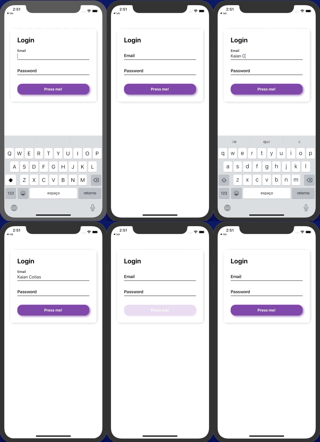
Do you need a beautiful, lightweight and customizable Animated Floating Input? Here it is!
A cross-platform Animated Floating Input component with style options and smooth animation.

- Checkout the example/ folder for use example.
Features
- OnFocus and OnDismiss animations
- Custom style for every little bit of it
- Smooth animations
- Very lightweight
Installation
Open a Terminal in the project root and run:
npm install react-native-animated-inputQuick Start
import React from "react";
import { View } from "react-native";
import AnimatedInput from "react-native-animated-input";

const App = () => {
  return (
    <View style={{ flex: 1, justifyContent: "center", paddingHorizontal: 20 }}>
      <AnimatedInput
        placeholder="Email"
        valid={isValid}
        errorText="Error"
        onChangeText={handleChange}
        value={email}
        styleLabel={{ fontWeight: "600" }}
        styleBodyContent={{ borderBottomWidth: 1.5 }}
      />
    </View>
  );
};
export default App;
Props
valid - boolean (Default - true)
Shows or hides the error text and color.
errorText - string (Default - none)
Sets the error text to be displayed.
errorColor - string (Default - red)
Sets the color of the error highlight.
placeholder - string (Default - none) REQUIRED
Defines the placeholder text to be shown and animated when onFocus.
disabled - boolean (Default - false)
Lock or unlock text input.
value - string (Default - none) - Works exactly as TextInput/ component
Defines the value of the input.
onChangeText - function (Default - none) Works exactly as TextInput/ component
Callback function that will handle the text input.
prefix - component (Default - none)
Renders the component on the beginning of the input. i.e R\$ -> R$ 200,00.
sufix - component (Default - none)
Renders the component on the end of the input. i.e Kg -> 200Kg.
others - props (Default - none)
Any other prop of the TextInput/ component can be used and will work properly.
Style Props
styleContent - obj {}
Customizes the component main View.
styleInput - obj {}
Customizes the TextInput component.
styleError - obj {}
Customizes the error to be shown.
styleLabel - obj {}
Customizes the label/placeholder of the input.
styleBodyContent - obj {}
Customizes the view that manage the component composition - sufix, prefix, animated. Be careful.
labelInitialSize - obj {}
Defines the fontSize of the label on it's initial State (inactive)
labelFinalSize - obj {}
Defines the fontSize of the label on it's Final State (active)
textInputFontSize - obj {}
Defines the fontSize of the text input (active)