1.0.3 • Published 1 year ago
react-native-animated-tab v1.0.3
react-native-animated-tab
A React Native component for creating an animated tab interface with customizable styles and animations.
- Description: A React Native component for creating an animated tab interface.
Installation
To install the package, use npm or yarn:
Using npm
npm install react-native-animated-tabUsing yarn
yarn add react-native-animated-tabUsage
To use the Tab component in your React Native project, follow these steps:
Import the Component
import Tab from 'react-native-animated-tab';Example
Here's a basic example of how to use the Tab component:
import React, { useState } from "react";
import { View, StyleSheet } from "react-native";
import Tab from "react-native-animated-tab";

const App = () => {
  const [selectedOption, setSelectedOption] = useState("Option 1");
  const options = ["Option 1", "Option 2", "Option 3"];

  return (
    <View style={styles.container}>
      <Tab
        options={options}
        animationType="spring"
        activeLabelColor="#fff"
        inactiveLabelColor="teal"
        activeBackgroundColor="teal"
        selectedOption={selectedOption}
        onOptionPress={setSelectedOption}
        springConfig={{damping: 18, stiffness: 150}}
        containerStyle={{marginVertical: 30, backgroundColor: '#fff'}}
      />
    </View>
  );
};

const styles = StyleSheet.create({
  container: {
    flex: 1,
    alignItems: "center",
    backgroundColor: "#fff",
    justifyContent: "center",
  },
});

export default App;
Demo
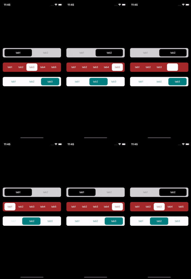
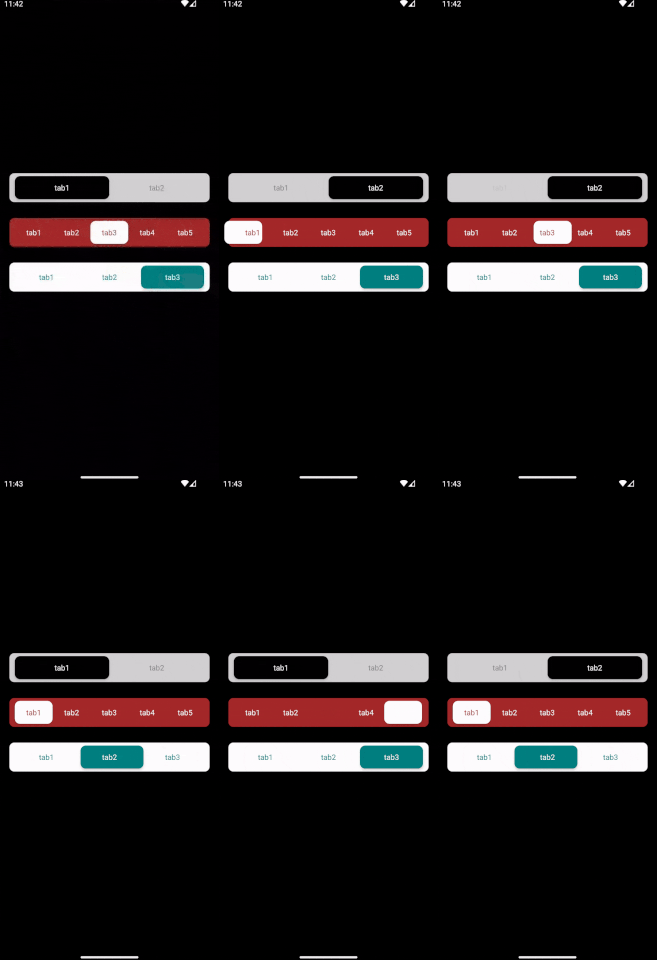
Check out the demo of the component in action:
Ios

Android

Props
| Prop | Type | Default | Description |
|---|---|---|---|
options | Array | N/A | Array of tab options to display. |
selectedOption | String | N/A | Currently selected tab option. |
onOptionPress | Function | N/A | Callback function when a tab option is pressed. |
height | Number | 54 | Height of the tab component. |
borderRadius | Number | 9 | Border radius for the tab component. |
activeLabelColor | String | "black" | Text color for the active label. |
inactiveLabelColor | String | "gray" | Text color for the inactive labels. |
activeBackgroundColor | String | "white" | Background color for the active tab. |
inactiveBackgroundColor | String | "lightgray" | Background color for inactive tabs. |
License
This project is licensed under the ISC License.
Contact
If you have any questions or issues, please open an issue on the GitHub repository or contact the author directly.