
3.2.0 • Published 6 months ago
react-native-body-highlighter
Licence
MIT
Version
3.2.0
Deps
1
Size
169 kB
Vulns
0
Weekly
0
react-native-body-highlighter


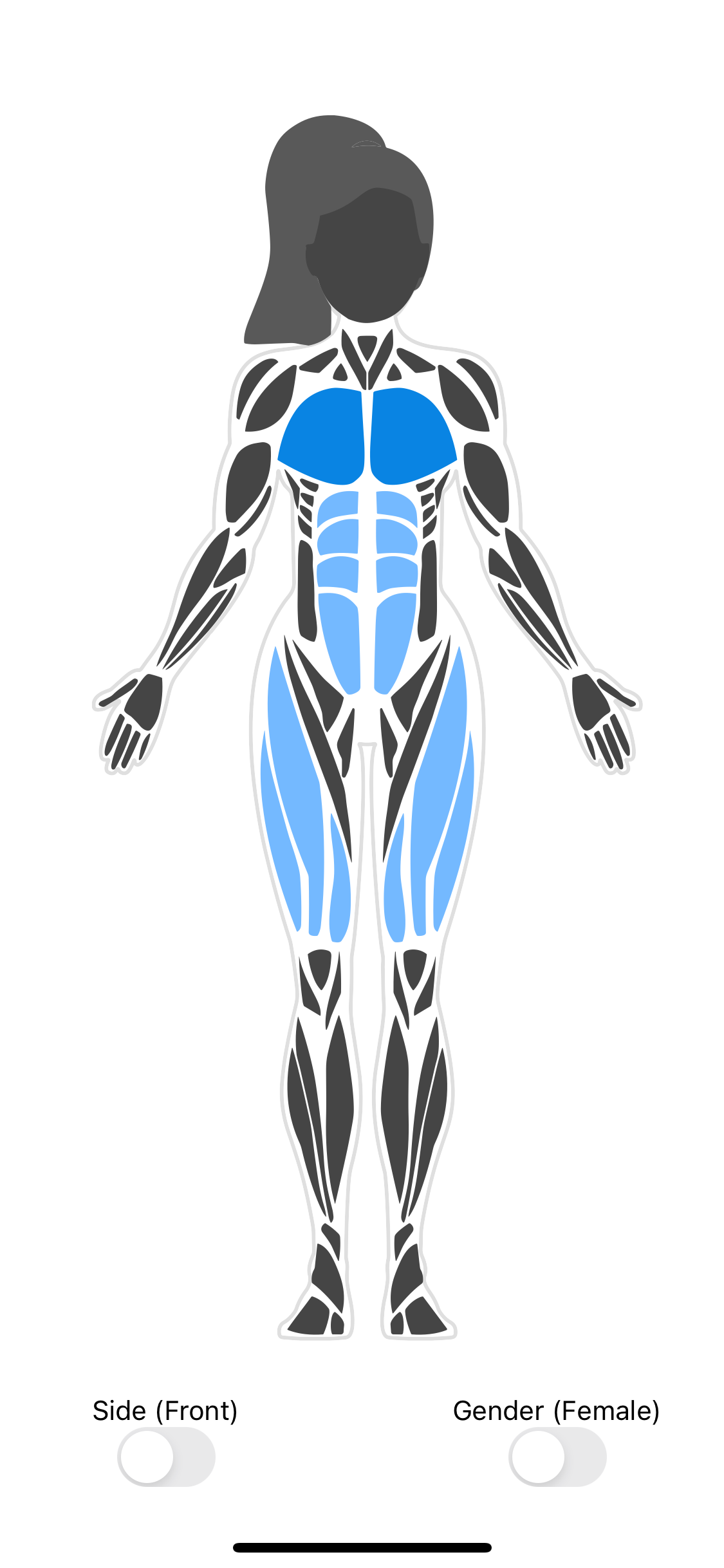
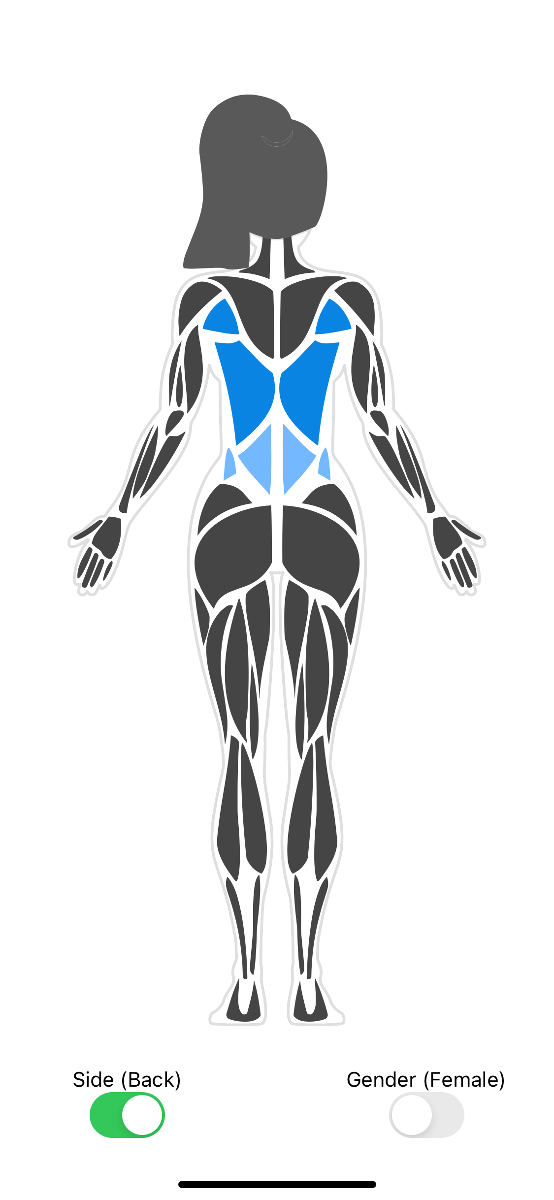
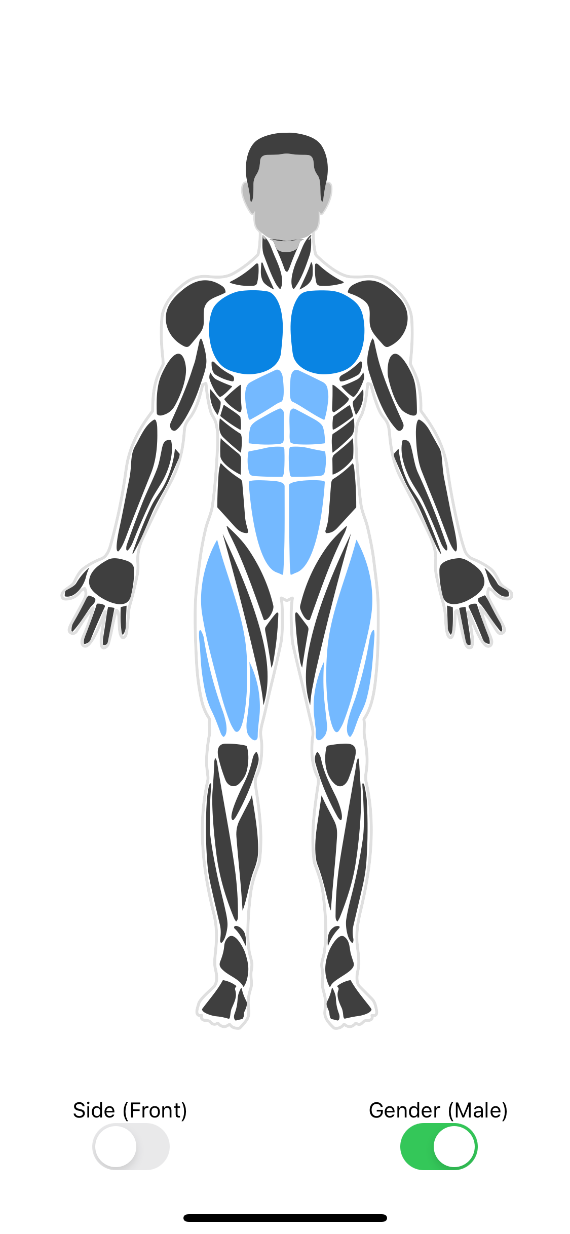
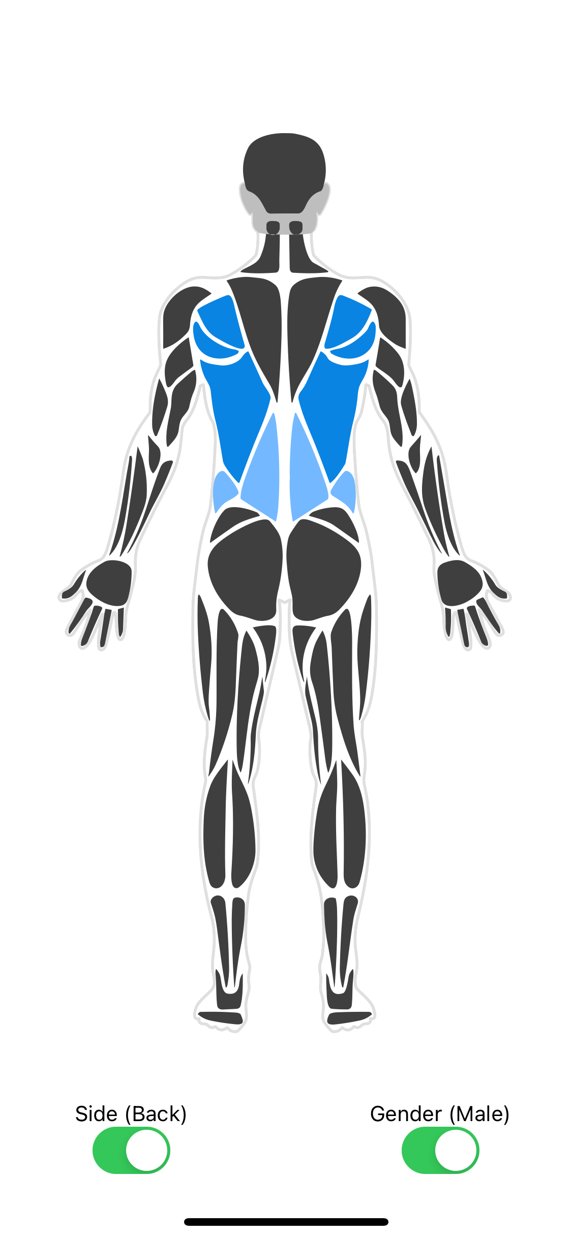
SVG human body parts highlighter for react-native (Expo compatible).
Installation
npm
$ npm install react-native-body-highlighteryarn
$ yarn add react-native-body-highlighterUsage
Basic example
import { useState } from "react";
import Body from "react-native-body-highlighter";

export default function App() {
  return (
    <View style={styles.container}>
      <Body
        data={[
          { slug: "chest", intensity: 1, side: "left" },
          { slug: "biceps", intensity: 2 },
        ]}
        gender="female"
        side="front"
        scale={1.7}
        border="#dfdfdf"
      />
    </View>
  );
}

const styles = StyleSheet.create({
  container: {
    flex: 1,
    backgroundColor: "#fff",
    alignItems: "center",
    justifyContent: "center",
  },
});
Complete example
import { StyleSheet, Switch, Text, View } from "react-native";
import { useState } from "react";
import Body, { ExtendedBodyPart } from "react-native-body-highlighter";

export default function App() {
  const [selectedBodyPart, setSelectedBodyPart] =
    useState <
    ExtendedBodyPart >
    {
      slug: "biceps",
      intensity: 2,
      side: "right",
    };
  const [side, setSide] = (useState < "back") | ("front" > "front");
  const [gender, setGender] = (useState < "male") | ("female" > "male");

  const sideSwitch = () =>
    setSide((previousState) => (previousState === "front" ? "back" : "front"));

  const toggleGenderSwitch = () => {
    setGender((previousState) =>
      previousState === "male" ? "female" : "male"
    );
  };

  return (
    <View style={styles.container}>
      <Body
        data={[
          { slug: "chest", intensity: 1, side: "left" },
          { slug: "biceps", intensity: 1 },
          selectedBodyPart,
        ]}
        onBodyPartPress={(e, side) =>
          setSelectedBodyPart({ slug: e.slug, intensity: 2, side })
        }
        gender={gender}
        side={side}
        scale={1.7}
        border="#dfdfdf"
      />
      <View style={styles.switchContainer}>
        <View style={styles.switch}>
          <Text>Side ({side})</Text>
          <Switch onValueChange={sideSwitch} value={side === "front"} />
        </View>
        <View style={styles.switch}>
          <Text>Gender ({gender})</Text>
          <Switch
            onValueChange={toggleGenderSwitch}
            value={gender === "male"}
          />
        </View>
      </View>
    </View>
  );
}

const styles = StyleSheet.create({
  container: {
    flex: 1,
    backgroundColor: "#fff",
    alignItems: "center",
    justifyContent: "center",
  },
  switchContainer: {
    flexDirection: "row",
    gap: 30,
  },
  switch: {
    flex: 1,
    alignItems: "center",
    justifyContent: "center",
  },
});
Props
| Prop | Required | Purpose |
|---|---|---|
| data | Yes | BodyPartObject[] - Array of BodyPartObject to highlight |
| onBodyPartPress | No | Func - (bodyPart: BodyPartObject, side?: left | right) => {} Callback called when a user tap a body part |
| colors | No | string[] - Defaults to ['#0984e3', '#74b9ff'] |
| side | No | front | back - Defaults to front |
| gender | No | string - Can be "male" or "female", Defaults to male |
| scale | No | number - Defaults to 1 |
| border | No | string - Defaults to #dfdfdf (none to hide the border) |
| disabledParts | No | Slug[] - Contains array of Slugs to be disabled |
| hiddenParts | No | Slug[] - Contains array of Slugs to be hidden (not rendered) |
| defaultFill | No | string - Default fill color for body parts. Defaults to #3f3f3f |
| defaultStroke | No | string - Default stroke color for body parts. Defaults to none |
| defaultStrokeWidth | No | number - Default stroke width for body parts. Defaults to 0 |
BodyPart object model
Accessibility
Each <Body /> component and its SVG wrappers (SvgMaleWrapper, SvgFemaleWrapper) are now accessible to screen readers.
Default accessibility labels are automatically provided for gender and side (e.g.,
"male-body-front","female-body-back").This improves overall screen reader compatibility by making the visual body component identifiable.
Adding accessibility per individual body part would require a deeper refactor of how SVG paths are structured.
BodyPartObject:
{ slug: BodyPartName, color?: colorHexValue, intensity?: IntensityNumber, side?: 'left' | 'right', styles?: BodyPartStyles }BodyPartName: Body part name to highlight (See the list of available body parts below)
colorHexValue: The Color of specific body part. Accepts HEX string. E.g
#ff0000ffIntensityNumber: Color intensity (if the
colorsproperty is set: from 1 tocolors.length+ 1. If not, intensity can be 1 or 2)Side (optional): Can be
left,right. Useful for selecting a single part or a pair (Do not set the side if you need to select the pair)BodyPartStyles (optional): Custom styling object for individual body parts
fill?: string- Custom fill color for this specific body part (overrides color and intensity)stroke?: string- Custom stroke color for this specific body partstrokeWidth?: number- Custom stroke width for this specific body part
Styling Priority
The fill color for each body part is determined in the following priority order (highest to lowest):
styles.fill- Per-part custom fill stylecolor- Per-part color propertyintensity- Color from thecolorsarray based on intensity valuedefaultFill- Global default fill color
List of body parts
| BodyParts | Side |
|---|---|
| trapezius | Both |
| triceps | Both |
| forearm | Both |
| adductors | Both |
| calves | Both |
| hair | Both |
| neck | Both |
| deltoids | Both |
| hands | Both |
| feet | Both |
| head | Both (Front only for female) |
| ankles | Both (Front only for female) |
| tibialis | Front |
| obliques | Front |
| chest | Front |
| biceps | Front |
| abs | Front |
| quadriceps | Front |
| knees | Front |
| abductors | Back |
| upper-back | Back |
| lower-back | Back |
| hamstring | Back |
| gluteal | Back |